Dot plots are simple charts consisting of dots plotted on a simple scale, typically used to show small counts or distributions.
Dot plots are one of the simplest statistical charts, only suitable for small-sized data sets. They’re helpful for understanding the “shape” of your data by highlighting clusters, gaps, and outliers. (A histogram is better suited to showing the data distribution of larger datasets, e.g. > 30 datapoints.)
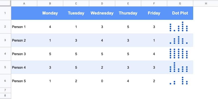
Here’s a table using dot plots to show the hypothetical number of meetings per day for these five employees:
How To Create Dot Plots In Google Sheets
You create dot plots in Google Sheets with formulas!
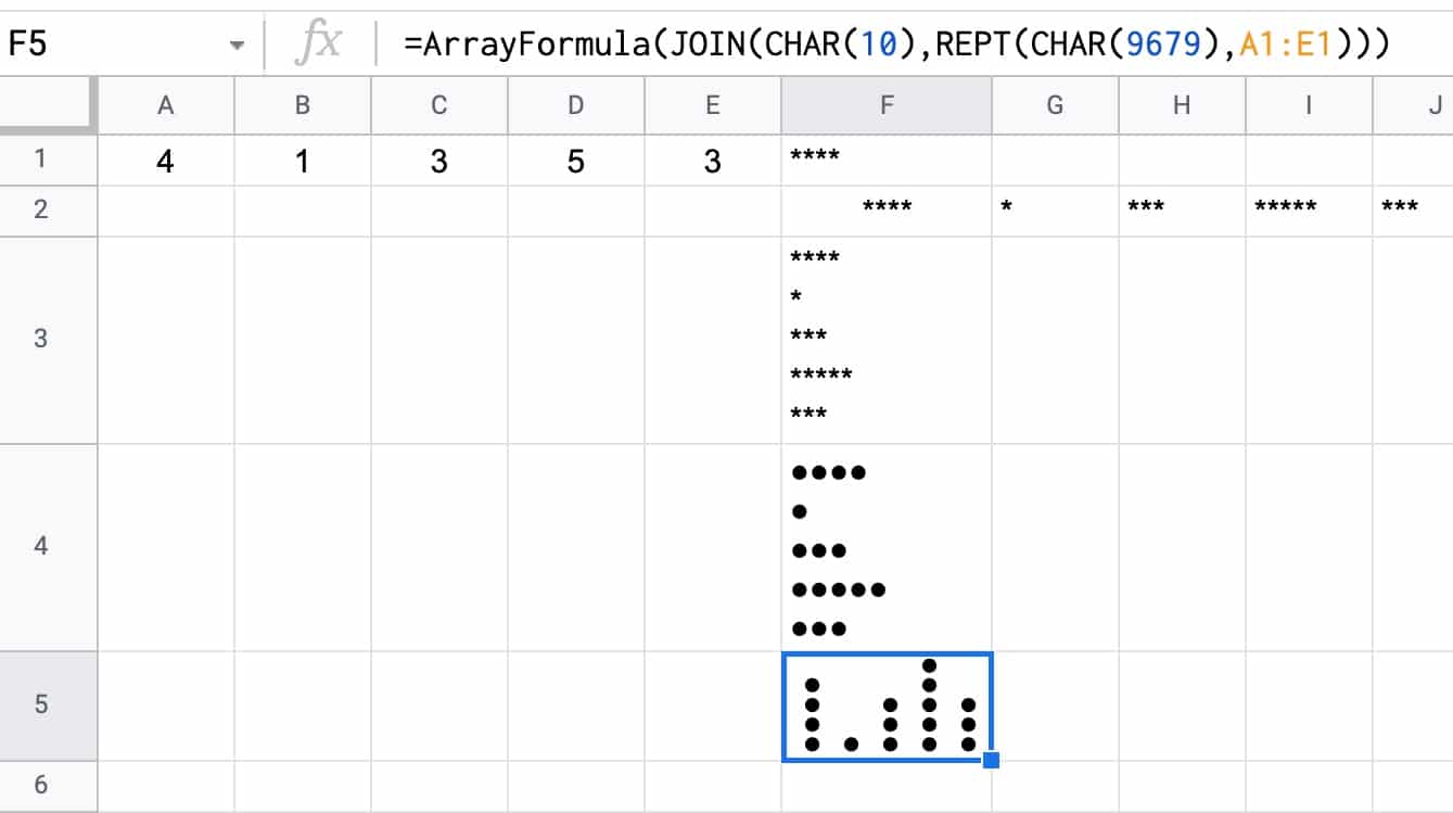
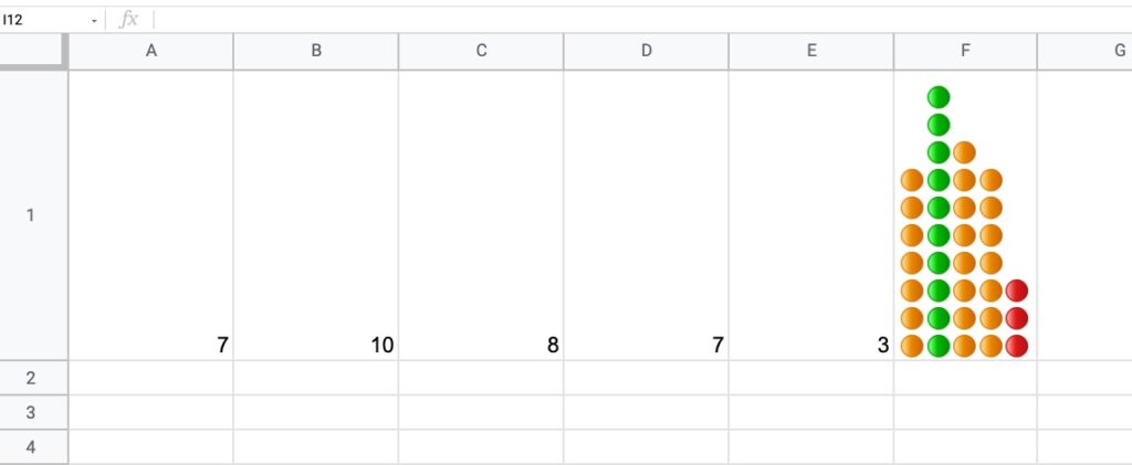
Suppose we have this data in row 1 of a Google Sheet, in cells A1 to E1:
Step 1:
Create a basic REPT function next to the data, e.g. in cell F1:
It’s an array formula that takes an input of the five numbers in columns A to E.
Inside the IFS function, the number (e.g. 7) is divided by the maximum number in the range (10 in this example) and compared to see if it’s bigger than the first threshold (0.85 in this example). If this is true, then the green dot is plotted, otherwise, the threshold is checked (0.5 in this example) If that’s true, then orange dot is used. If that is not true, then the red dot is used as the default.
The REPT function and the JOIN function perform the same way as step 3 above for the simpler single color example.
You can also replace the colored dots in this formula with their CHAR function equivalents, to keep it entirely formula driven:
In this post, you’ll learn how to set default values for cells in Google Sheets, without using Google Apps Script code.
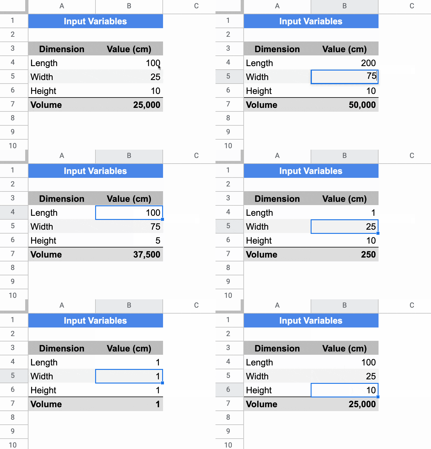
In the Sheet below, the cells in column B have default values of 100, 25, and 10 respectively. If a user types in a value (e.g. 200) it overwrites the default value. If a user deletes whatever value is in the cell already, then the default value of 100 is displayed again.
Setting Default Values For Cells In Google Sheets
The key to make this technique work is to use Array Literals to create a formula which spills into the adjacent cell. This is a rather abstract concept, so let’s run through an example.
In a blank Sheet, write the value “Input” in cell A1. In cell B1, type this formula:
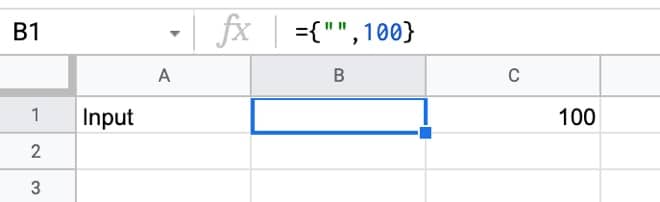
={"",100}
Your Sheet will look like this:
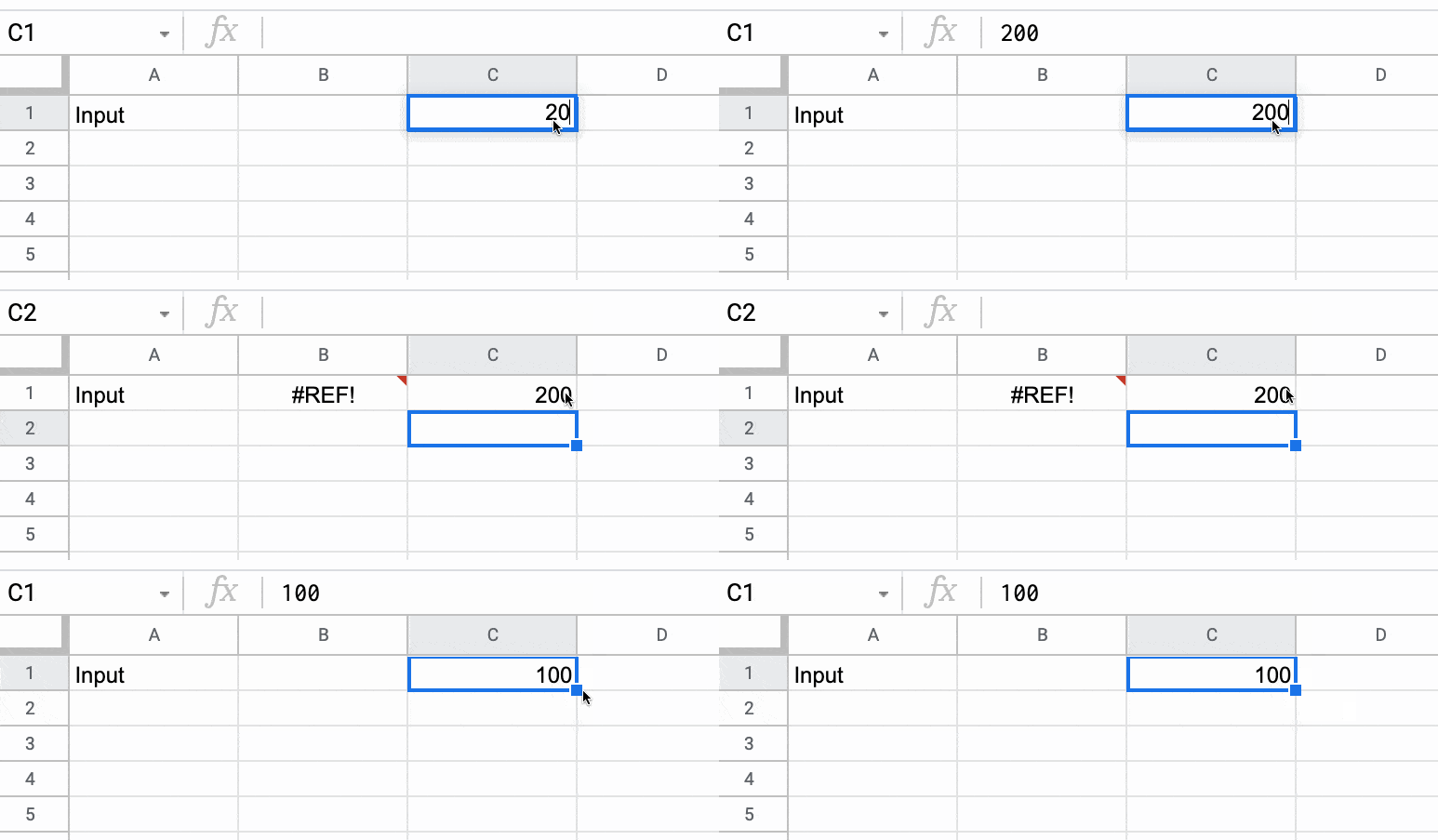
Try typing 200 in cell C1, over the top of the 100.
Cell C1 will show the 200, but cell B1 now displays a #REF! error.
Now, delete the value you just typed in cell C1. The error message disappears and the default value of 100 is displayed again.
Finally, hide column B so that the #REF! error is never seen, and you have a default value of 100 set for cell C1.
🎩 Hat tip to my friend Scott Ribble for showing me this ingenious solution.
Advanced Default Values Without Hidden Column
The method above suffers from one drawback though: it necessitates a hidden column.
However, we can use a clever circular formula to address this.
In a new blank Sheet, add this formula in cell A1:
=IF(ISBLANK(B1),{"Input",100},"Input")
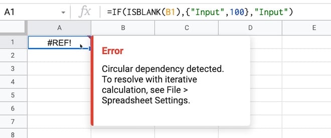
Initially, you may see this error message about a circular error (i.e. a formula that references itself):
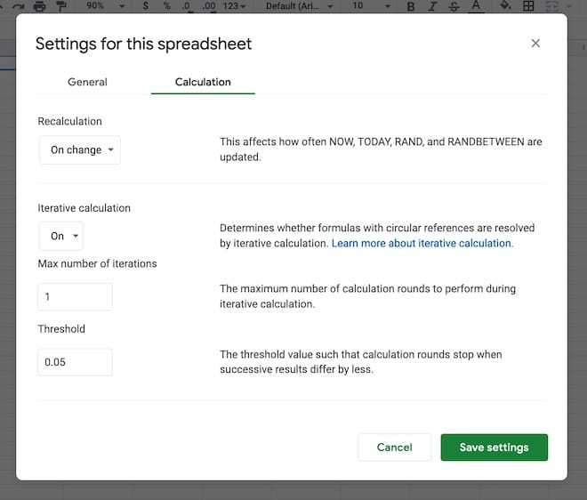
That is a problem, but we fix it by switching on iterative calculations and restricting them to a single iteration from the menu:
File > Settings
Go to “Calculation”.
Set “Iterative calculation” to “On” and the “Max number of iterations” to 1.
(The threshold can be left at 0.05 because it doesn’t apply in this case.)
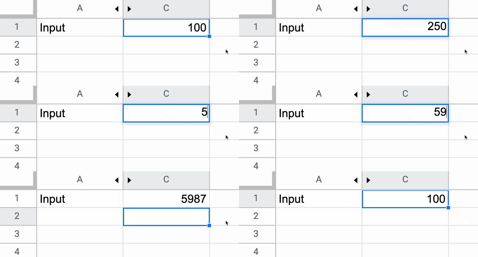
Now, you can enter any value you want in cell B1 and if you delete it, the default value of 100 will be shown.
If it is blank, then it outputs the array literal:
{"Input",100}
which displays “Input” in cell A1 and the value 100 in cell B1.
However, if cell B1 already has a value then the IF function output is just the string “Input” in cell A1.
Note: default values are not limited to numbers. It could be text, an image, or even another formula.
Default Values Checkbox Example
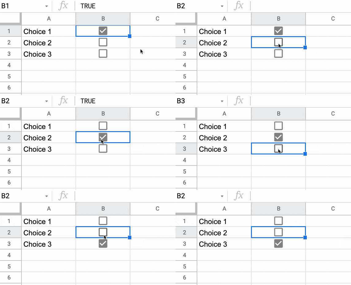
You can use default values to check or uncheck checkboxes. Here’s a cool illustration of how to create a select all checkbox in Google Sheets, using deafult values.
The world of online education is very different today than it was 10 years ago.
We now live in an age of information abundance, with all of human knowledge only a click away.
And that means we can shift the focus of online courses from information-heavy lectures to a community-driven learning environment with interactive sessions, collaboration, and shared knowledge.
And right now, accelerated by the pandemic, community-driven online courses are having their moment in the sun.
Online creators are seeing incredible demand for their live courses. Top-tier VC firms are investing in companies that facilitate these live, cohort-based courses.
Here are three reasons why these cohort-based courses are the best way to learn:
1. Cohort-Based Courses Hold You Accountable
Hands up if you’ve bought an online course with good intentions, but then never got past the introduction video?
Yup! Guilty as charged…
I kid myself that I’ll get around to it one day, but, like all of us, life is busy.
What is there was a different way?
There is!
Join a cohort-based course — like Pro Sheets — and you learn with other people, at scheduled times, with defined and manageable goals.
Turns out that we’re not very good at making and, crucially, keeping promises we make with ourselves. Even if we start a venture with huge enthusiasm, it’s hard to sustain, especially when the journey gets hard or we hit the inevitable hurdles.
Being part of a group offloads some of this willpower burden. Once you become part of something greater than yourself, you don’t want to let the group down by not bringing your best self to the table.
We as humans care deeply about what our fellow humans think of us, even when we’re told not to, or even though we know other people are too busy with their own realities to care much about ours. And yet, this external influence remains very strong.
In other words, when you join a live, group course, you’re giving yourself much better odds at actually sticking through the course and completing it, reaching your goal, and reaping the benefits.
With dedicated time slots and friendly faces waiting to greet you, you’ll feel inspired to attend as many live sessions as possible.
And by simply turning up, again and again, you’ll see the results you’re after.
I was a student in a cohort-based course earlier this year, and I was pumped every time a live class rolled around. I couldn’t wait to join and catch up with everyone. There’s no way I would have stuck with a video-only version of this course on my own.
2. Learning Together Is Faster
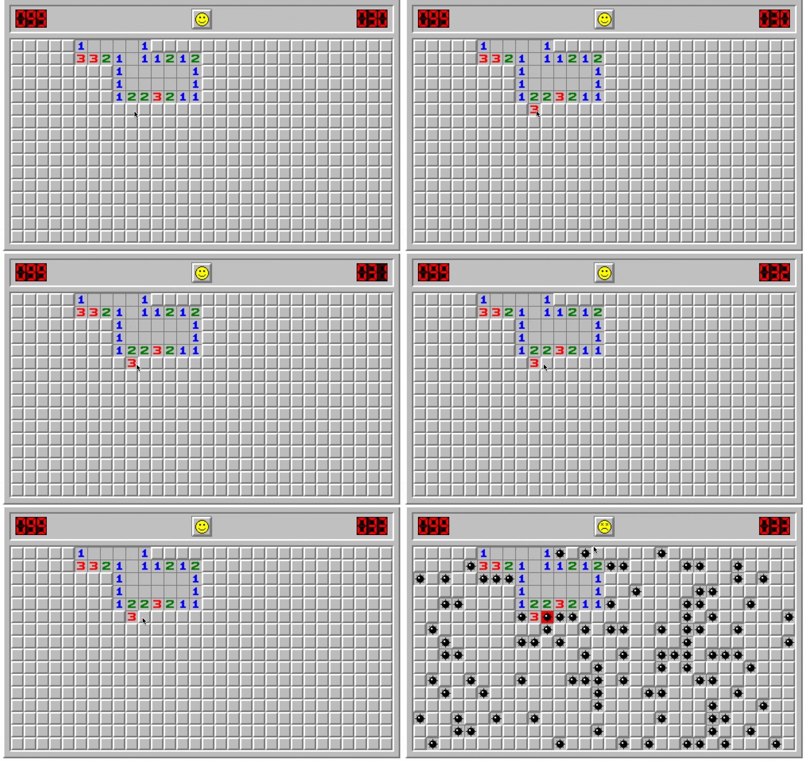
Remember the game minesweeper?
It was a classic strategy game, with a very strong 90s PC desktop vibe, requiring players to make calculated decisions and educated guesses on where the mines lay on the board.
Minesweeper makes for a nice analogy with learning a new skill or deepening an existing skill.
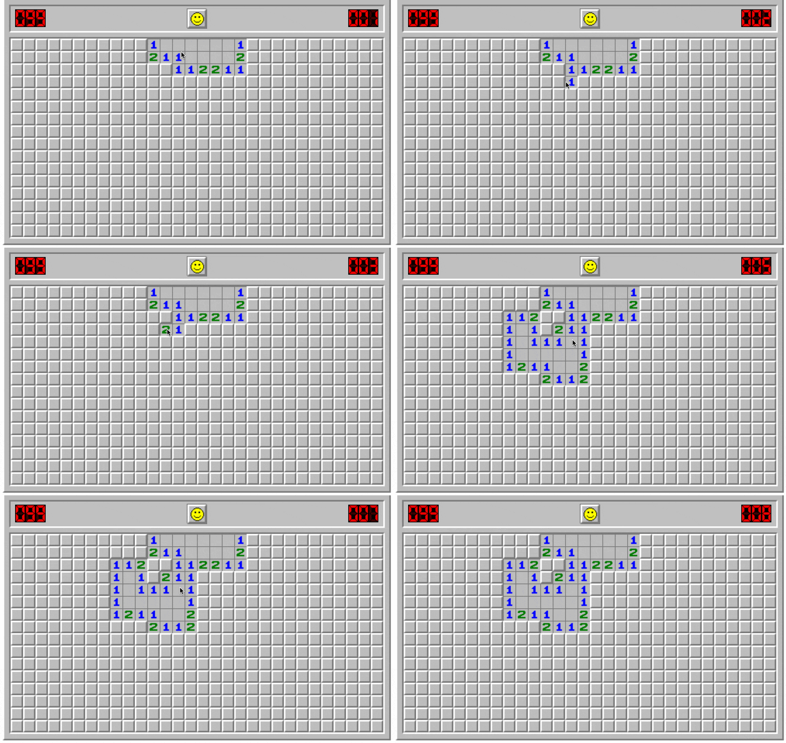
You have your existing knowledge, represented in Minesweeper by the portion of the board that is uncovered.
Now, suppose you’ve reached an impasse with your learning. You don’t know how to proceed.
This is like one of those vexing 2-3-3-4-1 combinations on the Minesweeper board that eventually require an educated guess.
Continuing alone is possible, but it will be slow going and frustrating, and you will make mistakes — step on mines — along the way.
If you learn with others though, whether they’re experts or just slightly ahead of you on their journey, they can show you the next move.
They can unlock the board for you, so whole new regions of knowledge open up in front of you.
Your journey will be dramatically quicker with a guide, simply because you make fewer mistakes and better decisions.
3. It’s More Fun
Look at all these beautiful smiles in the final live session of Pro Sheets Accelerator earlier this year:
When I launched Pro Sheets Accelerator, I expected students to say their favorite part was learning new formulas, scripts, or frameworks.
But by the end of the course, it wasn’t the formulas or scripts that students most appreciated, it was the community.
They loved learning with other spreadsheet enthusiasts!
One of the students, Jen, an educator from Massachusetts, summed it up well:
“It was really just nice to have other nerdy people to talk to and to share stories and ask questions to, who just really cared about talking through it in a high-quality conversation.”
And I was chatting recently with another student, Jim, a financial advisor from California, who said:
“Getting together with like-minded people who were really passionate about spreadsheets was just magic.”
By learning in a group, you meet like-minded people to share the highs and lows of the journey. You’ll laugh and have fun along the way, and your best learning happens when you’re happy and having fun.
The Cantor set is a special set of numbers lying between 0 and 1, with some fascinating properties.
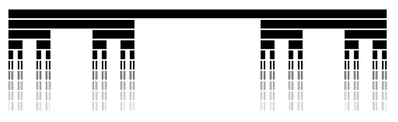
It’s created by removing the middle third of a line segment and repeating ad infinitum with the remaining segments, as shown in this gif of the first 7 iterations:
The formulas used to create the data for the Cantor set in Google Sheets are interesting, so it’s worth exploring for that reason alone, even if you’re not interested in the underlying mathematical concepts.
But let’s begin by understanding the set in more detail…
What Is The Cantor Set?
The Cantor set was discovered in 1874 by Henry John Stephen Smith and subsequently named after German mathematician Georg Cantor.
The construction shown in this post is called the Cantor ternary set, built by removing the middle third of a line segment and repeating ad infinitum with the remaining segments.
It is sometimes known as Cantor dust on account of the dust of points that remain after repeatedly removing the middle thirds. (Cantor dust also refers to the multi-dimensional version of the Cantor set.)
The set has some fascinating, counter-intuitive properties:
It is uncountable. That is, there are as many points left behind as there were to begin with.
It’s self-similar, meaning each subset looks like the whole set.
It’s fractal with a dimension that is not an integer.
It has an infinite number of points but a total length of 0.
Wow!
How To Draw The Cantor Set In Google Sheets
To be clear, the Cantor set is the set of numbers that remain after removing the middle third an infinite number of times. That’s hard to comprehend, let alone do in a Google Sheet 😉
But we can create a picture representation of the Cantor set by repeating the algorithm ten times, as shown in this tutorial:
Create The Data
Step 1:
In a blank sheet called “Data”, type the number “1” into cell A1.
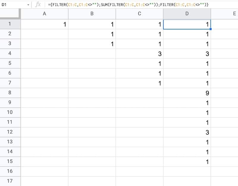
As we drag this formula to adjacent columns, the relative column references will change so that it always references the preceding column.
In column B, the output is:
1,1,1
Then in column C, we get:
1,1,1,3,1,1,1
And in column D:
1,1,1,3,1,1,1,9,1,1,1,3,1,1,1
etc.
This data is used to generate the correct gaps for the Cantor set.
Draw The Cantor Set
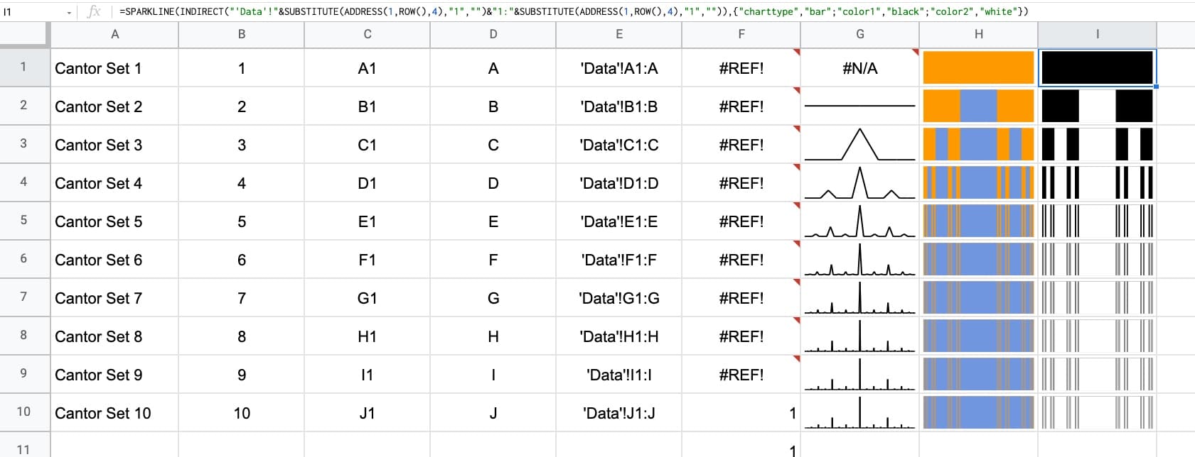
We’ll use sparklines to draw the Cantor set in Google Sheets.
Click to enlarge
Step 4:
Create a new blank sheet and call it “Cantor Set”.
Step 5:
Next, create a label in column A to show what iteration we’re on.
Put this formula in cell A1 and copy down the column to row 10:
="Cantor Set "&ROW()
This creates a string, e.g. “Cantor Set 1”, where the number is equal to the row number we’re on.
Step 6:
The next step is to dynamically generate the range reference. As we drag our formula down column B, we want this formula to travel across the row in the “Data” tab to get the correct data for this iteration of the Cantor set.
Start by generating the row number for each row with this formula in cell B1 and copy down the column:
=ROW()
(I set up my sheet with the data in columns because it’s easier to create and read that way. But then I want the Cantor set in a column too, hence why I need to do this step.)
Step 7:
Use the row number to generate the corresponding column letter with this formula in cell C1 and copy down the column:
=ADDRESS(1,ROW(),4)
This uses the ADDRESS function to return the cell reference as a string.
Step 8:
Remove the row number with this formula in cell D1 and copy down the column:
=SUBSTITUTE(ADDRESS(1,ROW(),4),"1","")
Step 9:
Combine these two references to create an open-ended range reference for the correct column of data in the “Data” sheet.
Put this formula in cell E1 and copy down the column:
Feel free to delete any working columns once you have finished the formula showing the Cantor set.
Finished Cantor Set In Google Sheets
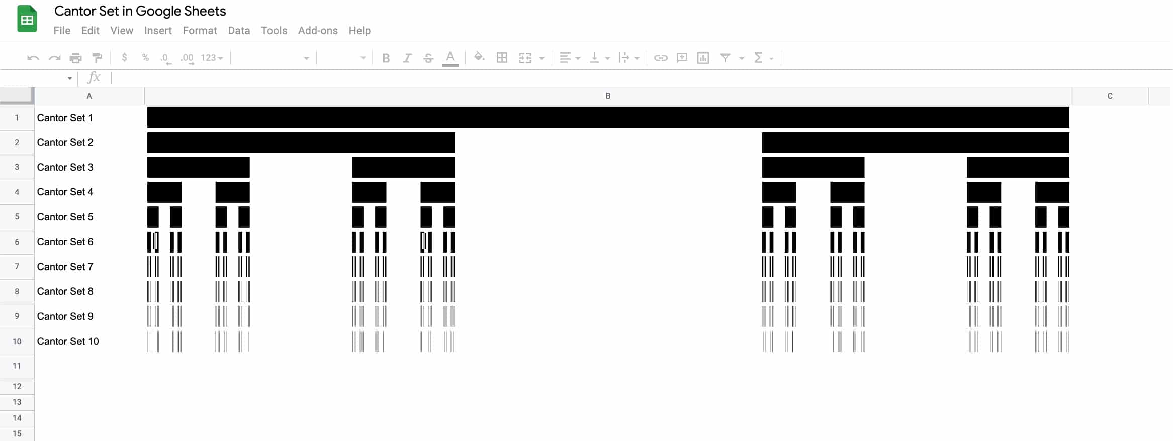
Here are the first 10 iterations of the algorithm to create the Cantor set:
Click to enlarge
Of course, this is a simplified representation of the Cantor set. It’s impossible to create the actual set in a Google Sheet since we can’t perform an infinite number of iterations.


 Strategies to speed up Google Sheets