 💡 Learn more
Learn more about working with Lambda Functions, Named Functions, and X-Functions in the FREE Lambda Functions 10-Day Challenge course
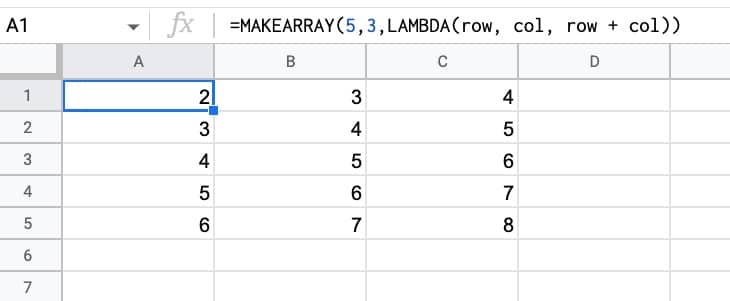
The MAKEARRAY function in Google Sheets generates an array of a specified size, with each value calculated by a custom lambda function.
The Lamba function has access to the row and column indices for each value.
Let’s see a simple example:
=MAKEARRAY(5,3,LAMBDA(row, col, row + col))This generates an array with 5 rows and 3 columns.
The value of each element in the row is the sum of the row position and the column position, within the array.
So the first value is 2 (row 1 + column 1) and the final value is 8 (row 5 + column 3). The indices are in relation to the position within the array, not the position within the Google Sheet.
🔗 Get this example and others in the template at the bottom of this article.
Continue reading MAKEARRAY Function in Google Sheets – LAMBDA Helper Function