Freezing rows and/or columns is a useful and simple technique to lock rows (or columns) of your spreadsheet so that they remain in view even as you scroll down your datasets. You’re anchoring them in place.
How To Freeze A Row In Google Sheets
Menu Method
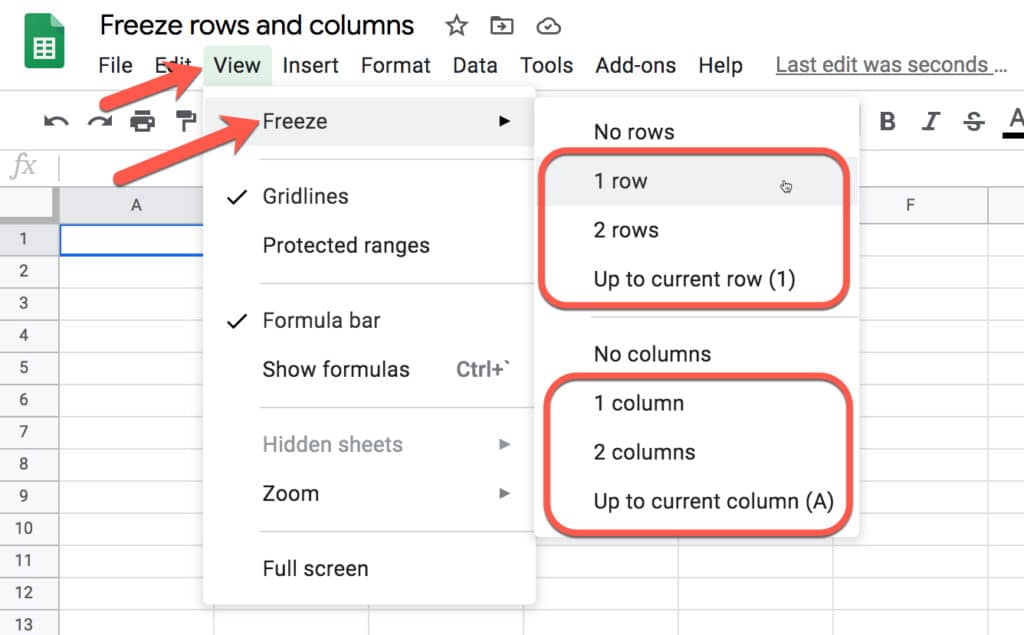
Go to the menu: View > Freeze
Choose how many rows or columns you want to freeze:
Sadly, the Alexa service, on which this post is based, has been discontinued, so the techniques shown below no longer work. However, the Apps Script to save the data on a daily basis is still a valid technique, and so I leave this post up for that reason.
Original Post:
This tutorial will show you how to create an Alexa Rank tracker in Google Sheets, using a couple of formulas and a few lines of code.
Alexa Rank is a third-party tool that measures how popular a website is. The lower your ranking, the higher your site traffic is.
For example, Google is ranked #1 and Facebook and Wikipedia also have very low rankings (and giant traffic). The full tool has a host of useful features, but I’ll show you how you can get a website’s Alexa Rank number and build an archive in your Google Sheet.
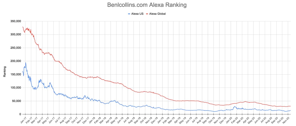
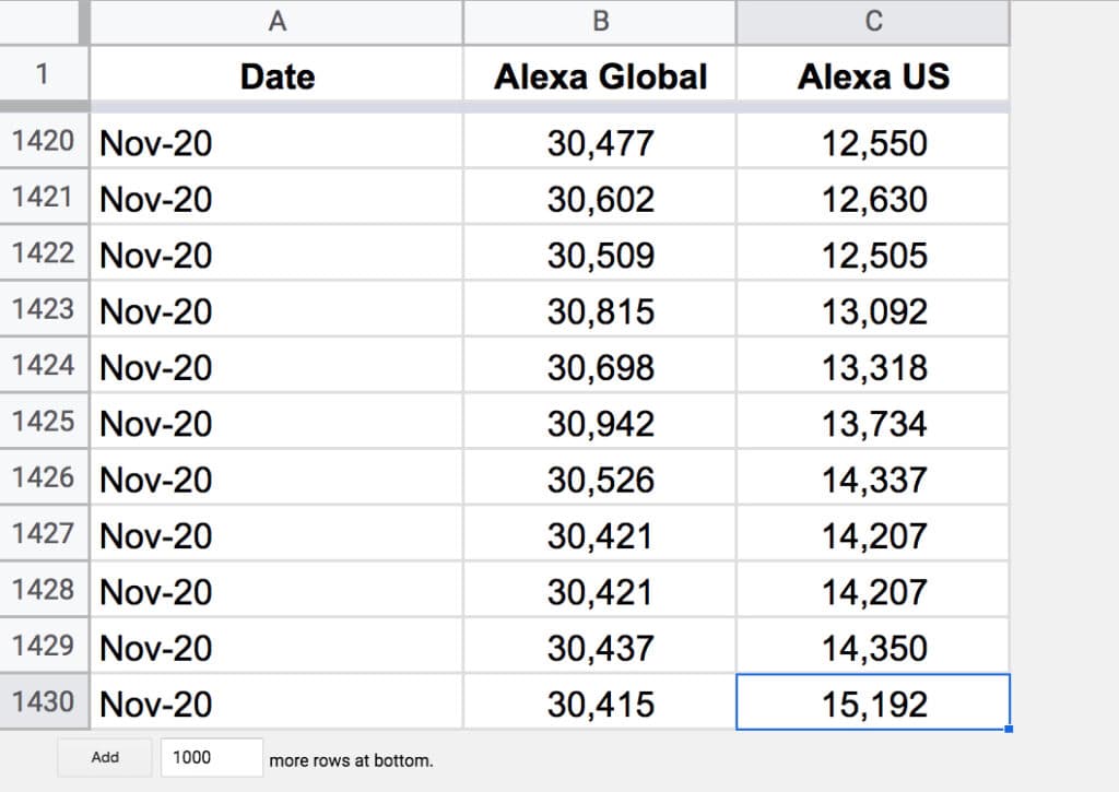
Here’s my website Alexa Rank over time:
(Click to enlarge)
I’ve been running this Sheet since December 2016, about 1 year after my website was created. In that period, my Alexa global ranking has dropped from 320,000 to 30,000, and my Alexa US ranking has dropped from 160,000 to 15,000.
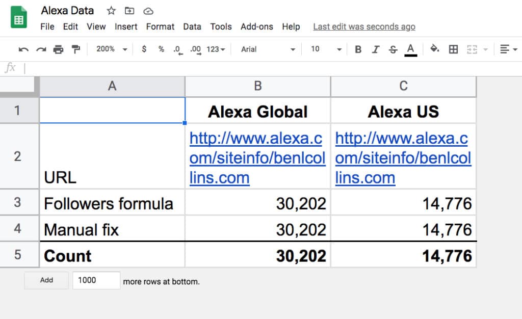
Alexa Rank Tracker Import Formulas
The first step is to setup a small settings Sheet with the formulas to import the Alexa Rank tracking data.
There are two columns: one for the global ranking figure and one for the US ranking figure.
These formulas work by importing the content of the Alexa site info for the given website, and them parsing it with a Google Sheets REGEX formula to extract the relevant numbers.
On row 4, in cells B4 and C4 are two manually typed values for the ranking, which are just used as backup values in case the import formula fails (which has happened only a handful of times in the past few years).
Periodically, I’ll paste in the latest formula values as text on row 4, to keep the backup as current as possible.
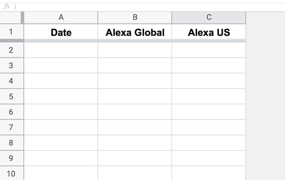
Add another blank Sheet to your Alexa Rank tracker Sheet, with 3 columns: date, global rank and US rank.
Call it alexa_rank.
Apps Script Code To Save Alexa Rank Data
Open your script editor: Tools > Script editor
And add the following code:
function saveAlexaData() {
  const ss = SpreadsheetApp.getActiveSpreadsheet();
  const dataSheet = ss.getSheetByName('alexa_rank');
  const settingsSheet = ss.getSheetByName('settings');

  // get the url, follower count and date from the first three cells
  const d = new Date();
  const global_count = settingsSheet.getRange(5,2).getValue();
  const us_count = settingsSheet.getRange(5,3).getValue();

  // append new ranking data to Sheet
  dataSheet.appendRow([d,global_count,us_count]);

  // format date string cell
  dataSheet.getRange(dataSheet.getLastRow(),1).setNumberFormat('MMM-YY');
}
Save and Run this script.
(You’ll be prompted to grant the script permission to access your Sheet files the first time you run it.)
It adds a row of data with the date and ranking data to your Sheet.
Run again if you want to see it add new data (but you’ll want to delete this row to avoid duplication).
Trigger To Run Code Automatically
Now let’s set it up to run on a daily basis.
Under the Triggers option in the left hand sidebar menu, create a new trigger.
Set it to time-driven and run it once a day.
The formulas reflect the value of the Alexa Rank at the current time. The script saves a copy of those ranking values at that point in time. Once the script has been running for a while, you’ll have an archive of historic data.
Chart To Display Ranking Trend
The final step is to highlight your table of ranking data and Insert > Chart
This outputs a 10 by 10 grid of ascending numbers from 1 to 100.
3. Next, adjust the column widths (and row heights) so that the cells are square.
4. Wrap the sequence function with an IF statement and ArrayFormula to check whether the value in a given cell is greater than the threshold percentage:
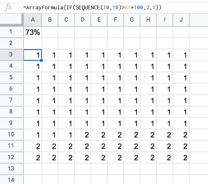
=ArrayFormula(IF(SEQUENCE(10,10)>A1*100,2,1))
Your output now will look like this:
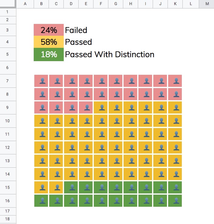
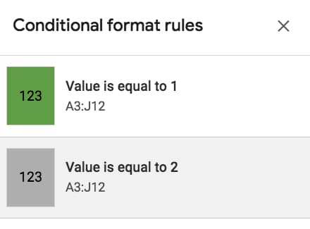
5. Highlight the 10 by 10 grid and add two conditional formatting rules:
Green cell background if the value “Is equal to 1”
Grey cell background if the value “Is equal to 2”
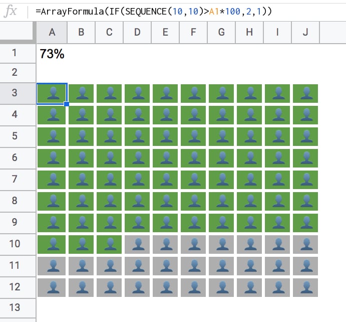
6. With the 10 by 10 grid highlighted, add thick white borders to separate the grids. Turn off the gridlines for the Sheet too, for an even cleaner look.
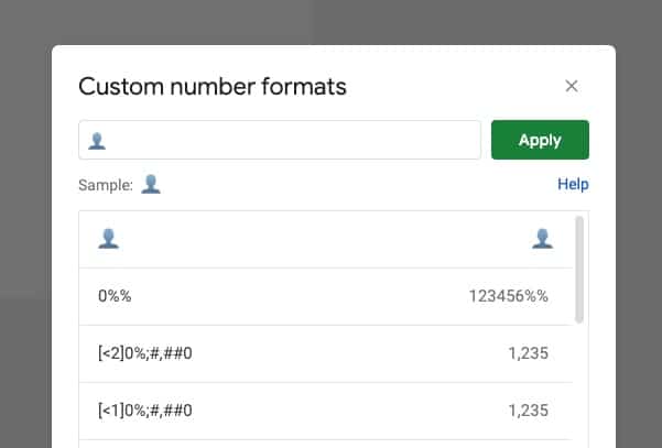
Format > Number > More formats > Custom number format, then paste in the emmoji: 👤
This changes all the values to 👤, regardless of whether it’s a 1 or a 2.
8. Finally, center-align the values horizontally and vertically:
Nice!
When you change the % value, the chart will adjust automatically for you.
3-Color Grid Chart
To create the 3-color chart shown above, add an additional percentage value and modify the formula to compare against both percentage figures using two IF statements, e.g.:
This will open a view-only version of the template. Feel free to make your own copy: File > Make a copy
(If you’re unable to open this file it may be because it’s from an outside organization, and my G Suite domain is not whitelisted at your organization. You may be able to ask your G Suite administrator about this.
In the meantime, feel free to open in an incognito window to view it.)