In this post, you’ll learn how to set default values for cells in Google Sheets, without using Google Apps Script code.
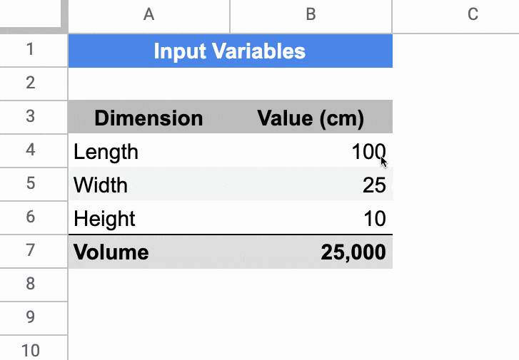
In the Sheet below, the cells in column B have default values of 100, 25, and 10 respectively. If a user types in a value (e.g. 200) it overwrites the default value. If a user deletes whatever value is in the cell already, then the default value of 100 is displayed again.
Setting Default Values For Cells In Google Sheets
The key to make this technique work is to use Array Literals to create a formula which spills into the adjacent cell. This is a rather abstract concept, so let’s run through an example.
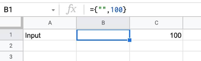
In a blank Sheet, write the value “Input” in cell A1. In cell B1, type this formula:
={"",100}
Your Sheet will look like this:
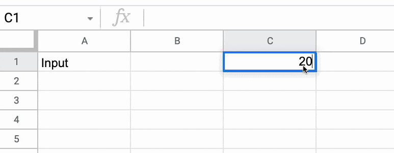
Try typing 200 in cell C1, over the top of the 100.
Cell C1 will show the 200, but cell B1 now displays a #REF! error.
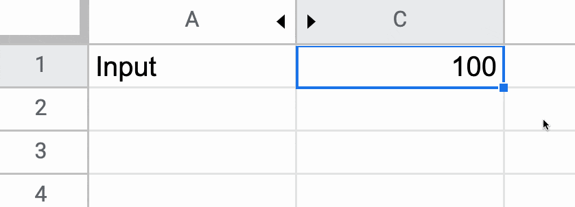
Now, delete the value you just typed in cell C1. The error message disappears and the default value of 100 is displayed again.
Finally, hide column B so that the #REF! error is never seen, and you have a default value of 100 set for cell C1.
🎩 Hat tip to my friend Scott Ribble for showing me this ingenious solution.
Advanced Default Values Without Hidden Column
The method above suffers from one drawback though: it necessitates a hidden column.
However, we can use a clever circular formula to address this.
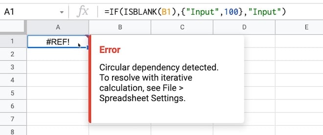
In a new blank Sheet, add this formula in cell A1:
=IF(ISBLANK(B1),{"Input",100},"Input")
Initially, you may see this error message about a circular error (i.e. a formula that references itself):
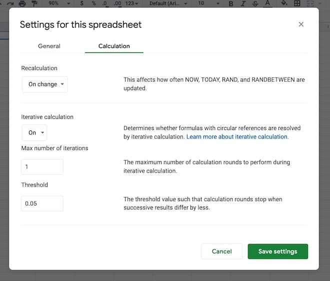
That is a problem, but we fix it by switching on iterative calculations and restricting them to a single iteration from the menu:
File > Settings
Go to “Calculation”.
Set “Iterative calculation” to “On” and the “Max number of iterations” to 1.
(The threshold can be left at 0.05 because it doesn’t apply in this case.)
Now, you can enter any value you want in cell B1 and if you delete it, the default value of 100 will be shown.
If it is blank, then it outputs the array literal:
{"Input",100}
which displays “Input” in cell A1 and the value 100 in cell B1.
However, if cell B1 already has a value then the IF function output is just the string “Input” in cell A1.
Note: default values are not limited to numbers. It could be text, an image, or even another formula.
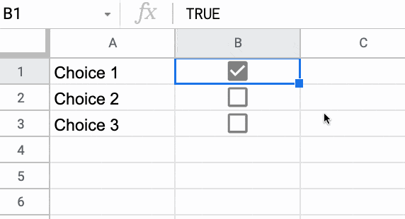
Default Values Checkbox Example
You can use default values to check or uncheck checkboxes. Here’s a cool illustration of how to create a select all checkbox in Google Sheets, using deafult values.
I wrote the first annual review in the year my eldest son was born. He’ll be 7 this year. How time flies!
As always, I’m super grateful that I get to write this because it means I’m still working for myself and building this business for another year.
Let’s begin with a review of 2021:
Did I Meet My 2021 Goals?
2021 was of course the second year of the pandemic, so once again, work hours were more limited than normal, and there was an undercurrent of stress throughout the year.
Overall though, from a work perspective, 2021 was a great year.
I had my best year of revenue to date, of which 95% came from course sales. I launched and ran two amazing cohorts of my live Pro Sheets course, created one new online course, and finished updating my course catalog.
Outside of work, I finally saw (most of) my UK family again at the very end of 2021, after over two years of nothing but video calls. These few weeks with my UK family were a highlight of the year.
Aside from that, we had lots of great family adventures locally and I did tons of great hiking in our local mountains.
All in all, 2021 was a good year given the circumstances.
Run 3 cohorts of the new live cohort based course Pro Sheets – Yes, and no. I ran two cohorts!
Run SheetsCon 2021 in March – No, I realized early in 2021, with the pandemic ongoing, that I didn’t have the bandwidth to do this and create the new cohort course, so I paused SheetsCon for 2021.
Improve the SEO and site speed of benlcollins – Yes, and no. I did improve both, but there’s still work to do.
Publish 30 long-form blog posts – Not quite… I published 26 posts.
Publish a comprehensive guide to REGEX in Google Sheets – Yes, here it is.
Hit 60k newsletter subscribers – No, my list growth plateaud in the second half of 2022 and I finished the year around 45k subs.
Send a Google Sheets tip email every week for the next year – Yes, I sent my Google Sheets tips newsletter every Monday 🙂
Create one new on-demand video course – Yes, I created a dedicated REGEX course.
One technical project, related to Sheets/Apps Script/Data in some way. – Yes, I wrote a script to control my home Nest thermostats. I worked on a few other project ideas but didn’t complete them.
Other 2021 Goals
See my UK family! – Yes, finally, after 2+ years 🙂
Have another healthy year – Yes, thankfully
Exercise regularly: 4 hike or bikes each week, 2 yoga/strength – Yes, although I’ve no idea if I reached this cadence and frankly, it doesn’t matter. I felt like a did a solid amount of outdoor exercise. Yoga fell off my radar from Q3 onwards and I didn’t do as much biking as I’d hoped but I did a lot more hiking than I’ve ever done!
Go camping again! I used to do a lot of camping trips but it’s been a few years since I last went 🙁 – Technically, yes, because I managed 1 night, but not as much as I’d hoped, haha! Bring on 2022.
Take my boys out on lots of adventures and camping trips. – Yes, plenty of adventures, but only one camping trip
Read 30 books (same target as 2020) – No, and I need to lower my expectations 😉 I read 18 books in 2021
2021 Highlights
Let’s look at the highlights from 2021:
1) Pro Sheets
My biggest work goal for the year was to launch a live cohort training course, called Pro Sheets. I ran two cohorts in 2021, in April/May and November/December, and it was a hugely rewarding and enjoyable experience.
Pro Sheets is a 5-week long, live, online training course where we meet 3 times a week for instruction around data analysis and automation with Google Sheets and Apps Script.
I had 37 students in the first cohort and 42 students in the second cohort, which was a huge success.
Running a cohort course is an enormous amount of work so I want to say thanks to a number of folks who helped me along the way:
Jenny Sauer-Klein’s Scaling Intimacy training in February, which was really helpful for me in figuring out how to run successful and immersive online experiences
Katey, my wonderful teaching assistant for both cohorts
Jo, my amazing assistant behind the scenes who helps run my business
For a sense of what Pro Sheets is all about, have a listen to what the students from the first cohort had to say:
In 2022, I plan to run at least one more cohort of Pro Sheets — cohort 3 — and implement a number of improvements. Looking forward to this!
Lots of non-work highlights this year, mostly on our local trails.
Undoubtedly THE highlight of the year was seeing my UK family again. From the surprise visit of my brother from Australia to the epic hikes we did together (3 peaks, Raven Rocks), and the joy of Christmas with grandparents reunited with grandkids, it was a wonderful three weeks!
Another highlight of the year was the summer road trip that Lexi, me, and the boys took around our home state of West Virginia. We did a big clockwise loop around the State, taking in the mountains, the new National Park, cute towns, cabins in the woods, and lots of history. It was a memorable way to spend 3 weeks this summer when most other options were still off the table because of the pandemic.
Other specific highlights that stand out from the year are all local adventures:
My brother Pete and me on the Appalachian TrailLexi and me at White Rock overlook on the Appalachian Trail
Challenges In 2021
It goes without saying that the ongoing coronavirus pandemic continued to be the major challenge of the year. Staying safe and sane, whilst growing the business and running a household, was one long risk-assessment-and-schedule-juggling-nightmare. But we got through it, and somehow came out the other side fitter, healthier, and in a better place than we were at the beginning of 2021.
I’m relieved to not have a “health” subheading under the challenges of 2021. Let’s see if I can keep it that way in 2022.
Of course, most of the challenges of 2021 were related to navigating covid, but there were a couple of big work challenges too:
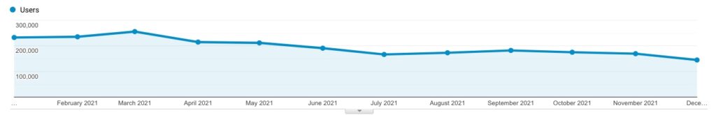
Website Traffic Decline
This year, I’ve decided to list my website under “Challenges” as well as “Highlights”.
Yes, I did publish 26 posts in 2021 and my overall traffic figures were similar to 2020 (over 2 million unique visitors to this site and nearly 4 million page views!).
But… since the summer, when the traffic peaked at over 400k pageviews and 255k users a month, it has steadily declined back to around 200k pageviews/month. I believe this is partly because the frequency of my posts decreased, some of my popular posts are getting old (and thus losing ranking spots), and there’s much more competition in the Google Sheets space now than there ever has been.
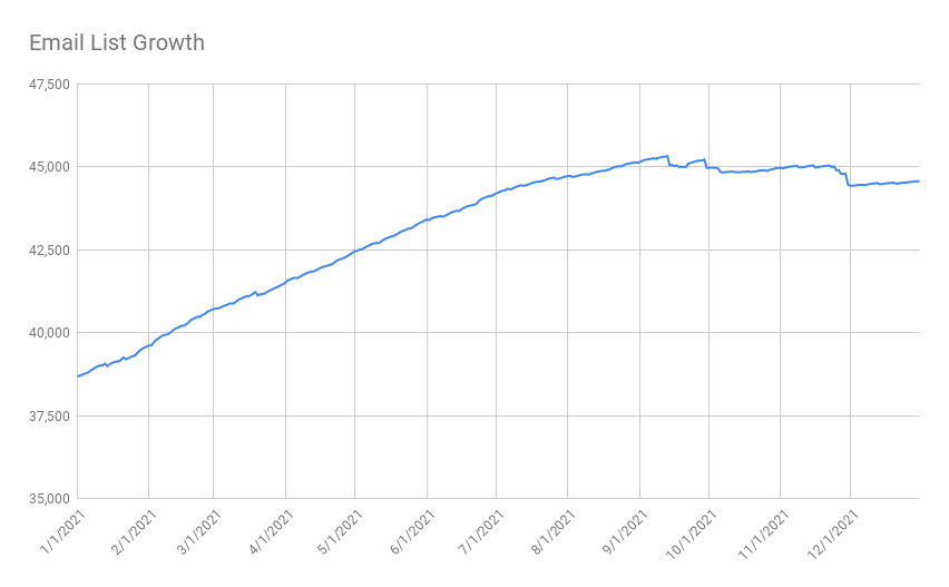
Email List Growth Plateau
My goal at the beginning of 2021 was to hit 60k newsletter subscribers. A lofty goal to be sure, but not impossible.
I missed it and ended the year on around 45k subscribers.
So I’m keeping this same 60k goal for 2022 and dedicating more time to email list growth this year.
My email list grew at a steady clip for the first nine months of the year but plateaued for the last three months. I believe this is due to a combination of decreasing web traffic (see above) and higher unsubscribes during a couple of months where I did a lot of course launches (the additional sales emails result in higher unsubscribe rates for a short period).
One of my big challenges for 2022 is to figure out how to grow my audience (see more below).
Other Challenges
Well, not really a challenge as such, but I really missed not attending any in-person conferences this year. The Google Next conference online is not a patch on the in-person event. I thoroughly enjoyed my trips to San Francisco in 2018 and 2019 and felt inspired for months afterward. Fingers crossed Next can happen in-person again this year!
Looking Forward To 2022
I’m excited and hopeful for 2022.
I’m hopeful that we’ll see an end to this wretched pandemic, although I thought this last year and look where we are (record cases! Thanks, Omicron! 😡)
With each passing year, I gain a better understanding of my business. What works and what doesn’t. Which levers make a difference and which ones don’t.
I’ve realized that growing my business boils down to two main levers: i) growing my email list, and ii) creating more courses.
With that in mind, my goals in 2022 are directly in line with increasing one or both of these levers. If I run a marketing campaign that results in hundreds or thousands of new subs, then that will correlate with increased revenues down the line. Similarly, if I can create great new courses for my existing audiences then I can increase my revenue.
2022 Work Goals
In no particular order:
Create 3 new video courses (the first of which will be a dedicated QUERY function course 🤩)
Send my Google Sheets Tips newsletter every Monday
Hit 60k newsletter subscribers
That’s it.
You’ll notice that I’m not setting a goal for posts published this year or other technical projects etc. I’m sticking to fewer, bigger goals. Goals that fall into my two buckets of i) list growth, and/or ii) new courses.
Other 2022 Goals
Complete a century bike ride (100 miles). It’s been a few years since my last century rides and I miss those long days out on the bike.
Twelve challenge walks (walks that start and/or finish at home and are a challenge by virtue of their length or difficulty)
Family trip to the UK this summer
Have another healthy year
10 nights camping this year (at the very least, I want to beat the low target of 1 from last year!)
Read 20 books
Weekly brainstorming hike with my wife
2022 Plan
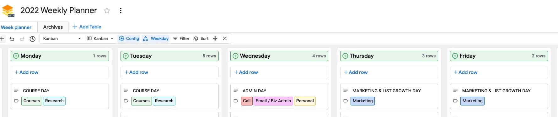
My plan this year is to be super-efficient with my time and ruthless with what projects I pursue.
My approach is to block my time by day. Previously, I’ve blocked my time into hour blocks, but eventually, the whole system breaks down and merges into one soup of activities with a large amount of associated context switching costs. This year, I want to stick to this weekly schedule as closely as possible and for as long as possible (provided it works!).
I’m sure it will help me get more done in the same or less amount of time.
So, Monday and Tuesday will be reserved for work on new courses.
Wednesday will be my admin and miscellaneous day, where I get stuff done.
And Thursday and Friday will be dedicated to marketing and list growth.
The simplicity of this approach is deeply appealing to me too.
Thank You
If you’ve read this far, thank you!
Thank you for being a supporter of my work. Thank you for being part of this weird little corner of the internet where I continue my mission to create the world’s best resources for learning Google Sheets and data analysis.
Best wishes to all of you for 2022!
Finally, a huge thank you to my wife, Alexis Grant, who has been my biggest supporter from day 1. I couldn’t do this without you!
The world of online education is very different today than it was 10 years ago.
We now live in an age of information abundance, with all of human knowledge only a click away.
And that means we can shift the focus of online courses from information-heavy lectures to a community-driven learning environment with interactive sessions, collaboration, and shared knowledge.
And right now, accelerated by the pandemic, community-driven online courses are having their moment in the sun.
Online creators are seeing incredible demand for their live courses. Top-tier VC firms are investing in companies that facilitate these live, cohort-based courses.
Here are three reasons why these cohort-based courses are the best way to learn:
1. Cohort-Based Courses Hold You Accountable
Hands up if you’ve bought an online course with good intentions, but then never got past the introduction video?
Yup! Guilty as charged…
I kid myself that I’ll get around to it one day, but, like all of us, life is busy.
What is there was a different way?
There is!
Join a cohort-based course — like Pro Sheets — and you learn with other people, at scheduled times, with defined and manageable goals.
Turns out that we’re not very good at making and, crucially, keeping promises we make with ourselves. Even if we start a venture with huge enthusiasm, it’s hard to sustain, especially when the journey gets hard or we hit the inevitable hurdles.
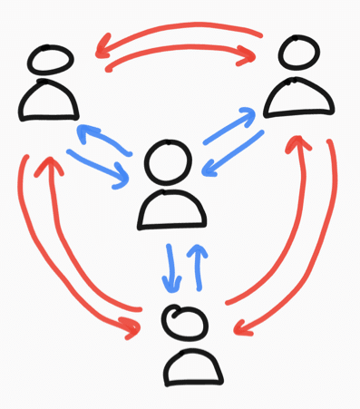
Being part of a group offloads some of this willpower burden. Once you become part of something greater than yourself, you don’t want to let the group down by not bringing your best self to the table.
We as humans care deeply about what our fellow humans think of us, even when we’re told not to, or even though we know other people are too busy with their own realities to care much about ours. And yet, this external influence remains very strong.
In other words, when you join a live, group course, you’re giving yourself much better odds at actually sticking through the course and completing it, reaching your goal, and reaping the benefits.
With dedicated time slots and friendly faces waiting to greet you, you’ll feel inspired to attend as many live sessions as possible.
And by simply turning up, again and again, you’ll see the results you’re after.
I was a student in a cohort-based course earlier this year, and I was pumped every time a live class rolled around. I couldn’t wait to join and catch up with everyone. There’s no way I would have stuck with a video-only version of this course on my own.
2. Learning Together Is Faster
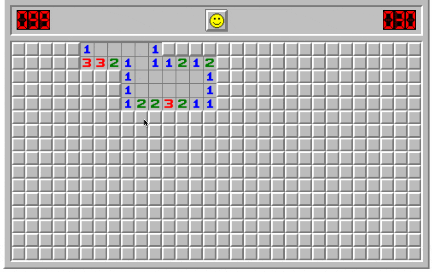
Remember the game minesweeper?
It was a classic strategy game, with a very strong 90s PC desktop vibe, requiring players to make calculated decisions and educated guesses on where the mines lay on the board.
Minesweeper makes for a nice analogy with learning a new skill or deepening an existing skill.
You have your existing knowledge, represented in Minesweeper by the portion of the board that is uncovered.
Now, suppose you’ve reached an impasse with your learning. You don’t know how to proceed.
This is like one of those vexing 2-3-3-4-1 combinations on the Minesweeper board that eventually require an educated guess.
Continuing alone is possible, but it will be slow going and frustrating, and you will make mistakes — step on mines — along the way.
If you learn with others though, whether they’re experts or just slightly ahead of you on their journey, they can show you the next move.
They can unlock the board for you, so whole new regions of knowledge open up in front of you.
Your journey will be dramatically quicker with a guide, simply because you make fewer mistakes and better decisions.
3. It’s More Fun
Look at all these beautiful smiles in the final live session of Pro Sheets Accelerator earlier this year:
When I launched Pro Sheets Accelerator, I expected students to say their favorite part was learning new formulas, scripts, or frameworks.
But by the end of the course, it wasn’t the formulas or scripts that students most appreciated, it was the community.
They loved learning with other spreadsheet enthusiasts!
One of the students, Jen, an educator from Massachusetts, summed it up well:
“It was really just nice to have other nerdy people to talk to and to share stories and ask questions to, who just really cared about talking through it in a high-quality conversation.”
And I was chatting recently with another student, Jim, a financial advisor from California, who said:
“Getting together with like-minded people who were really passionate about spreadsheets was just magic.”
By learning in a group, you meet like-minded people to share the highs and lows of the journey. You’ll laugh and have fun along the way, and your best learning happens when you’re happy and having fun.
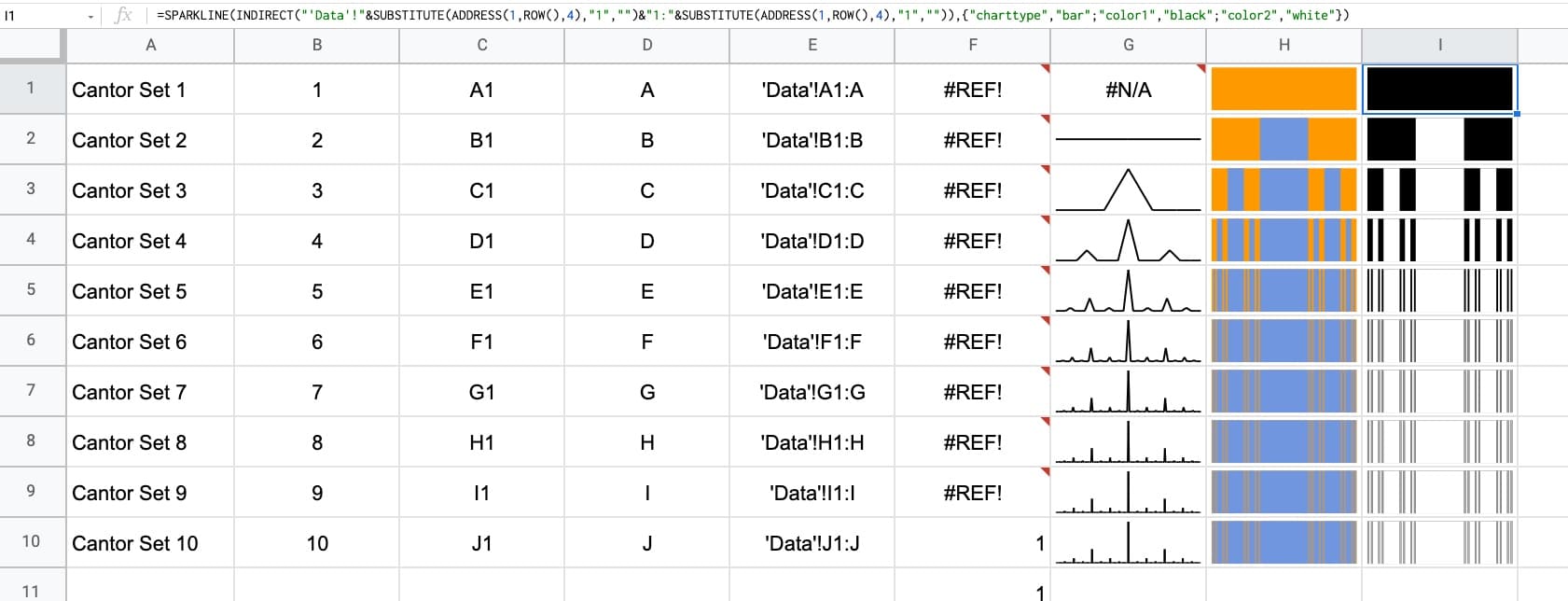
The Cantor set is a special set of numbers lying between 0 and 1, with some fascinating properties.
It’s created by removing the middle third of a line segment and repeating ad infinitum with the remaining segments, as shown in this gif of the first 7 iterations:
The formulas used to create the data for the Cantor set in Google Sheets are interesting, so it’s worth exploring for that reason alone, even if you’re not interested in the underlying mathematical concepts.
But let’s begin by understanding the set in more detail…
What Is The Cantor Set?
The Cantor set was discovered in 1874 by Henry John Stephen Smith and subsequently named after German mathematician Georg Cantor.
The construction shown in this post is called the Cantor ternary set, built by removing the middle third of a line segment and repeating ad infinitum with the remaining segments.
It is sometimes known as Cantor dust on account of the dust of points that remain after repeatedly removing the middle thirds. (Cantor dust also refers to the multi-dimensional version of the Cantor set.)
The set has some fascinating, counter-intuitive properties:
It is uncountable. That is, there are as many points left behind as there were to begin with.
It’s self-similar, meaning each subset looks like the whole set.
It’s fractal with a dimension that is not an integer.
It has an infinite number of points but a total length of 0.
Wow!
How To Draw The Cantor Set In Google Sheets
To be clear, the Cantor set is the set of numbers that remain after removing the middle third an infinite number of times. That’s hard to comprehend, let alone do in a Google Sheet 😉
But we can create a picture representation of the Cantor set by repeating the algorithm ten times, as shown in this tutorial:
Create The Data
Step 1:
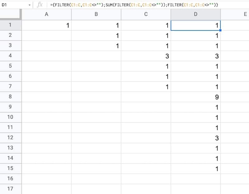
In a blank sheet called “Data”, type the number “1” into cell A1.
As we drag this formula to adjacent columns, the relative column references will change so that it always references the preceding column.
In column B, the output is:
1,1,1
Then in column C, we get:
1,1,1,3,1,1,1
And in column D:
1,1,1,3,1,1,1,9,1,1,1,3,1,1,1
etc.
This data is used to generate the correct gaps for the Cantor set.
Draw The Cantor Set
We’ll use sparklines to draw the Cantor set in Google Sheets.
Click to enlarge
Step 4:
Create a new blank sheet and call it “Cantor Set”.
Step 5:
Next, create a label in column A to show what iteration we’re on.
Put this formula in cell A1 and copy down the column to row 10:
="Cantor Set "&ROW()
This creates a string, e.g. “Cantor Set 1”, where the number is equal to the row number we’re on.
Step 6:
The next step is to dynamically generate the range reference. As we drag our formula down column B, we want this formula to travel across the row in the “Data” tab to get the correct data for this iteration of the Cantor set.
Start by generating the row number for each row with this formula in cell B1 and copy down the column:
=ROW()
(I set up my sheet with the data in columns because it’s easier to create and read that way. But then I want the Cantor set in a column too, hence why I need to do this step.)
Step 7:
Use the row number to generate the corresponding column letter with this formula in cell C1 and copy down the column:
=ADDRESS(1,ROW(),4)
This uses the ADDRESS function to return the cell reference as a string.
Step 8:
Remove the row number with this formula in cell D1 and copy down the column:
=SUBSTITUTE(ADDRESS(1,ROW(),4),"1","")
Step 9:
Combine these two references to create an open-ended range reference for the correct column of data in the “Data” sheet.
Put this formula in cell E1 and copy down the column:
Feel free to delete any working columns once you have finished the formula showing the Cantor set.
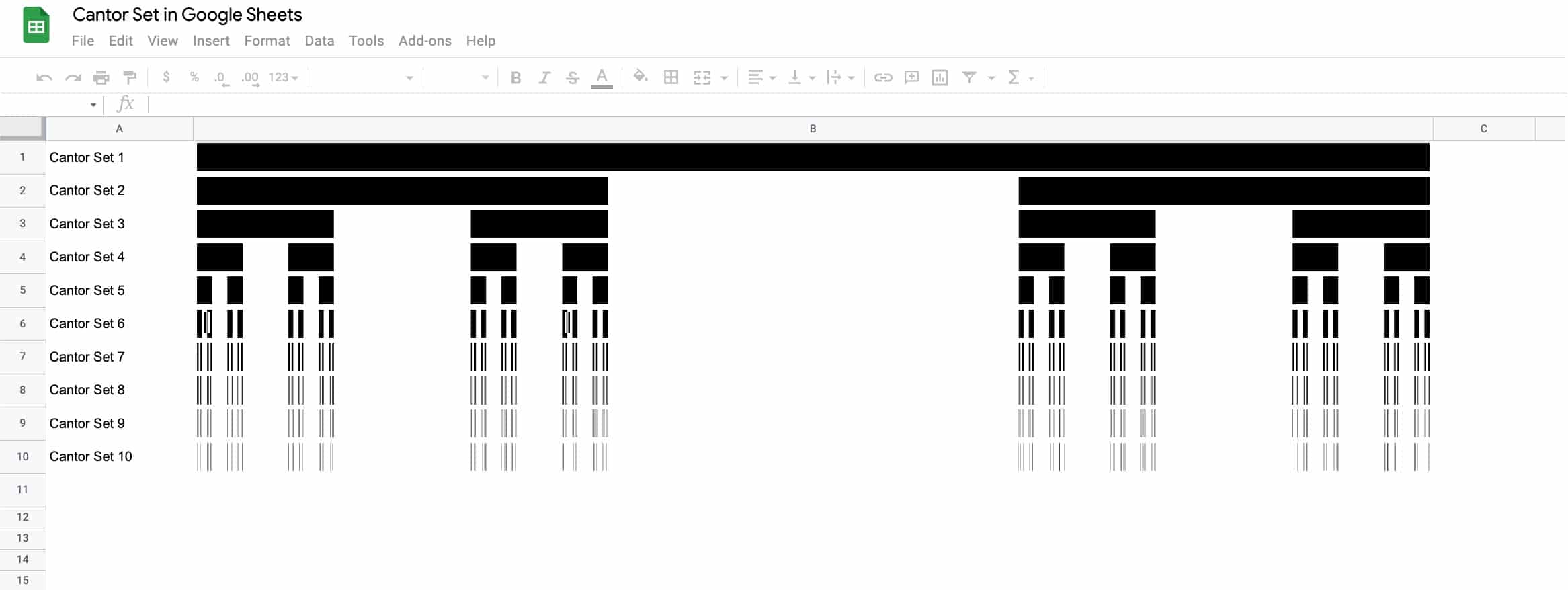
Finished Cantor Set In Google Sheets
Here are the first 10 iterations of the algorithm to create the Cantor set:
Click to enlarge
Of course, this is a simplified representation of the Cantor set. It’s impossible to create the actual set in a Google Sheet since we can’t perform an infinite number of iterations.
 Strategies to speed up Google Sheets