The SWITCH function is a useful tool for categorizing data. In the right circumstances, it can save you from messy, nested IF functions.
The SWITCH function is used to test an expression against a list of cases. It returns a value when the expression is equal to one of the cases.
It has some similarities to the IFS function but differs because SWITCH tests for exact matching rather than whether a condition is true (e.g. X > Y). SWITCH also has a default option to return a value if no match is found.
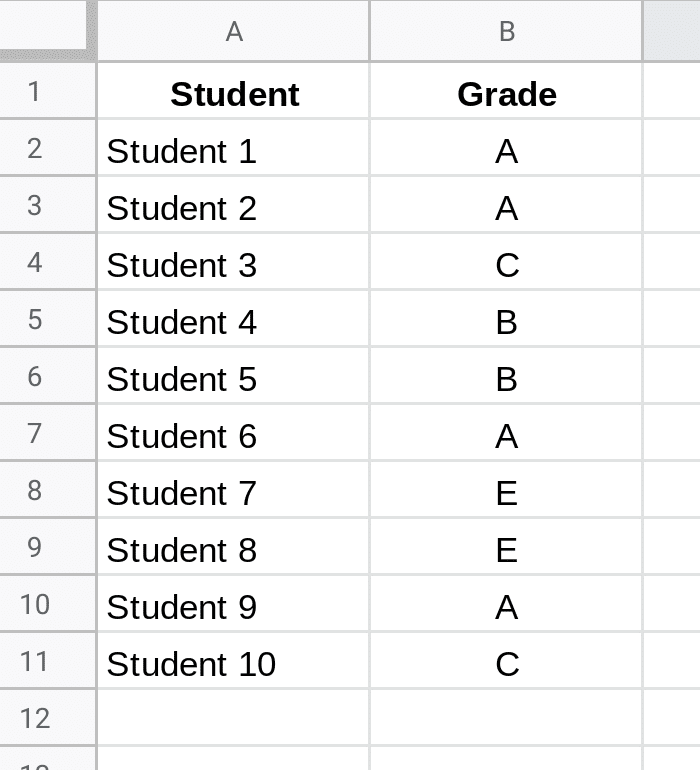
Let’s see an example. Suppose we have this data set of student grades and we want to add context to each grade level.
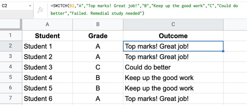
Use this SWITCH function to categorize these grades:
=SWITCH(B2,

"A","Top marks! Great job!",

"B","Keep up the good work",

"C","Could do better",

"Failed. Remedial study needed")
Let’s break it down:
B2 is the condition we’re going to test. It’s the grade letter from column B and it’s the input to our SWITCH function.
We check the value of B2 against the first case “A”. If they match (i.e. the grade in B2 was also “A”) then SWITCH returns the string “Top marks! Great job!”.
If the value from B2 doesn’t match “A”, we move on and test it against “B” and if that fails, test against “C”.
If the condition doesn’t match any of the cases, the last string is returned: “Failed. Remedial study needed”. It’s our catch-all solution. Anything that’s not “A”, “B” and “C” will return this answer.
Let’s start with a mind-blowing fact, and then use the FACT function in Google Sheets to explain it.
Pick up a standard 52 card deck and give it a good shuffle.
The order of cards in a shuffled deck will be unique.
One that has likely never been seen before in the history of the universe and will likely never be seen again.
I’ll let that sink in.
Isn’t that mind-blowing?
Especially when you picture all the crazy casinos in Las Vegas.
Let’s understand why, and in the process learn about the FACT function and basic combinatorics (the study of counting in mathematics).
Four Card Deck
To keep things simple, suppose you only have 4 cards in your deck, the four aces.
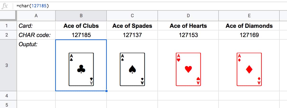
You can create this deck in Google Sheets with the CHAR function:
The formulas to create these four cards are:
Ace of Clubs:
=CHAR(127185)
Ace of Spades:
=CHAR(127137)
Ace of Hearts:
=CHAR(127153)
Ace of Diamonds:
=CHAR(127169)
Let’s see how many different combinations exist with just these four cards.
Pick one of them to start. You have a choice of four cards at this stage.
Once you’ve chosen the first one, you have three cards left, so there are 3 possible options for the second card choice.
When you’ve picked that second card, you have two cards left. So you have a choice of two for the third card.
The final card is the last remaining one.
So you have 4 choices * 3 choices * 2 choices * 1 choice = 4 * 3 * 2 * 1 = 24
There are 24 permutations (variations) with just 4 cards!
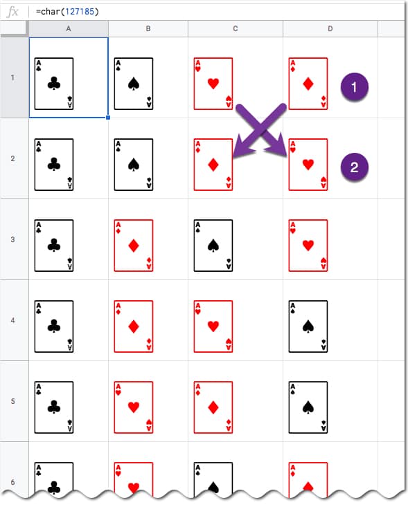
Visually, we can show this in our Google Sheet by displaying all the different combinations with the card images from above:
(I’ve just shown the first 6 rows for brevity.)
You can see for example, when moving from row 1 to row 2, we swapped the position of the two red suits: the Ace of Hearts and the Ace of Diamonds.
Five Card Deck
This time there are 5 choices for the first card, then 4, then 3, then 2, and finally 1.
So the number of permutations is 5 * 4 * 3 * 2 * 1 = 120
Already a lot more! I have not drawn this out in a Google Sheet and leave that as an optional exercise for you if you wish.
The FACT function
The FACT function in Google Sheets (see documentation) is a math function that returns the factorial of a given number. The factorial is the product of that number with all the numbers lower than it down to 1.
In other words, exactly what we’ve done above in the above calculations.
Four:
The 4 card deck formula is:
=FACT(4)
which gives an answer of 24 permutations.
Five:
The 5 card deck formula is:
=FACT(5)
which gives an answer of 120 permutations.
Six:
A 6 card deck is:
=FACT(6)
which gives an answer of 720 permutations.
Twelve:
A 12 card deck has 479,001,600 different ways of being shuffled:
=FACT(12)
(You’re more likely to win the Powerball lottery at 1 in 292 million odds than to get two matching shuffled decks of cards, even with just 12 cards!)
Fifty Two:
Keep going up to a full deck of 52 cards with the formula and it’s a staggeringly large number.
=FACT(52)
Type it into Google Sheets and you’ll see an answer of 8.07E+67, which is 8 followed by 67 zeros!
(This number notation is called scientific notation, where huge numbers are rounded to the first few digits multiplied by a 10 to the power of some number, 67 in this case.)
This answer is more than the number of stars in the universe (about 10 followed by 21 zeros).
Put another way if all 6 billion humans on earth began shuffling cards at 1 deck per minute every day of the year for millions of years, we still wouldn’t even be close to finding all possible combinations.
In this article, we’ll see how to make checkboxes in Google Sheets behave like radio buttons. In other words, we’ll ensure that only one can be checked at a time.
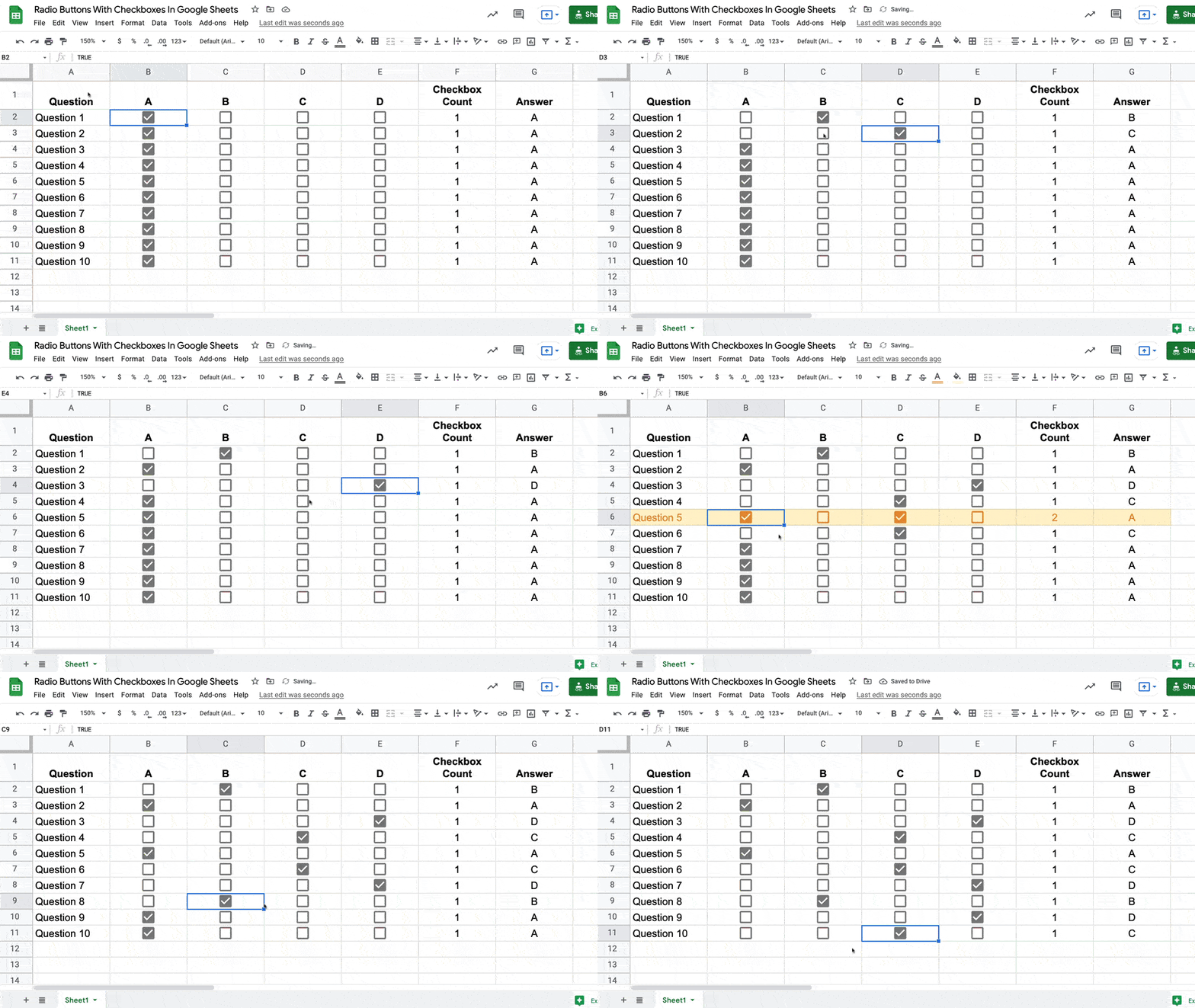
Here are the radio buttons in Google Sheets in action:
You can see that when I check a new checkbox, any other checkboxes on that row are unchecked.
It takes a split second: you can see the row turns orange when the checked checkbox count is briefly 2, but this is simply the script working in the background.
Unpivot in Google Sheets is a method to turn “wide” tables into “tall” tables, which are more convenient for analysis.
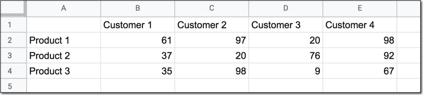
Suppose we have a wide table like this:
Wide data like this is good for the Google Sheets chart tool but it’s not ideal for creating pivot tables or doing analysis. The main reason is that data is captured in the column headings, which prevents you using it in pivot tables for analyis.
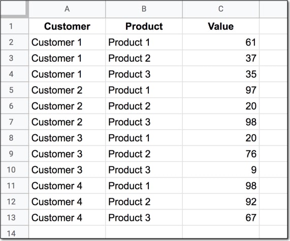
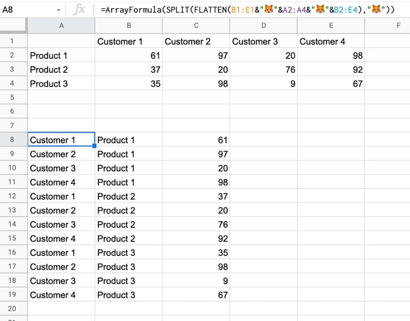
So we want to transform this data — unpivot it — into the tall format that is the way databases store data:
But how do we unpivot our data like that?
It turns out it’s quite hard.
It’s harder than going the other direction, turning tall data into wide data tables, which we can do with a pivot table.
This article looks at how to do it using formulas so if you’re ready for some complex formulas, let’s dive in…
Unpivot in Google Sheets
We’ll use the wide dataset shown in the first image at the top of this post.
The output of our formulas should look like the second image in this post.
In other words, we need to create 16 rows to account for the different pairings of Customer and Product, e.g. Customer 1 + Product 1, Customer 1 + Product 2, etc. all the way up to Customer 4 + Product 4.
Of course, we’ll employ the Onion Method to understand these formulas.
Feel free to make your own copy (File > Make a copy…).
(If you can’t open the file, it’s likely because your G Suite account prohibits opening files from external sources. Talk to your G Suite administrator or try opening the file in an incognito browser.)
Step 1: Combine The Data
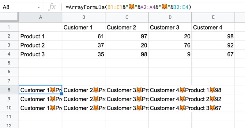
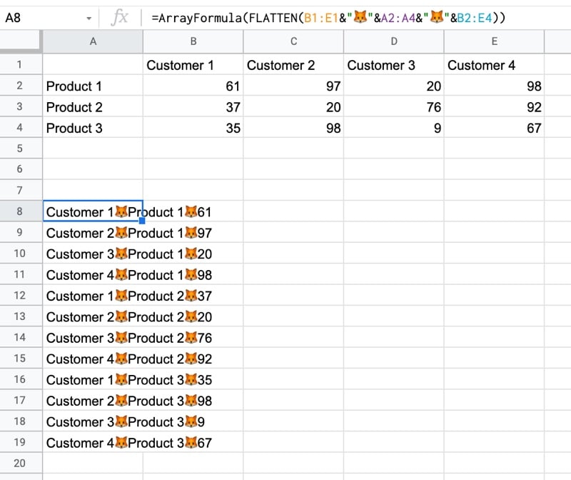
Use an array formula like this to combine the column headings (Customer 1, Customer 2, etc.) with the row headings (Product 1, Product 2, Product 3, etc.) and the data.
It’s crucial to add a special character between these sections of the dataset though, so we can split them up later on. I’ve used the fox emoji (because, why not?) but you can use whatever you like, provided it’s unique and doesn’t occur anywhere in the dataset.
=ArrayFormula(B1:E1&"🦊"&A2:A4&"🦊"&B2:E4)
The output of this formula is:
Step 2: Flatten The Data
Before the introduction of the FLATTEN function, this step was much, much harder, involving lots of weird formulas.
Thankfully the FLATTEN function does away with all of that and simply stacks all of the columns in the range on top of each other. So in this example, our combined data turns into a single column.
=ArrayFormula(FLATTEN(B1:E1&"🦊"&A2:A4&"🦊"&B2:E4))
The result is:
Step 3: Split The Data Into Columns
The final step is to split this new tall column into separate columns for each data type. You can see now why we needed to include the fox emoji so that we have a unique character to split the data on.
Wrap the formula from step 2 with the SPLIT function and set the delimiter to “🦊”:
Pro Sheets Accelerator was a live cohort-based course, where students went through the experience together over the course of 5 weeks. We had 37 students in the first cohort.
Rather than watching pre-recorded course videos alone, students met multiple times a week to learn together in a live setting on Google Meet. In addition, we had office hours, guest sessions, a community platform for Q&A, weekly recaps, templates, and replays of the live sessions online.
If video courses are all about the content and information, then cohort-based courses are all about community, accountability, and transformation.
The Cohort-Based Course Student Learning Loop
Cohort-Based Course Student Learning Loop
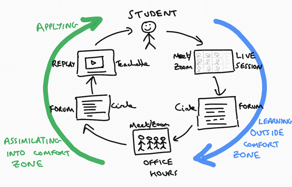
The Student Learning Loop is a mechanism in your course to facilitate student transformations.
Cohort students pay a premium so they expect a premium outcome. They want to be transformed by the experience.
As the teacher/facilitator you have to create the mechanisms that enable students to have these transformative experiences.
There are countless videos on YouTube teaching your topic, so instead, you have to create an environment where students can undergo a transformation. Watching a YouTube video shows you a new technique. Attending a live session and participating gets you implementing a new technique. For many folks, this makes a big difference.
Let’s walk through the full cohort-based course Student Learning Loop, using specific examples from my Pro Sheets Accelerator course.
Student Learning Loop Phase 1: Learning
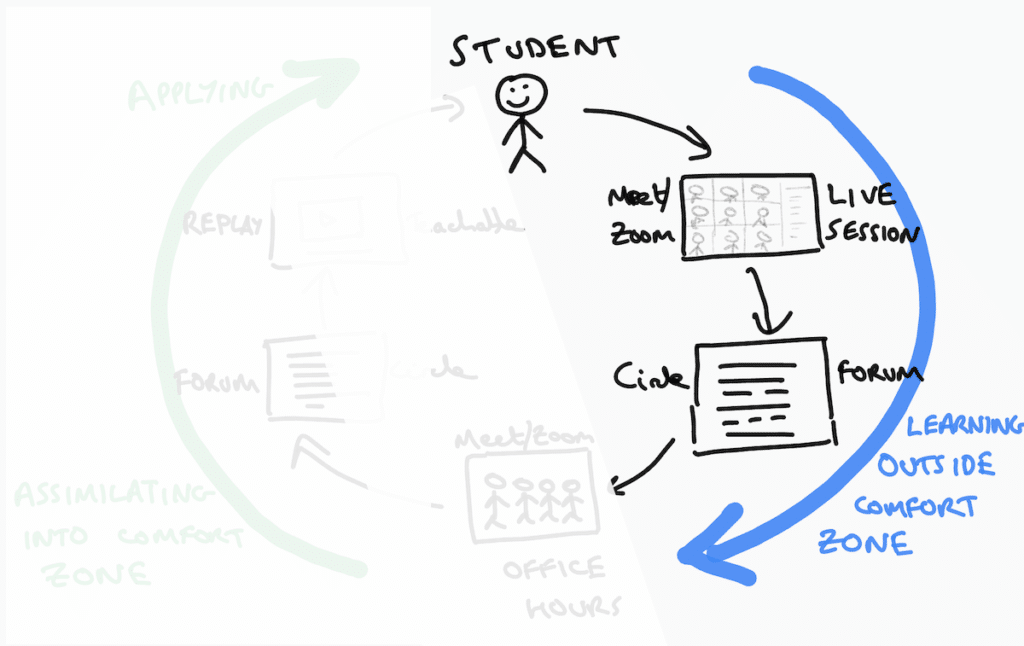
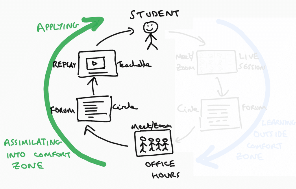
Learning happens in the first half of the Student Learning Loop, represented by the blue arc in this diagram:
Student Learning Loop Phase 1
The goal here is to get students into the zone of proximal development. To take them outside their comfort zones and stretch their abilities, but not so far that you lose them.
There’s a sweet spot where the majority of your students will be fully absorbed and learning.
There are two components in this phase:
live sessions
community forum for Q&A
Live Sessions
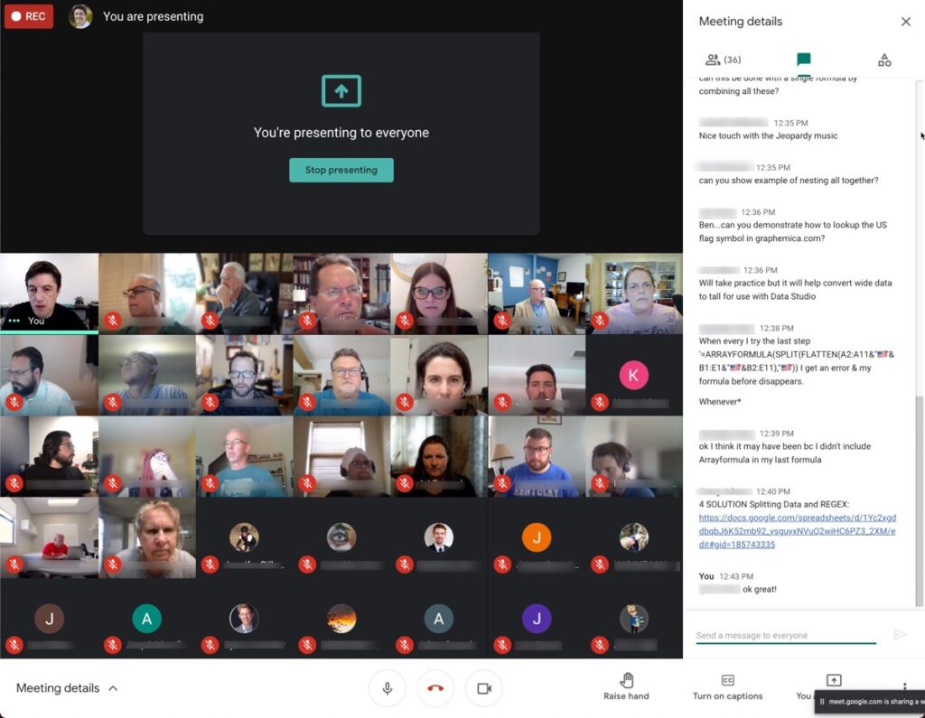
Pro Sheets Live Session 2
How do you conduct an engaging live session teaching technical topics via Google Meet or Zoom?
The key is to make it active with frequent state changes.
You can break up long slide monologues with demos, exercises, and breakout rooms.
Ben introduction to reinforce the journey and introduce the first new topic (10 minutes)
Ben live demo in a Google Sheet or Apps Script (10 minutes)
Student exercise (or breakout room) to practice themselves (20 minutes)
Topic consolidation and Q&A as a whole group (10 minutes)
Ben slides to introduce the second new topic (5 minutes)
Ben live demo of second new topic (10 minutes)
Second student exercise or breakout room (15 minutes)
Topic consolidation and Q&A as a whole group (5 minutes)
Closing discussion: recap what we learned today (5 minutes)
Frequent activities keep the students engaged, which makes for an effective learning environment.
Community Forum For Q&A
Hands up if you’ve thought of great questions after a live session?
Of course you have! We’ve all been there.
Not only that but some students aren’t comfortable asking questions in front of a group. And sometimes students miss a live session but still want to ask questions.
So it’s critical to have a place for students to ask questions about the materials asynchronously, outside the live sessions.
I use the community platform Circle to host the Pro Sheets Accelerator community. It’s an amazing tool that let me create a welcoming space for students to ask their questions.
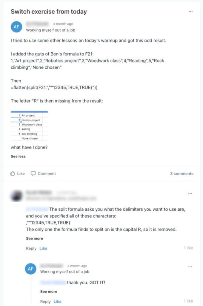
Here’s an example of the asynchronous learning process from Pro Sheets Accelerator:
IFS, SWITCH, and CHOOSE Functions Example
We covered the IFS function, SWITCH function, and CHOOSE function as part of session 4, in week 2. For many students, these were new functions so they were definitely outside their comfort zones during the live session demo and exercises.
After class, students practiced using these functions in their own work and could ask questions in our Circle forum:
Pro Sheets Circle Forum SWITCH function answer
In this particular example, a fellow student helped answer the question.
This peer coaching is another example of the value of cohort-based courses. Everyone is both a student and a teacher, bringing their own unique skills and experiences to the table.
Student Learning Loop Phase 2: Assimilation and Application
The second half of the Student Learning Loop happens when students incorporate information from the live sessions into their own workflows.
Both the office hours and the community forum help students do this effectively.
This is the second half of the Student Learning Loop, shown in green:
Student Learning Loop Phase 2
Student learning doesn’t stop once the lesson ends.
In fact, it’s really just the beginning.
True learning happens when students apply knowledge from the lessons to their own specific situations. Students benefit enormously from rapid feedback, so they don’t get stuck for long and learn quickly from their mistakes.
There are three components in this phase:
live office hours
more questions in the community forum
replays of live sessions
Live Office Hours
In Pro Sheets, we had live weekly office hours. These were 90-minute, drop-in, unstructured sessions where students could ask whatever questions they wanted.
They were a place for students to ask specific questions from their own domains.
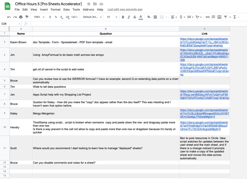
We used a Google Sheet to collect questions, which then served as a repository of that knowledge for future reference.
Pro Sheets Office Hours Question Sheet
More Questions in the Community Forum
Throughout phase 2, students have lots of questions so the community plays an integral part in the assimilation and application of knowledge.
Students deepen their knowledge by asking and answering each other’s questions in the community forum.
Students also share their work wins with the community to get the validation they’re on track, which builds their confidence and reinforces the learning experience.
QUERY Function Example
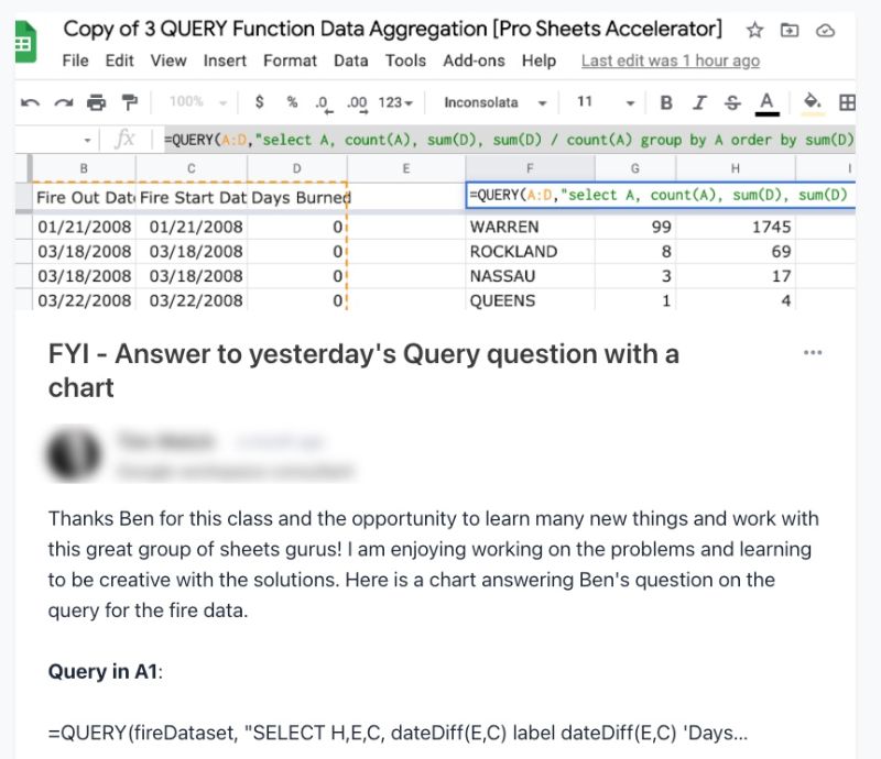
For example, in week 2, I covered how to use the QUERY function to solve a challenging data analysis problem. The students were given a dataset of fires in New York State and asked to answer the question:
What is the average fire length in days, by county?
It was a challenging question because it required a query on top of another query (akin to a sub-query in SQL).
And here’s one student sharing their answer with the community:
Pro Sheets Circle Forum QUERY function answer
Replays and Templates
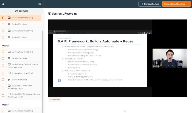
I use Teachable to host my on-demand video courses so it was a natural place to also host the video replays of the live session recordings for the Pro Sheets Accelerator course.
Teachable allows me to present the video recordings in a syllabus, with links to all of the template files.
Students have lifetime access to these video recordings and templates, so they can watch the live session replays and review topics as many times as they want.
This repetition helps cement the understanding.
Pro Sheets Session 1 replay on Teachable
Completing the Loop
Some students will progress through the loop multiple times a week, on the back of every live session. Others might progress at a slower pace and go through the loop once a week, whilst for others, it might happen a couple of times throughout the whole course.
Students undergo a transformation when they go through the learning loop. They return to work with new abilities and newfound confidence.
And that is the north star outcome we’re aiming for as course creators.
Evidence of A Transformation
“If you can’t measure it, you can’t improve it.” – Peter Drucker
Virtual high-fives during the final live session
I used Google Forms to conduct pre-course and post-course surveys, so I could measure and understand the transformation occurring at different stages of the Student Learning Loop framework.
In the post-course feedback form, I asked lots of questions, including what was the most valuable thing about the course, what they liked about the Circle community, the project, and the office hours. Here are some of the answers for Pro Sheets:
“It was great to work on a project during the week knowing that if I got stuck I could ask for help on Friday [office hours].”
“I’m really enjoying the course. I find myself thinking about the subject matter at odd hours, so it’s really taking root in my head.”
“Everyone in Circle was SO HELPFUL! And I loved seeing other peoples’ projects and questions. I got so many new ideas and perspectives. I also loved that in Circle we could build off of each others’ ideas. Like, the “Adding Notes” topic – you started with the basic idea but then so many people chimed in to make improvements. I have that script in at least 3 of my sheets now!”
“The workflow and BAR models are very useful concepts that I knew in a practical sense but needed to see more concretely. I feel like I moved forward on Array formulas, queries, custom functions, and Index-Match-Match.”