
In this tutorial, you’ll learn how to merge cells in Google Sheets, when to use merged cells in Google Sheets, the pros and cons of using merged cells, and finally, how to identify them with Apps Script.
Continue reading How To Merge Cells In Google Sheets And When To Be Careful
Blog
Checklist Template In Google Sheets
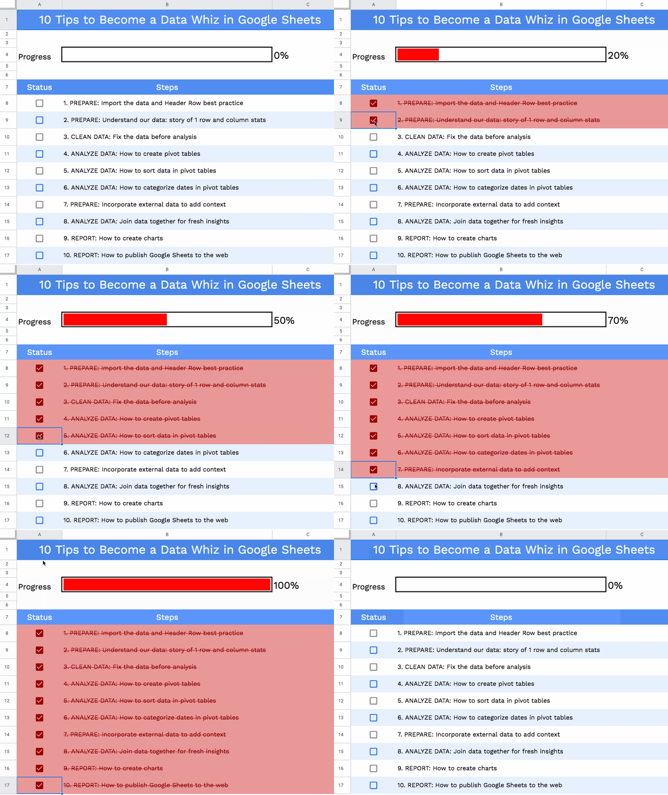
In this tutorial, we’ll create a checklist template in Google Sheets.
We’ll use checkboxes, conditional formatting and a sparkline to build a checklist template like this:
Alexa Rank Tracker in Google Sheets
Update May 2022:
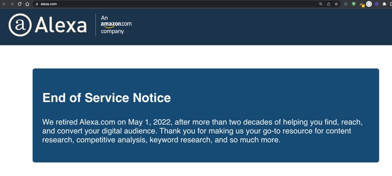
Sadly, the Alexa service, on which this post is based, has been discontinued, so the techniques shown below no longer work. However, the Apps Script to save the data on a daily basis is still a valid technique, and so I leave this post up for that reason.
Original Post:
This tutorial will show you how to create an Alexa Rank tracker in Google Sheets, using a couple of formulas and a few lines of code.
Alexa Rank is a third-party tool that measures how popular a website is. The lower your ranking, the higher your site traffic is.
For example, Google is ranked #1 and Facebook and Wikipedia also have very low rankings (and giant traffic). The full tool has a host of useful features, but I’ll show you how you can get a website’s Alexa Rank number and build an archive in your Google Sheet.
Here’s my website Alexa Rank over time:
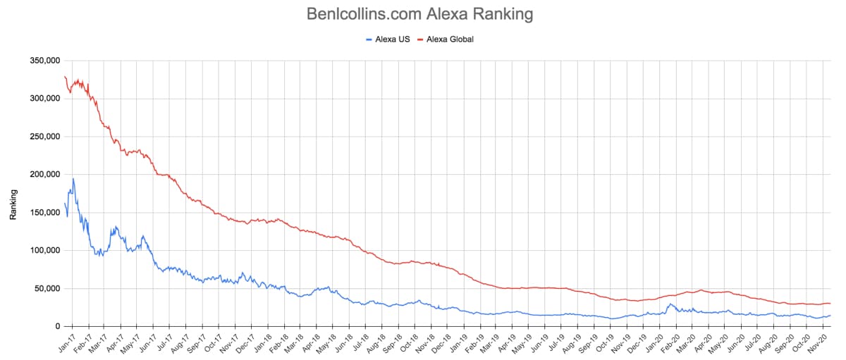
I’ve been running this Sheet since December 2016, about 1 year after my website was created. In that period, my Alexa global ranking has dropped from 320,000 to 30,000, and my Alexa US ranking has dropped from 160,000 to 15,000.
Alexa Rank Tracker Import Formulas
The first step is to setup a small settings Sheet with the formulas to import the Alexa Rank tracking data.
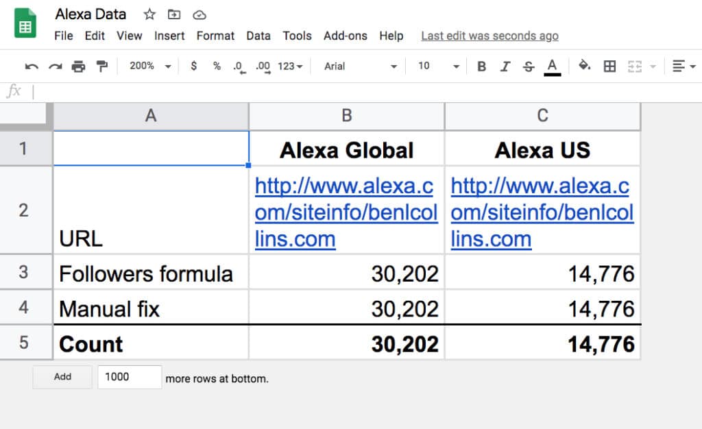
There are two columns: one for the global ranking figure and one for the US ranking figure.
Cells B2 and C2 are the same, containing the URL of the website in the Alexa Rank tracker: https://www.alexa.com/siteinfo/benlcollins.com
Import Formulas
In cell B3, enter this formula to import the global rank:
=VALUE(REGEXEXTRACT(JOIN("|",ARRAY_CONSTRAIN(IMPORTDATA(B2),30,1)),"global.(.+)\|us"))In cell C3, enter this formula to import the US rank:
=VALUE(REGEXEXTRACT(JOIN("|",ARRAY_CONSTRAIN(IMPORTDATA(C2),30,1)),"us:.(.+)\|\}\|rating"))These formulas work by importing the content of the Alexa site info for the given website, and them parsing it with a Google Sheets REGEX formula to extract the relevant numbers.
For more information on these formulas, and an alternative Alexa formula, have a look at this post: How to import social media statistics into Google Sheets: The Import Cookbook
Error Handling
On row 4, in cells B4 and C4 are two manually typed values for the ranking, which are just used as backup values in case the import formula fails (which has happened only a handful of times in the past few years).
Periodically, I’ll paste in the latest formula values as text on row 4, to keep the backup as current as possible.
On row 5, use the IFERROR function in Google Sheets to catch errors and use the backup values instead:
=IFERROR(B3,B4)and
=IFERROR(C3,C4)That’s it for the settings Sheet.
Archive Sheet
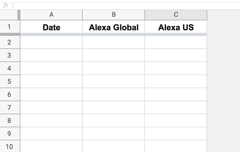
Add another blank Sheet to your Alexa Rank tracker Sheet, with 3 columns: date, global rank and US rank.
Call it alexa_rank.
Apps Script Code To Save Alexa Rank Data
Open your script editor: Tools > Script editor
And add the following code:
function saveAlexaData() {
  const ss = SpreadsheetApp.getActiveSpreadsheet();
  const dataSheet = ss.getSheetByName('alexa_rank');
  const settingsSheet = ss.getSheetByName('settings');

  // get the url, follower count and date from the first three cells
  const d = new Date();
  const global_count = settingsSheet.getRange(5,2).getValue();
  const us_count = settingsSheet.getRange(5,3).getValue();

  // append new ranking data to Sheet
  dataSheet.appendRow([d,global_count,us_count]);

  // format date string cell
  dataSheet.getRange(dataSheet.getLastRow(),1).setNumberFormat('MMM-YY');
}
Save and Run this script.
(You’ll be prompted to grant the script permission to access your Sheet files the first time you run it.)
It adds a row of data with the date and ranking data to your Sheet.
Run again if you want to see it add new data (but you’ll want to delete this row to avoid duplication).
Trigger To Run Code Automatically
Now let’s set it up to run on a daily basis.
Under the Triggers option in the left hand sidebar menu, create a new trigger.
Set it to time-driven and run it once a day.
The formulas reflect the value of the Alexa Rank at the current time. The script saves a copy of those ranking values at that point in time. Once the script has been running for a while, you’ll have an archive of historic data.
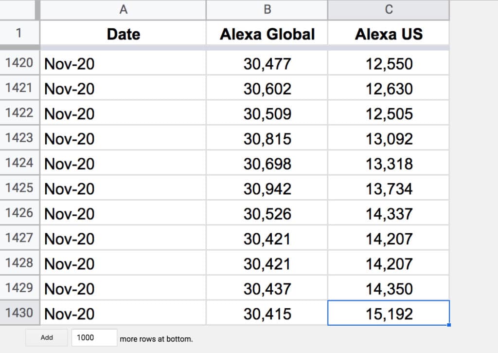
Chart To Display Ranking Trend
The final step is to highlight your table of ranking data and Insert > Chart
Format it as you wish.
Voilà! You can now see your Alexa Rank over time.
Further Reading
Using Google Sheets as a basic web scraper
How to import social media statistics into Google Sheets: The Import Cookbook
How To Create A Grid Chart In Google Sheets
Earlier this year, The Washington Post told a story about the effects of Coronavirus on the US workforce, and illustrated the story with grid charts.
Grid charts can show you the breakdown of the whole into constituent parts, to allow at-a-glance understanding of the big picture.
In this post, I’ll show you how to create a Grid Chart in Google Sheets.
💡 This was tip #128 of my weekly Google Sheets newsletter. Join over 35k+ others and receive the Google Sheets Tips newsletter for exclusive tips, tricks and Google Sheets news.
Grid Chart
Here’s a fictitious grid chart example in Google Sheets, showing how students fared in an exam:
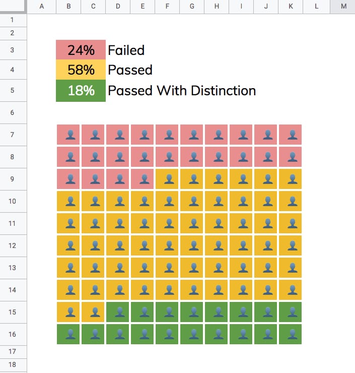
Changing the percentages in the cells above the chart will automatically adjust the chart colors to match.
How to create a grid chart in Google Sheets
1. Enter a % value in cell A1 e.g. 73%
2. Underneath, in cell A3, enter this SEQUENCE formula:
=SEQUENCE(10,10)This outputs a 10 by 10 grid of ascending numbers from 1 to 100.
3. Next, adjust the column widths (and row heights) so that the cells are square.
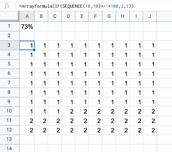
4. Wrap the sequence function with an IF statement and ArrayFormula to check whether the value in a given cell is greater than the threshold percentage:
=ArrayFormula(IF(SEQUENCE(10,10)>A1*100,2,1))Your output now will look like this:
5. Highlight the 10 by 10 grid and add two conditional formatting rules:
- Green cell background if the value “Is equal to 1”
- Grey cell background if the value “Is equal to 2”
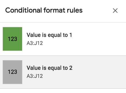
6. With the 10 by 10 grid highlighted, add thick white borders to separate the grids. Turn off the gridlines for the Sheet too, for an even cleaner look.
7. Keeping the grid highlighted, change the number format to a custom number format with the emoji symbol: 👤
Format > Number > More formats > Custom number format, then paste in the emmoji: 👤
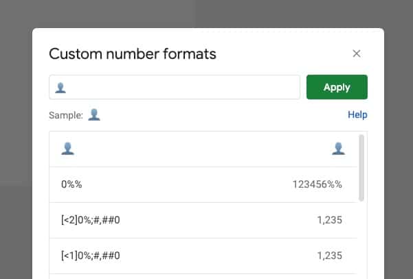
This changes all the values to 👤, regardless of whether it’s a 1 or a 2.
8. Finally, center-align the values horizontally and vertically:
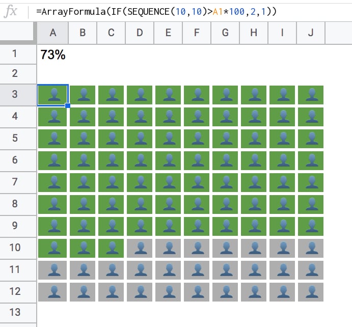
Nice!
When you change the % value, the chart will adjust automatically for you.
3-Color Grid Chart
To create the 3-color chart shown above, add an additional percentage value and modify the formula to compare against both percentage figures using two IF statements, e.g.:
=ArrayFormula(IF(SEQUENCE(10,10)<=A1*100,1,IF(SEQUENCE(10,10)<=((A2+A1)*100),2,3)))In the second conditional test, you’ll notice I need to add percentage 1 and 2 together, to get the cumulative value at that point in time.
You also need to add an extra conditional formatting rule for the cells that have the value 3.
Google Sheets Grid Chart Template
Click here to open the Google Sheets Grid Chart template.
This will open a view-only version of the template. Feel free to make your own copy: File > Make a copy
(If you’re unable to open this file it may be because it’s from an outside organization, and my G Suite domain is not whitelisted at your organization. You may be able to ask your G Suite administrator about this.
In the meantime, feel free to open in an incognito window to view it.)
Sentiment Analysis For Google Tables Using Apps Script
2024 Update: Table’s features and capabilities are now integrated into AppSheet. Read more here.
In this post we’ll use Google Cloud’s Natural Language API to do sentiment analysis on tickets submitted to a Google Tables Support Issue Tracker.
We’ll use Google Tables as the platform for our Support Tracker and Apps Script to connect to the Cloud Natural Language API.
Here’s a GIF showing a portion of the Issue tracker to illustrate what happens when an issue ticket is submitted:
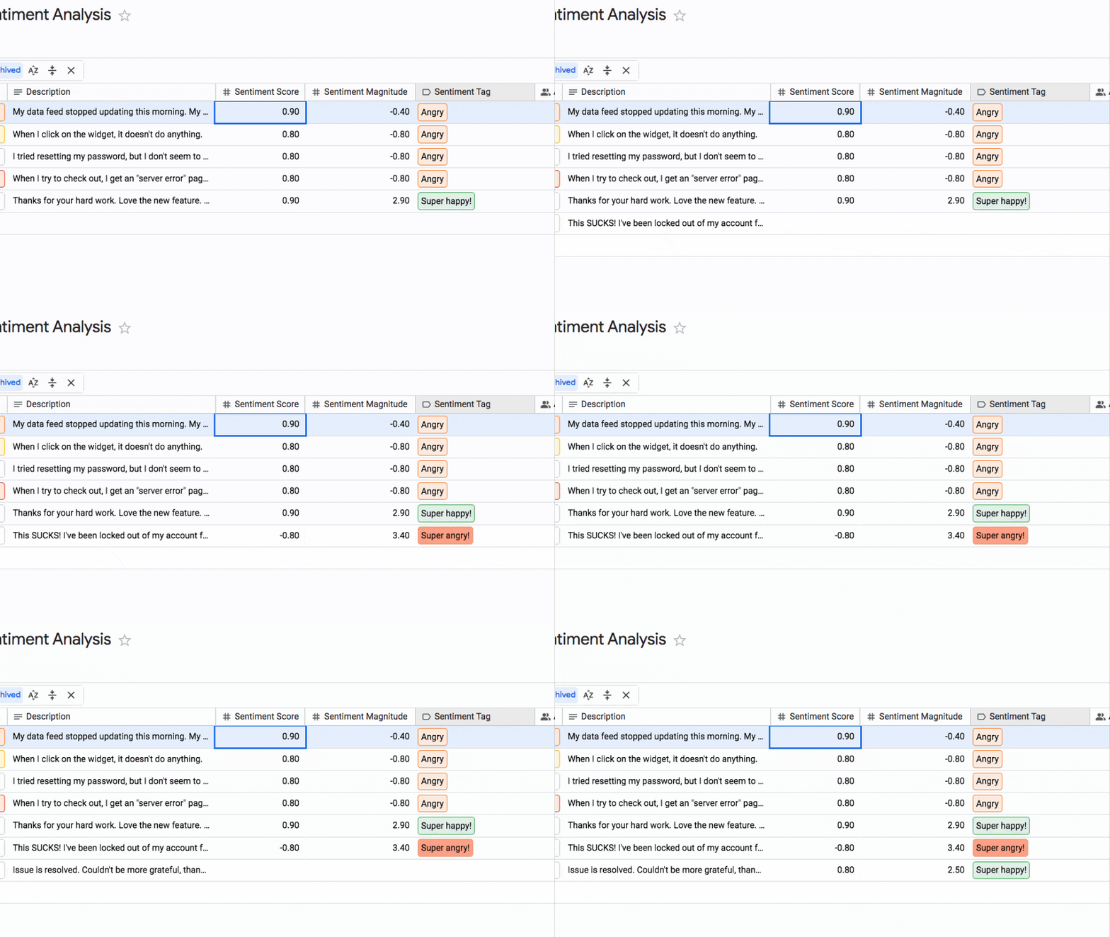
The description (which someone fills out when they submit a support ticket) is sent to the Natural Language API for sentiment analysis, to determine if it’s positive (i.e. good) or negative (i.e. bad) feedback.
This information is returned to our Google Tables table and displayed as a tag alongside each row, so that we can group tickets by sentiment.
For example, we may want to prioritize tickets that are either extremely positive or extremely negative, as these are probably the most important items to double down on or fix!
Sentiment Analysis Google Tables Overview
Here’s the architecture of the system:
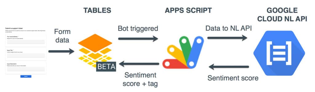
In words:
- User submits support ticket
- New row of data added to our table
- Bot is triggered and sends data to our Apps Script webhook
- The Apps Script receives data and parses it
- Apps Script sends data to Natural Language API
- And receives the sentiment scores back from API
- Apps Script parses score to create sentiment tag
- And updates the original row of data in our table
This all happens in a under a second, so it feels almost simultaneous.
Inspiration for this idea came from the excellent sentiment analysis in Google Sheets post originally published by Alicia Williams.
Note: Since I’ve set this up using a webhook triggered by each new row, the API is called once for every new row. If we were building a high volume ticket system, we’d want to consider a different set up where we send the data through in batches and have the Apps Script running on a timer trigger instead.
Sentiment Analysis Google Tables Set Up
For this example, I’m starting with the default “New ? Support Ticket Queue” template from the Google Tables team.
1. Open Google Tables, login and select Templates > New ? Support Ticket Queue
2. Add three new columns: 1) Sentiment Score (number), 2) Sentiment Magnitude (number) and 3) Sentiment Tag (Tags).
3. Edit the new Sentiment Tag column and add the following tags: Super happy!, Happy, Satisfied, No opinion, Frustrated, Angry, Super angry!
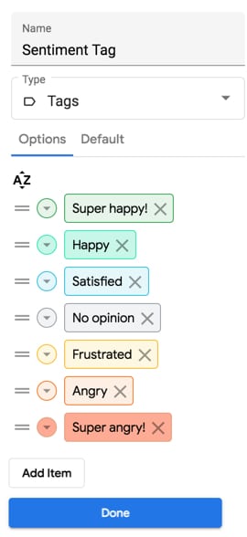
(You can edit these categories to whatever you want, but you’ll need them to match the tags in your Apps Script.)
Sentiment Analysis Apps Script Set Up
4. Create a blank Apps Script file in Drive or through the Apps Script dashboard
5. Clear out the boiler plate code and add the following code to declare the two global variables we need for this project (we’ll fill them in soon):
/**
 * global variables
 */
const API_KEY = ''; // <-- enter google cloud project API key
const TABLE_NAME = ''; // <-- enter google tables table ID
Since we just created our Table, let’s copy in the Table ID.
6. We find our table’s ID, by looking at the URL and copying the string right after /table/.
Table URLs can take the following form:
https://tables.area120.google.com/u/0/workspace/abcdefghijklmnop/table/TABLE_ID
https://tables.area120.google.com/u/0/table/TABLE_ID
https://tables.area120.google.com/u/0/table/TABLE_ID/view/abcedfghijk
Look for the string represented by the TABLE_ID in these fictional examples.
7. Paste this ID string into our Apps Script project, between the quotes in the line where we declare the variable TABLE_NAME:
const TABLE_NAME = ''; // <-- enter google tables table ID
Sentiment Analysis Google Cloud Set Up
This is probably the most difficult part of this whole project! 😉
For this to work, we need a Google Cloud account with billing set up. Don’t worry though, the Natural Language API is free for the first 5k “units” we use (each unit is worth 1000 characters). This is way more than we need to set this project up and test it out.
The full details of how to set up Google Cloud Natural Language API can be found in the documentation.
The steps to take are:
8. If you don’t already have a Cloud account, register for a Google Cloud account and set up billing.
9. Create a project in the Google Cloud account to use for this project.
10. Enable the Cloud Natural Language API, by clicking the link half-way down this page.
11. Create credentials for the Cloud Natural Language API. From the Cloud console choose the project we created in step 5 and navigate to APIs & Services > Credentials
Generate a new API Key through +CREATE CREDENTIALS > API key
12. Restrict the API key we generated to the Cloud Natural Language API
13. Copy the API key and paste it into our Apps Script file, between the quotes in the line where we declare the variable API_KEY (see code above):
const API_KEY = ''; // <-- enter google cloud project API key
Sentiment Analysis Google Tables Code
Staying in the Apps Script file, let’s add the webhook listener and main control function code for our program.
We use a special function called doPost(e) { } so that we can (eventually) publish our script as a web app. The doPost function sits there listening for a ping from our Google Tables bot (which we’ll set up later).
When a new row is added to our Google Table by a Form submission, the bot is triggered and sends the data we need through to our webhook.
This doPost function receives that data, parses it and sends it to the Natural Language API for sentiment analysis.
The returned sentiment data is parsed and sent back to our table to update the new row, using the patch method of the Area120Tables service.
14. Add the following doPost code:
/**
 * doPost webhook to catch data from Google Tables
 */
function doPost(e) {

  if (typeof e !== 'undefined') {

    // parse data
    const data = JSON.parse(e.postData.contents);

    // get the id and description
    const rowId = data.id
    const description = data.description;

    // analyze sentiment
    const sentiment = analyzeFeedback(description); // [nlScore,nlMagnitude,emotion]

    // combine arrays
    const sentimentArray = [rowId,description].concat(sentiment);

    // send score back to Google Tables
    const rowName = 'tables/' + TABLE_NAME + '/rows/' + rowId;
    const sentimentValues = {
      'Sentiment Score': sentiment[0],
      'Sentiment Magnitude': sentiment[1],
      'Sentiment Tag': sentiment[2]
    };
    Area120Tables.Tables.Rows.patch({values: sentimentValues}, rowName);

    return null;
  }
}
In the code above, we call a function called analyzeFeedback, so we had better declare it.
This function handles the logic around the NL scores and how to interpret them as human readable tags. Feel free to play around with the boundaries. The sentiment score is bounded between -1 (max negative) and 1 (max positive), but the magnitude only has a lower bound of 0, so can be any positive number.
For more about the interpretation of the sentiment scoring, have a read of this page in the documentation.
15. Add the following code to our Apps Script file to analyze the sentiment scores:
/**
 * Get each new row of form data and retrieve the sentiment
 * scores from the NL API for text in the feedback column.
 */
function analyzeFeedback(description) {

  if (description !== '') {

      // call the NL API
      const nlData = retrieveSentiment(description);
      nlMagnitude = nlData.documentSentiment.magnitude ? nlData.documentSentiment.magnitude : 0; // set to 0 if nothing returned by api
      nlScore = nlData.documentSentiment.score ? nlData.documentSentiment.score : 0; // set to 0 if nothing returned by api
      //console.log(nlMagnitude);
      //console.log(nlScore);
    }
    else {

      // set to zero if the description is blank
      nlMagnitude = 0;
      nlScore = 0;

    }

    // turn sentiment numbers into tags
    let emotion = '';

    // happy
    if (nlScore > 0.5) {

      if (nlMagnitude > 2) { emotion = 'Super happy!'; } // higher magnitude gets higher emotion tag
      else { emotion = 'Happy'; }

    }

    // satisfied
    else if (nlScore > 0) {  emotion = 'Satisfied'; }

    // frustrated
    else if (nlScore < 0 && nlScore >= -0.5) { emotion = 'Frustrated'; }

    // angry
    else if (nlScore < -0.5) {

      if (nlMagnitude > 2) { emotion = 'Super angry!'; } // higher magnitude gets higher emotion tag
      else { emotion = 'Angry'; }

    }

    // if score is 0
    else { emotion = 'No opinion' }

    return [nlScore,nlMagnitude,emotion];
}
Finally we need to declare the function called retrieveSentiment to actually call the API.
16. Add the code to call the NL API:
/**
 * Calls Google Cloud Natural Language API with string from Tables
 */
function retrieveSentiment(description) {

  //console.log(description);

  const apiEndpoint = 'https://language.googleapis.com/v1/documents:analyzeSentiment?key=' + API_KEY;

  // Create our json request, w/ text, language, type & encoding
  const nlData = {
    document: {
      language: 'en-us',
      type: 'PLAIN_TEXT',
      content: description
    },
    encodingType: 'UTF8'
  };

  //  Package all of the options and the data together for the call
  const nlOptions = {
    method : 'post',
    contentType: 'application/json',
    payload : JSON.stringify(nlData)
  };

  //  Try fetching the natural language api
  try {

    // return the parsed JSON data if successful
    const response = UrlFetchApp.fetch(apiEndpoint, nlOptions);
    return JSON.parse(response);

  } catch(e) {

    // log the error message and return null if not successful
    console.log("Error fetching the Natural Language API: " + e);
    return null;
  }
}
Press save!
The full code is available here on GitHub.
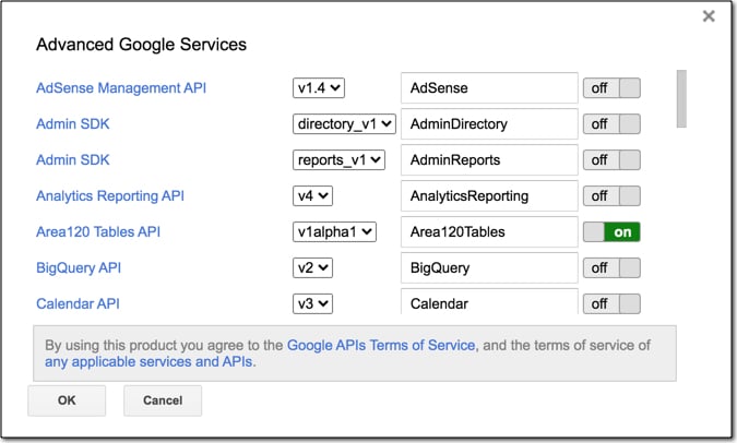
Since we’re using the Area 120 Tables Apps Script service, we need to enable it for this project.
17. Go to Resources > Advanced Google services… and switch on Area120 Tables API:
Publish As Web App
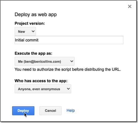
18. Publish this file as a web app via the menu: Publish > Deploy as a web app…
19. Set the access to Anyone, even anonymous, as shown in this image:
We’ll be prompted to review permissions:
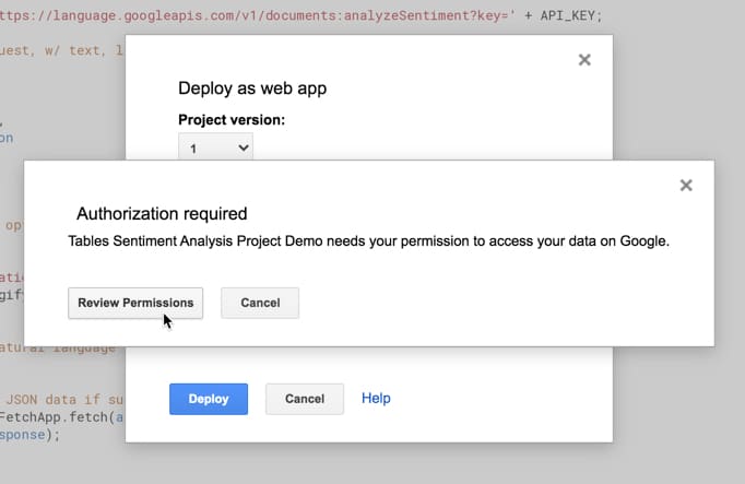
followed by a review of the project scopes:
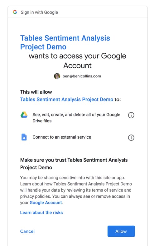
Click Allow.
This is a one-time step the first time we publish to the web or run our script (unless we add additional services in the future).
20. Copy the URL of the web app so we can paste that into our Tables bot, which we’ll create next!
Sentiment Analysis Tables Bot Set Up
The final piece of the puzzle is the bot in Google Tables.
When the issue tracker form is submitted it creates a new row of data in our table, which triggers the bot. The bot sends the data to the webhook (i.e. the code above) that handles the rest.
21. Create a new bot with the following specification:
Trigger: row added
Action: Send to webhook
Webhook URL: Our Apps Script web app URL from step 20
Webhook format: POST with JSON
Request parameters:
id : [[record_id]]
description : {{description}}
Visually, this is the bot:
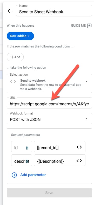
The red arrow indicates where we paste the Apps Script web app URL.
Test The Sentiment Analysis Google Tables Tool
Finally, we’re ready to submit the form.
22. From the Google Table, click on the Support Ticket Form to open it in a new tab:
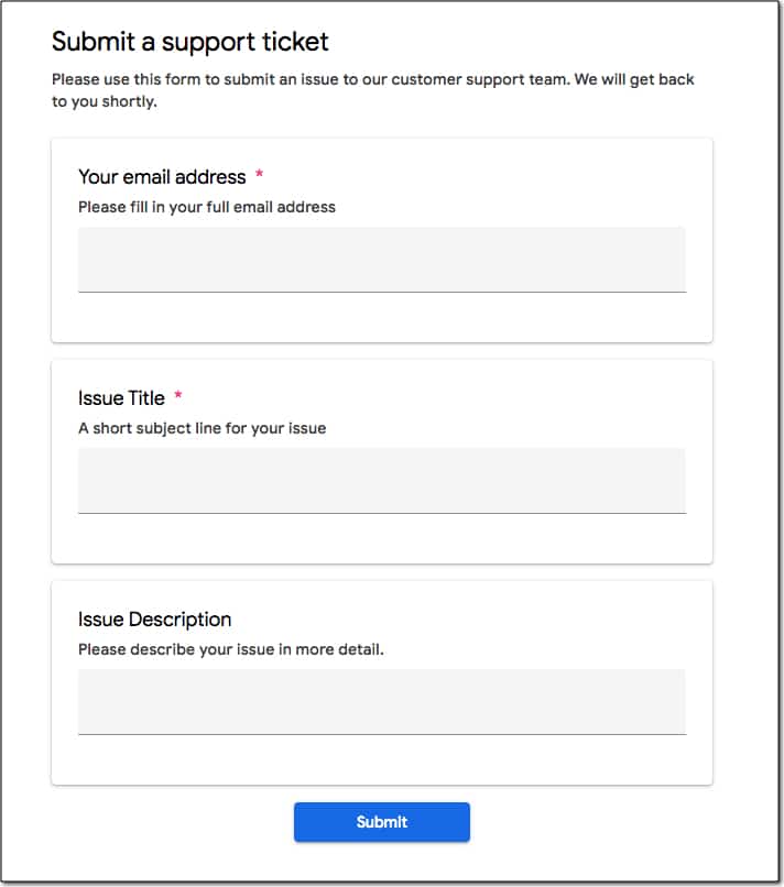
23. Submit it with a strong positive or negative sentiment in the description field (which is the one we send to the Natural Language API) to test out the Natural Language scores.
You’ll see the row of data arrive when we submit the form and then, a few moments later, the sentiment analysis columns get automatically populated too!
That’s it! Let me know how you get on in the comments.