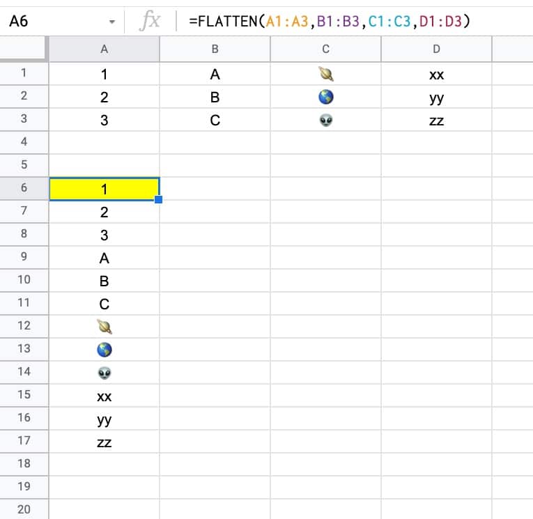
The FLATTEN Function in Google Sheets flattens all the values from one or more ranges into a single column.
For example, in the following image, the four columns of data are stacked on top of each other by the single FLATTEN function in cell A6:
FLATTEN Function Syntax
=FLATTEN(range1,[range2,...])
It takes one or more range arguments.
It doesn’t require them to be the same dimensions, so you can happily mix single cells, rows, columns, and even static values, and the FLATTEN function won’t bat an eyelid. E.g.:
=FLATTEN(A1,"fixed value 1",C1:C1000,A4:Z5,"fixed value 2")
Note that this behavior is different to other functions like the FILTER function or the MMULT function that require specific matching dimensions with the input ranges.
FLATTEN is part of the Array family of functions in Google Sheets.
FLATTEN Function Notes
Entering the data as one big range or as separate columns affects how the FLATTEN function combines the data.
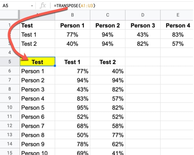
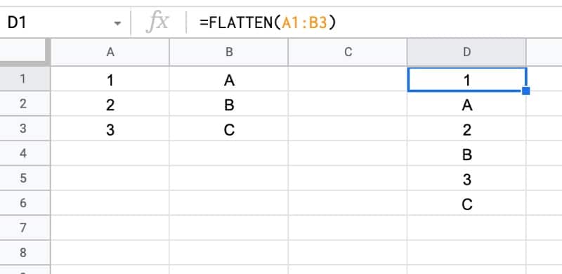
For example, if we pass in a single range as the argument to a FLATTEN function, it combines the data by stacking each row in turn, so that the data alternates:
=FLATTEN(A1:B3)
Compare this to the output when we enter the columns of our data table as separate ranges:
=FLATTEN(A1:A3,B1:B3)
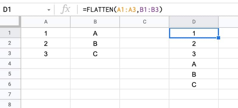
In this case, we can see that the columns are stacked atop each other, i.e. all the values from column A first, then all the values from column B, etc.
FLATTEN Function Template
Click here to open a view-only copy >>
Feel free to make a copy: File > Make a copy…
If you can’t access the template, it might be because of your organization’s Google Workspace settings. If you right-click the link and open it in an Incognito window you’ll be able to see it.
You can also read about it in the Google Documentation.
FLATTEN Formula Example
The FLATTEN function is handy for tidying up messy data.
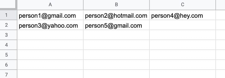
For example, suppose we have the following dataset with emails spread across columns A, B, and C, and we want to consolidate them into a single column:
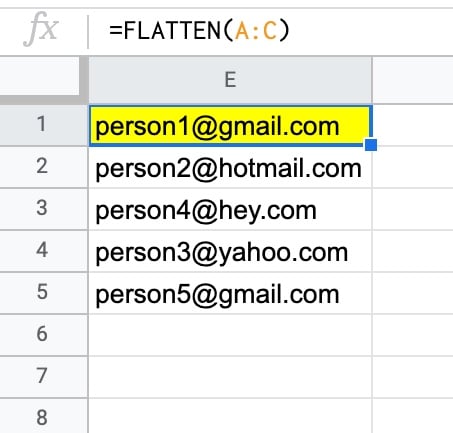
The FLATTEN function is an easy, succinct method:
=FLATTEN(A:C)
which gives an output:
Advanced FLATTEN Formula Examples
Unpivot Data With FLATTEN
Probably the most useful application I’ve seen for the FLATTEN function is to unpivot in Google Sheets.
Unpivot is a method to turn wide data into tall data.
It’s the opposite action to a pivot table, which turns data from the tall format (database) to a wide table format (good for humans and charts to read).
Unpivoting data used to be difficult in Google Sheets before the FLATTEN function arrived, but thankfully it’s now possible with a single array formula.
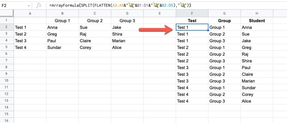
The unpivot is achieved by this array formula that joins the data together, flattens it, and then splits it into multiple columns.
=ArrayFormula(SPLIT(FLATTEN(A2:A5 & "🪐" & B1:D1 & "🪐" & B2:D5), "🪐"))
Now I know you’re wondering about that planet emoji “🪐” in the formula…
For the SPLIT function, we can use whatever character you like as the delimiter, provided it’s not in our dataset already. Hence why I chose the 🪐 emoji!
Learn more about the unpivot method here: Unpivot In Google Sheets With Formulas (How To Turn Wide Data Into Tall Data)
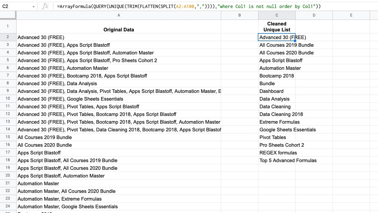
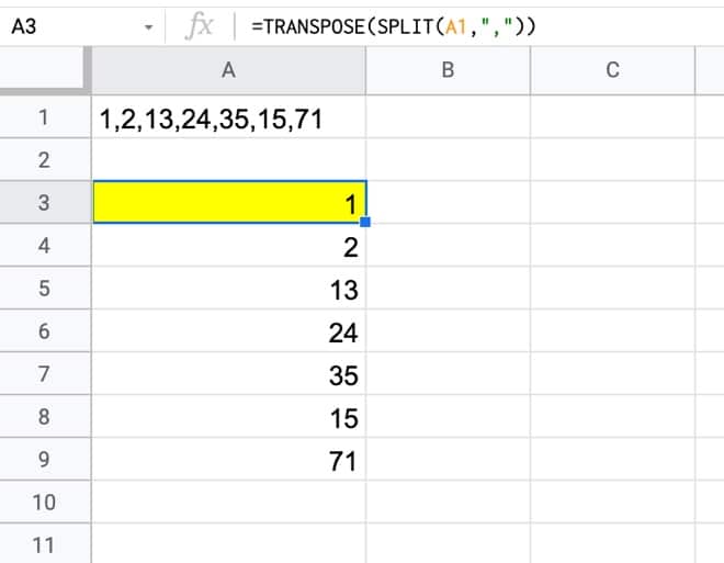
Find Unique Items In A Grouped List
Suppose you want to find unique values from data that looks like this:

You want to extract a unique list of items from the column containing grouped words, which are separated by commas.
Use this formula to extract the unique values:
=ArrayFormula( QUERY( UNIQUE( TRIM( FLATTEN( SPLIT(A2:A100,",")))),"where Col1 is not null order by Col1"))
Read more about this technique in this post: Get A Unique List Of Items From A Column With Grouped Words