The CHAR function in Google Sheets is a nifty function that converts a number into a special character according to the current Unicode table.
It’s super easy to use and is a great way to add some fun to your Google Sheets.
What is the CHAR Function?
It’s a function that turns numbers into special characters, e.g. emojis, in your Google Sheets.
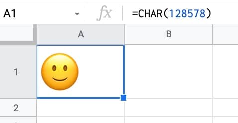
For example, suppose you want to add a smiling emoji to your Sheet.
Of course you can copy-paste it into your Sheet, but you can also enter it via a formula:
Adding it via a formula has the advantage that you can generate and use these special characters in other formulas more easily than if they are text characters.
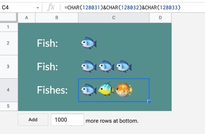
As another example, maybe you want some fish in your Google Sheet? Sure, here you go:
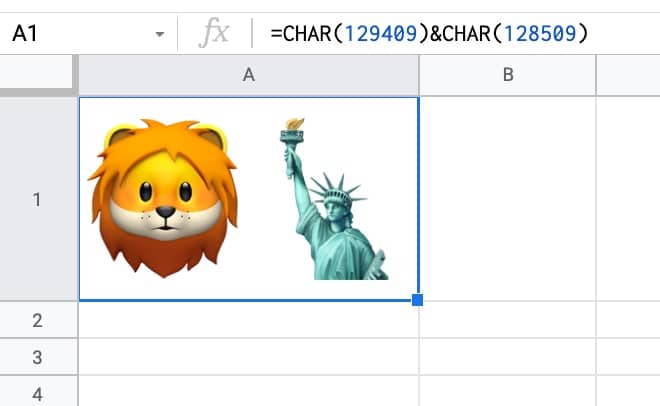
Or perhaps a picture of a lion next to the Statue of Liberty:
The point is, you can use the CHAR function to generate thousands of special characters in your Google Sheets and add some fun and self-expression.
There are lots of more practical examples of the CHAR function further down this post.
CHAR Function in Google Sheets Syntax
It takes one argument that is a number. It can be entered directly as a number, reference another cell containing a number, or contain a nested formula that outputs a number.
E.g.
=CHAR(128578)
or
=CHAR(A1)
or
=CHAR(IF(RAND()>0.5,128994,128308))
It converts the given number into a special character according to the current Unicode table.
It’s part of the TEXT family of functions in Google Sheets.
How To Get The Numbers For The CHAR Function
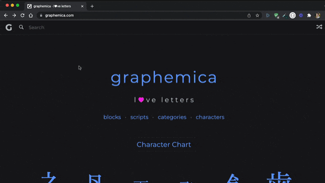
I use a tool called Graphemica to find the number of special characters.
The workflow is:
- Search for a character, e.g. music
- Select the character you want, e.g. quarter note ♩
- Scroll down to the Code section
- Copy the numbers after
&# from the HTML Entity (Decimal) section, e.g. 9833. The HTML Entity number is the decimal representation of the unicode number, which the CHAR function requires.
- Add to the CHAR function in your Google Sheet, e.g.
=CHAR(9833)
Here is what this process looks like:
You can also explore the CHAR formula output by putting this formula into cell A1:
=CHAR(ROW())
And dragging it down as far as you dare!
Or open this Sheet where I’ve done that for you 😉
The first 32 rows are blank and the emoji characters start around row 129292…
CHAR Function Template
Click here to get a copy of the CHAR Function Template
Feel free to make a copy: File > Make a copy…
If you can’t access the template, it might be because of your organization’s Google Workspace settings. If you right-click the link and open it in an Incognito window you’ll be able to see it.
The CHAR formula is also covered in the Day 30 lesson of my free Advanced Formulas 30 Day Challenge course.
You can also read about it in the Google documentation.
Interesting CHAR Function Examples
Star Rating
You can use the CHAR function with the REPT function to create a star rating system.
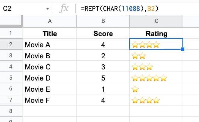
The formula is:
=REPT(CHAR(11088),B2)
Header Tricks
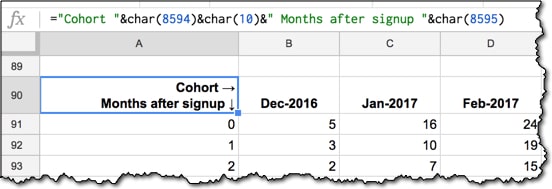
The formula for this is:
="Cohort " & CHAR(8594) & CHAR(10) & "Months after signup "&CHAR(8595)
Here’s an alternative header trick, using text rotation:
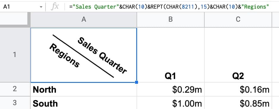
The formula for this example is:
="Sales Quarter" & CHAR(10) & REPT(CHAR(8211),15) & CHAR(10) & "Regions"
Set the text rotation to -35 or -45 to achieve the same look.
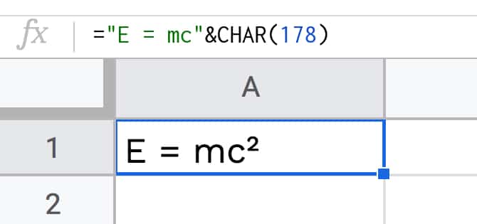
Superscript and Subscript Example
Use the CHAR function to add superscripts and subscripts to words, which is especially useful for creating math or science equations in Google Sheets:
See this post: How To Add Subscript and Superscript In Google Sheets
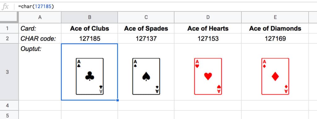
Playing Cards
Here’s a nice example of the CHAR function used to show playing cards in your Google Sheet, as part of an explanation as to why a shuffled deck of cards is unique.
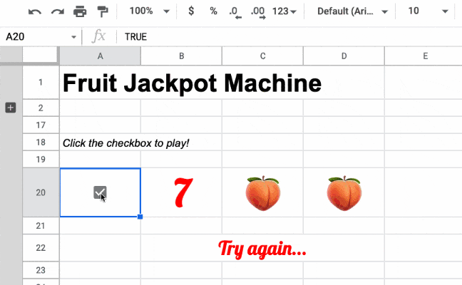
Fruit Machine
Naturally, you can and should build something silly with the CHAR function, like this fruit machine.
Toggle the checkbox to shuffle the fruits to see if you hit the jackpot!
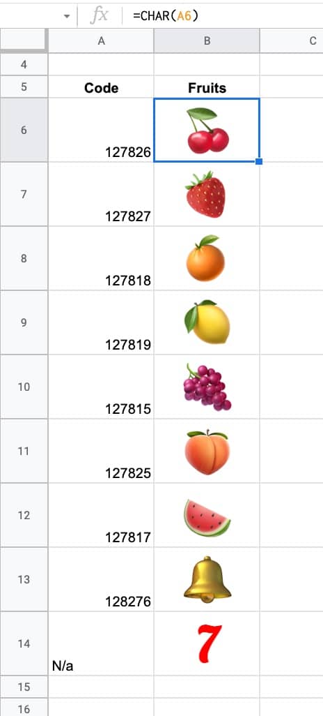
How does this work?
Firstly, we create a lookup table with the fruits, shown here with their character codes:
Then we create the fruit machine algorithm with the RANDBETWEEN function, the INDEX function, and array literals:
={ INDEX(B6:B14,RANDBETWEEN(1,9)), INDEX(B6:B14,RANDBETWEEN(1,9)), INDEX(B6:B14,RANDBETWEEN(1,9)) }
The RANDBETWEEN function randomly selects a number between 1 and 9. The INDEX function returns the fruit at that position from the fruit array.
The curly brackets (array literals) create an array of the three fruits next to each other.
Every time the checkbox is toggled, it causes the RANDBETWEEN to recalculate.
Finally, we use this IF function to check if it’s a jackpot:
=IF(PRODUCT(B20:D20)=343,"JACKPOT!!!","Try again...")
There are thousands more CHAR characters to explore, so I encourage you to go and experiment.