Reverse Text In Google Sheets

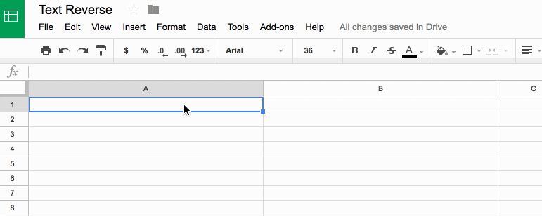
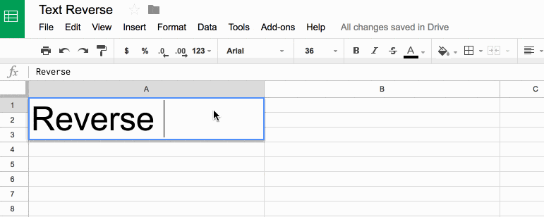
In this example, you’ll see how to reverse text in Google Sheets.

To start, enter some text into cell A1 and the formula in cell B1, to reverse the order of the text:

Text reverse in Google Sheets

Reverse Text In Google Sheets

What’s the formula?

=ArrayFormula(IFERROR(PROPER(CONCATENATE(MID(A1,LEN(A1)-ROW(INDIRECT("1:"&LEN(A1)))+1,1))),""))

It’s a beast! See below for a detailed breakdown of how it works.

It might be useful if you wanted to find the last character in a string, or the last occurrence of a character using the FIND() function.

Here’s an alternative, which reverses the capitalization too (submitted by Michael D over email – thanks!):

=JOIN("",ARRAYFORMULA(MID(A1,LEN(A1)-ROW(INDIRECT("1:"&LEN(A1)))+1,1)))

Can I see an example worksheet?

Yes, here you go.

How does this formula work?

Basically we make an array of numbers corresponding to how many letters are in the original text string. Then we reverse that, so the array shows the largest number first. Then we extract each letter at that position (so the largest number will extract the last letter, the second largest will extract the second-to-last letter, etc., all the way to the smallest number extracting the first letter). Then we concatenate these individual letters.

Easy! Err…

The only way to really understand this formula is to break it down, starting from the inner functions and building back out.

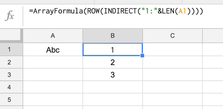
Assuming we have the text string “Abc” in cell A1, then let’s build the formula up in cell B1, step-by-step:

Step 1:

Use the LEN function to calculate the length of the text string and turn it into a range string with “1:”&LEN(A1)

Use the INDIRECT function to turn this string range reference into a valid range reference.

Finally wrap with ROW to convert into a row number list.

=ROW(INDIRECT("1:"&LEN(A1)))

which outputs a result of 1 in cell B1.

Step 2:

Turn the formula into an array formula, by hitting Ctrl + Shift + Enter, or Cmd + Shift + Enter (on a Mac), to the formula above. This will add the ArrayFormula wrapper around the formula:

=ArrayFormula(ROW(INDIRECT("1:"&LEN(A1))))

This outputs 1 in cell B1, 2 in cell B2 and 3 in cell B3:

Array to reverse text

Step 3:

Reverse the output, so 3 is in cell B1, 2 in B2 and 1 in B3, by subtracting from the length of the text in A1 and adding 1 to avoid 0:

=ArrayFormula(LEN(A1)-ROW(INDIRECT("1:"&LEN(A1))) + 1)

Step 4:

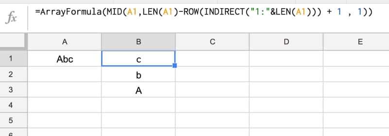
Use the MID formula to now extract the letters at position 3 (“c”), position 2 (“b”) and position 1 (“A”) and display in cells B1:B3:

=ArrayFormula(MID(A1,LEN(A1)-ROW(INDIRECT("1:"&LEN(A1))) + 1 , 1))

so your output is now:
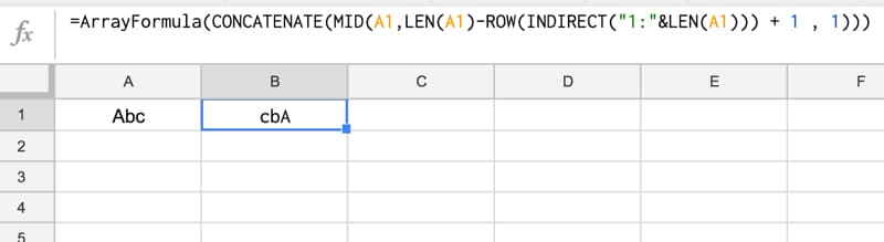
MID formula in Google Sheets

Step 5:

Concatenate so that all the individual outputs are combined into a single cell:

=ArrayFormula(CONCATENATE(MID(A1,LEN(A1)-ROW(INDIRECT("1:"&LEN(A1))) + 1 , 1)))

Reverse text in google sheets

Step 6 (optional):

The string is essentially reversed now, so we could stop here.

However, you can use the PROPER function to capitalize the first letters of each word only, for a true reverse effect:

=ArrayFormula(PROPER(CONCATENATE(MID(A1,LEN(A1)-ROW(INDIRECT("1:"&LEN(A1))) + 1 , 1))))

Step 7 (optional):

Last step is to add in an IFERROR function to avoid an unsightly error message if the input cell (A1) is blank:

=ArrayFormula(IFERROR(PROPER(CONCATENATE(MID(A1,LEN(A1)-ROW(INDIRECT("1:"&LEN(A1)))+1,1))),""))

Final output:

Here’s the formula in action again:

Reverse text in google sheets

Further Reading

You might also like this article on Using Text Rotation to Create Custom Table Headers in Google Sheets.

How to reply to Google Forms survey responses quickly with Sheets & Apps Script

Google Forms survey email tool system
1. User submits Google Forms survey
2. Response logged in Google Sheet
3. Google Apps Script parses responses and sends emails
4. Original user receives reply!

You’re happy!

You sent out a Google Forms survey to your customers and received hundreds of responses.

They’re sitting pretty in a Google Sheet but now you’re wondering how you can possibly reply to all those people to say thank you.

Manually composing a new email for each person, in turn, will take forever. It’s not an efficient use of your time.

You could use an ESP like Mailchimp to send a bulk “Thank You” message, but it won’t be personal. It’ll be a generic, bland email and nobody likes that. It won’t engage your customers and you’ll be missing an opportunity to start a genuine conversation and reply to any feedback from the survey.

Thankfully, there is another way.

Of course, there is, otherwise, why would I be writing this tutorial! πŸ˜‰

By adding a reply column to your Google Sheet, next to the Google Forms survey responses, you can efficiently compose a personal response to every single survey respondent.

Then, using Google Apps Script (a Javascript-based language to extend Google Workspace), you can construct an email programmatically for each person, and send out the responses in bulk directly from your Google Sheet.

Continue reading How to reply to Google Forms survey responses quickly with Sheets & Apps Script

How to Create an Annotated Line Graph in Google Sheets

line graph in Google Sheets
Animated line chart in Google Sheets

This post looks at how to make a line graph in Google Sheets, an advanced one with comparison lines and annotations, so the viewer can absorb the maximum amount of insight from a single chart.

For fun, I’ll also show you how to animate this line graph in Google Sheets.

Want your own copy of this line graph?

Click here to access your copy of this template >>

This chart was originally developed for The Write Life during their 4-day product sale earlier this year. It featured as part of a dashboard that was linked to the E-junkie sales platform and displayed sales data in real-time:

Google Sheet e-junkie real-time dashboard

As with any graph, we start with the data:

The data table

Line graph data table

The key to this line graph in Google Sheets is setting up the data table correctly, as this allows you to show an original data series (the grey lines in the animated GIF image), progress series lines (the colored lines in the animated GIF) and current data values (the data label on the series lines in the GIF).

In this example, I have date and times as my row headings, as I’m measuring data across a 4-day period, and sales category figures as column headings, as follows:

Annotated line graph data table

Red columns

The red column, labeled with 1 above, contains historic data from the 2015 sale.

Red column 2 is a copy of the same data but only showing the progress up to a specific point in time.

In red column 3, the following formula will create a copy of the last value in column 2, which is used to add a value label on the chart:

=IF(AND((C2+C3)=C2,C2<>0),C2,"")

Purple columns:

Purple columns 4,5 and 6 are exactly the same but for 2016 data. The formula in this case, in column 6, is:

=IF(AND((F2+F3)=F2,F2<>0),F2,"")

Green columns:

Data in green columns 7 and 8, is our current year data (2017), so in this case there is no column of historic data. The formula in column 8 for this example is:

=IF(AND((H2+H3)=H2,H2<>0),H2,"")

Creating the line graph in Google Sheets

Highlight your whole data table (Ctrl + A if you’re on a PC, or Cmd + A if you’re on a Mac) and select Insert > Chart from the menu.

In the Recommendations tab, you’ll see the line graph we’re after in the top-right of the selection. It shows the different lines and data points, so all that’s left to do is some formatting.

Line graph selection

Format the series lines as follows:

  • For the historic data (columns 1 and 4 in the data table), make light grey and 1px thick
  • For the current data (columns 2, 5 and 7 in the data table), choose colors and make 2px thick
  • For the “max” values (columns 3, 6 and 8 in the data table), match the current data colors, make the data point 7px and add data label values (see steps 1, 2 and 3 in the image below)

Line graph data labels

This is the same technique I’ve written about in more detail in this post:

How can I annotate data points in Google Sheets charts?

Animating the chart with Apps Script

How about creating an animated version of this chart?

Oh, go on then.

When this script runs, it collects the historic data, then adds that data back to each new row after a 10 millisecond delay (achieved with the Utilities.sleep method and the SpreadsheetApp.flush method to apply all pending changes).

I don’t make any changes to the graph or create any fancy script to change it, I leave that up to the Google Chart Tool. It just does its best to keep up with the changing data, although as you can see from the GIF at the top of this post, it’s not silky smooth.

By the way, you can create and modify charts with Apps Script (see this waterfall chart example, or this funnel chart example) or with the Google Chart API (see this animated temperature chart). This may well be a better route to explore to get a smoother animation, but I haven’t tried yet…

Here’s the script:

function startTimedData() {
  var ss = SpreadsheetApp.getActive();
  var sheet = ss.getSheetByName('Animated Chart');
  var lastRow = sheet.getLastRow()-12;
  
  var data2015 = sheet.getRange(13,2,lastRow,1).getValues(); // historic data
  var data2016 = sheet.getRange(13,5,lastRow,1).getValues(); // historic data
  
  // new data that would be inputted into the sheet manually or from API
  var data2017 = [[1],[7],[14],[19],[27],[32],[34],[36],[44],[49],[57],[65],[72],[76],[79],[86],[92],[99],[104],[109],[111],[112],[120],[128],[130],
                  [132],[133],[140],[144],[149],[151],[152],[158],[162],[170],[177],[179],[184],[188],[194],[200],[205],[211],[216],[224],[232],[238],
                  [241],[246],[248],[252],[259],[266],[268],[276],[284],[291],[299],[300],[301],[306],[311],[315],[316],[323],[324]];
  
  for (var i = 0; i &lt; data2015.length;i++) {
    outputData(data2015[i],data2016[i],data2017[i],i);
  }
  
}

function outputData(d1,d2,d3,i) {
  var ss = SpreadsheetApp.getActive();
  var sheet = ss.getSheetByName('Animated Chart');
  
  sheet.getRange(13+i,3).setValue(d1);
  sheet.getRange(13+i,6).setValue(d2);
  sheet.getRange(13+i,8).setValue(d3);
  Utilities.sleep(10);
  SpreadsheetApp.flush();
}

function clearData() {
  var ss = SpreadsheetApp.getActive();
  var sheet = ss.getSheetByName('Animated Chart');
  var lastRow = sheet.getLastRow()-12;
  
  sheet.getRange(13,3,lastRow,1).clear();
  sheet.getRange(13,6,lastRow,1).clear();
  sheet.getRange(13,8,lastRow,1).clear();
  
}

On lines 6 and 7, the script grabs the historic data for 2015 and 2016 respectively. For the contemporary 2017 data, I’ve created an array in my script to hold those values, since they don’t exist in my spreadsheet table.

This code is available here on GitHub.

Finally, add a menu for access from your Google Sheet with the following code:

function onOpen() {
  var ui = SpreadsheetApp.getUi();
  
  ui.createMenu("Timed data")
    .addItem("Start","startTimedData")
    .addItem("Clear","clearData")
    .addToUi();
}

This allows you to run the Start and Clear functions directly from your Google Sheet browser tab, rather than the script editor tab.

That’s it. Hit Start and you should see your chart animate before your eyes:

Animated Apps Script chartAnimated Apps Script chart

If you look closely, you’ll also see the data populating your sheet.

Dashboard Design Checklist: From a Blank Google Sheet to Business Insights

Dashboard design is hard.

You start with a blank canvas, or a blank Google Sheet in this case, and you have to somehow turn that into business insights, which will grow your bottom line, make your organization more efficient or help you understand your customers better.

Dashboard design process
Notice the blank sheet is Draft 1 and the final dashboard is Draft 4. It’s an iterative process. Click to open larger image in new browser tab.

The blank screen stares back at you, waiting for you to do something.

It feels overwhelming.

You clasp your hands around the back of your head, lean back in your chair and rue the day you mentioned building a dashboard to your boss.

It was supposed to be easy. Easy to create a masterpiece, a thing of beauty to wow your team.

Meanwhile, that blank Sheet continues to stare back at you, emptier than ever.

Dashboard design starts with a blank Google Sheet
Continue reading Dashboard Design Checklist: From a Blank Google Sheet to Business Insights

How to build a real-time sales dashboard for E-junkie using Google Sheets and Apps Script

It’s day two of a four day product launch. You’ve worked hard all year to create a fantastic product, test your sales systems and tell the world about this amazing offer. You know you’ve sold 100 products so far, but…

…you don’t know whether your ads are effective, which affiliates are really killing it versus which have forgotten about your launch, or even whether your own emails are converting.

Looking at your sales log only, and having to decipher what’s happened since the last time you looked an hour ago, is like trying to drive in the dark without headlights.

Thankfully there is a better way to track your sales, so you can see your data, get insights about what’s working and what’s not, and immediately act to increase your bottom line.

This post looks at how to build a real-time dashboard for the E-junkie digital sales platform using Google Sheets:

Google Sheet e-junkie real-time dashboard
Google Sheet e-junkie real-time dashboard (fictitious data)
Want your own copy of this dashboard?
Click here to access your copy of this template >>

E-junkie is a digital shopping cart, used for selling digital products and downloads. The system handles the shopping cart mechanics, but does not do any data analytics or visualizations.

You can view a transaction log (i.e. a list of all your sales) but if you want to understand and visualize your sales data, then you’ll need to use another tool to do this. Google Sheets is a perfect tool for that.

You can use a Google Sheet to capture sales data automatically in real-time and use the built-in charts to create an effective dashboard.

You’d be crazy not to have a tracking system set up, to see and understand what’s going on during sales events or product launches. This E-junkie + Google Sheets solution is effective and incredibly cheap ($5/month for E-junkie and Google Sheets is free).

The Write Life ran a Writer’s Bundle sale this year, during the first week of April. It’s a bundled package of outstanding resources for writers, including ebooks and courses, heavily discounted for a short 4-day sales window.

I created a new dashboard for The Write Life team to track sales and affiliates during the entire event. This year’s dashboard was a much improved evolution of the versions built for the Writer’s Bundle sales in 2014 (which, incidentally, was my first blog post on this website!) and 2015.

The biggest improvement this year was to make the dashboard update automatically in real-time.

In previous years, the dashboard was updated every 3 hours when new data was manually added from a download of E-junkie sales data. This time, using Apps Script, I wrote a script and set up E-junkie so that every sale would immediately appear in my Google Sheet dashboard.

So, it truly was a real-time dashboard.

Animated e-junkie sales chart in Google Sheets
Animated chart showing fictitious sales data during a flash sale

The real-time dashboard in Google Sheets

Here’s the final dashboard, annotated to show the different sections:

Annotated Google Sheets dashboard
Annotated Google Sheets dashboard with fictitious data (click to enlarge)

There are too many steps to detail every single one, but I’ll run through how to do the E-junkie integration in detail and then just show the concepts behind the Google Sheet dashboard setup.

How to get data from E-junkie into Google Sheets

New to Apps Script? Check out my primer guide first.

Open up a new Google Sheet and in the code editor (Tools > Script editor…) clear out any existing code and add the following:

function doPost(e) {
  var ss = SpreadsheetApp.getActiveSpreadsheet();
  var sheet = ss.getSheetByName('Sheet1');
  
  if (typeof e !== 'undefined') {
    var data = JSON.stringify(e);
    sheet.getRange(1,1).setValue(data);
    return;
  }
}

Save and then publish it:

Publish > Deploy as a web app...

and set the access to Anyone, even anonymous, as shown in this image:

access Google sheets web app

You’ll be prompted to review permissions:

Apps script review permissions

followed by:

Apps script confirm permissions

Click Allow.

This is a one-time step the first time you publish to the web or run your script.

Now we want to test this code by sending a POST request method to this Sheet’s URL to see if it gets captured.

We’ll use a service called hurl.it to send a test POST request.

Open hurl.it, select the POST option in the first dropdown menu, add the URL of your published sheet into the first text box and, for good measure, add a parameter, like so (click to open large version):

Hurl to test POST request

Click “Launch Request”, head back to your Google Sheet and you should now see some data in cell A1 like this (click to open large version):

POST data in Google Sheet

where the data is something like this (the custom parameter shown in red):

{"parameter":{"testValue":"Ben"},"contextPath":"","contentLength":13,"queryString":null,"parameters":{"testValue":["Ben"]},"postData":{"type":"application/x-www-form-urlencoded","length":13,"contents":"testValue=Ben","name":"postData"}}

Voila! The data sent by the POST action is sitting pretty in our Google Sheet!

It’s essentially exactly the same mechanics for the E-junkie example.

So now we know it’s working, let’s change the Sheet and the code to handle E-junkie data.

For the Sheet: Delete the data in cell A1, and add a row of headings that match the headings in lines 12 to 33 of the code below (omitting the data.):

E-junkie Google Sheet set-up

(This screenshot doesn’t show all the columns, some are off-screen to the right.)

For the code: Delete all the previous code and replace with this (note that I’m still referring to Sheet1, so if you’ve changed the name of your Sheet to something else you’ll need to change it in the code on line 4 as well):

function doPost(e) {
  
  var ss= SpreadsheetApp.openById("&lt;Sheet ID&gt;");
  var sheet = ss.getSheetByName("Sheet1");
  
  var outputArray = [];
  
  if(typeof e !== 'undefined') {
    var data = e.parameter;
    
    outputArray.push(
      data.ej_txn_id,
      data.invoice,
      data.payment_date,
      data.item_name,
      data.from_email,
      data.receiver_email,
      data.discount_codes,
      data.mc_gross,
      data.payment_type,
      data.payer_id,
      data.payer_email,
      data.first_name,
      data.last_name,
      data.residence_country,
      data.payer_status,
      data.payment_status,
      data.payment_gross,
      data.affiliate_id,
      data.item_affiliate_fee_total,
      data.mc_currency,
      data.payer_business_name,
      data.payment_fee
    );
    
    sheet.appendRow(outputArray);
  }
  
  return;
}

Here’s the e-junkie code on GitHub.

Save your code and update the published web app (Publish > Deploy as a web app… and click Update).

Copy this updated application URL to your clipboard. Log in to E-junkie and navigate to Edit Preferences:

E-junkie menu

Paste in your URL into the Custom/Third-Party Integration Common Notification URL text box:

E-junkie custom integration

And that’s it!

Whenever you make a sale through E-junkie, you should now see the data show up in your Sheet.

Further reading on the E-junkie integration: Official E-junkie integration documentation

Thanks:

Thanks to Google Developer Expert RiΓ«l Notermans who pointed out how to fix the redirect issue I was dealing with in earlier versions of the script.

Thanks to all the kind folks on Stack Overflow who helped me get this working.

Build Business Dashboards With Google Sheets

Digital marketing dashboard in Google Sheets
Learn how to build beautiful, interactive dashboards in my online course.
9+ hours of video content, lifetime access and copies of all the finished dashboard templates.
Learn more

How I created the dashboard in Google Sheets with E-junkie data

Really the crux of this whole example was getting the E-junkie data into my Google Sheet in real-time. Once I had that up and running, I was free to do anything I wanted with the data.

Data staging

The E-junkie sales data looked like this in my Google Sheet once the transactions started to come in (blurred to hide details):

E junkie data

From this raw data, I created a staging table for the line tracking chart:

staging table for line chart

This table was driven by checking whether the hour date in column E of the current row (green) was less than the current time and then counting sales up to that point. The 2014 and 2015 datasets were included for reference.

The extra columns J, K and M were created for the chart annotations (see how to create an annotated line graph in Google Sheets).

To ensure everything updated in near real-time, I changed the calculation settings (File > Spreadsheet settings... > Calculation) to: On change and every minute

Progress tracking chart

The line tracking chart showed progress during the sale period, against the 2014 and 2015 benchmarks.

In action, it looked like this (showing fictitious data, and sped up to show progress through the sale period):

Animated Apps Script chartAnimated Apps Script chart
Read more about how the progress tracking line chart was created (including animation) here.

Revenue/profit bar chart

The revenue/profit chart was a standard bar chart showing total revenue and total profits against the target metrics (fictitious numbers):

Revenue and Profit bar chart

Sales channel metrics

The lower portion of the chart was a breakout of all the different sales channels we tracked, everything from individual emails, to ads (Facebook and Pinterest) and different affiliates.

Every one of these channels had their own row, showing the actual sales performance against that channel’s projected sales (click to view larger version; numbers are fictitious):

Example of sales data

The key formula driving this section of the dashboard was a simple COUNTIF formula, labeled 1 above, which counted the number of sales in the E-junkie dataset attributed to this channel:

=COUNTIF('ejunkie staging data'!$S$4:$S,D25)

The sparkline formula for the green bar charts, labeled 2 above, was:

=IF(J25=0,"",SPARKLINE(J25,{"charttype","bar";"max",MAX($G$25:$G$36);"color1","#4caf50"}))

Note: both of these formulas work for the data in row 25.

In action

One fun thing we did with the dashboard this time around, which I’d never done previously, was to show it full screen on a big TV during the sale, using an Apple TV and AirPlay:

Google Sheet e-junkie dashboard on big screen

Cool! πŸ™‚