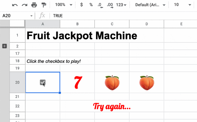
I was playing with my children the other day when one of them grabbed our Etch A Sketch toy and started drawing a treasure map with it.
Sitting in my office later that day I had a crazy thought “Could I build a working Etch A Sketch in Google Sheets?”
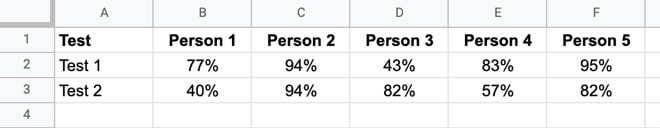
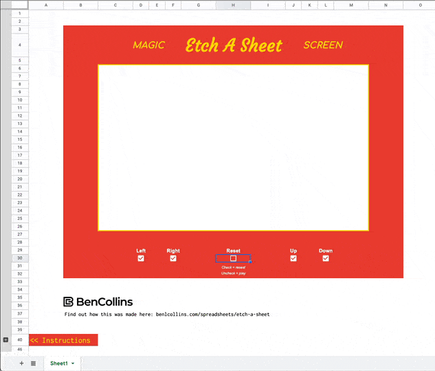
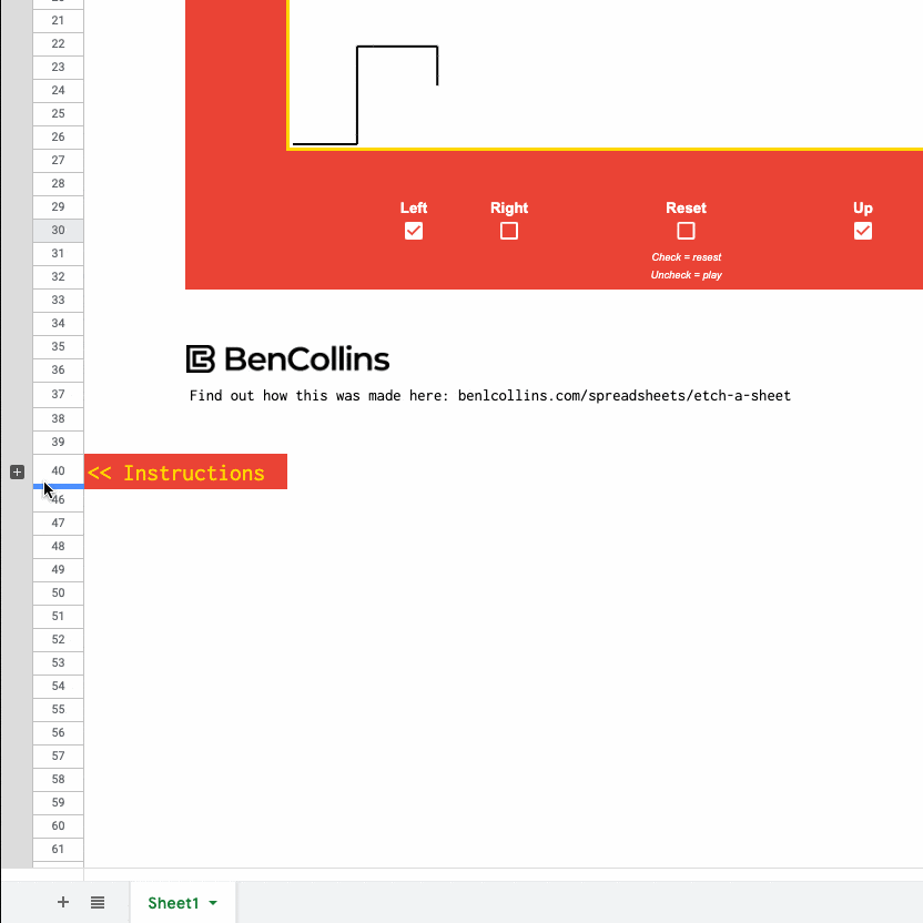
Two days later and boom! Here it is:
🔗 Grab your own copy of the template at the bottom of this article.
The game works using four techniques:
- Checkboxes as buttons
- Self-referencing formulas with iterative calculations
- Dynamic array, or spill, formulas to generate coordinates
- A sparkline formula to draw the line
It doesn’t use any code. In fact, it’s created entirely with the native built-in functions of Google Sheets.
Before I dive in though, I want to acknowledge a fellow Google Sheets aficionado…
Hat Tip To Tyler Robertson
Tyler Robertson is a Google Sheets wizard who’s built an amazing portfolio of spreadsheet games (described by some as the Sistine Chapel for spreadsheets) using only built-in formulas.
Thankfully, he hasn’t built an Etch A Sketch clone yet 😉
This Etch A Sheet game uses Tyler’s checkboxes as a button technique, and has similar logic to his moving-a-character-around-a-Sheet game.
So thank you, Tyler, for your amazing work!
How Does Etch A Sheet Work?
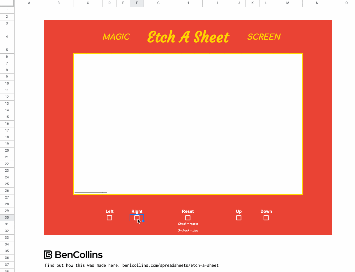
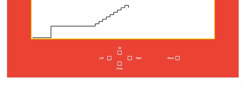
Just like the real Etch A Sketch game, there are controls to move the stylus left or right and up or down, to create lineographic images.
Since you can’t “shake” a Google Sheet (although I bet you wish you could sometimes!), there’s an additional reset checkbox to clear out the image and put the stylus back to the bottom left corner.
Etch A Sheet Formulas
There’s a button to open up the right side of the Sheet and see the formulas that generate coordinates for the sparkline function:
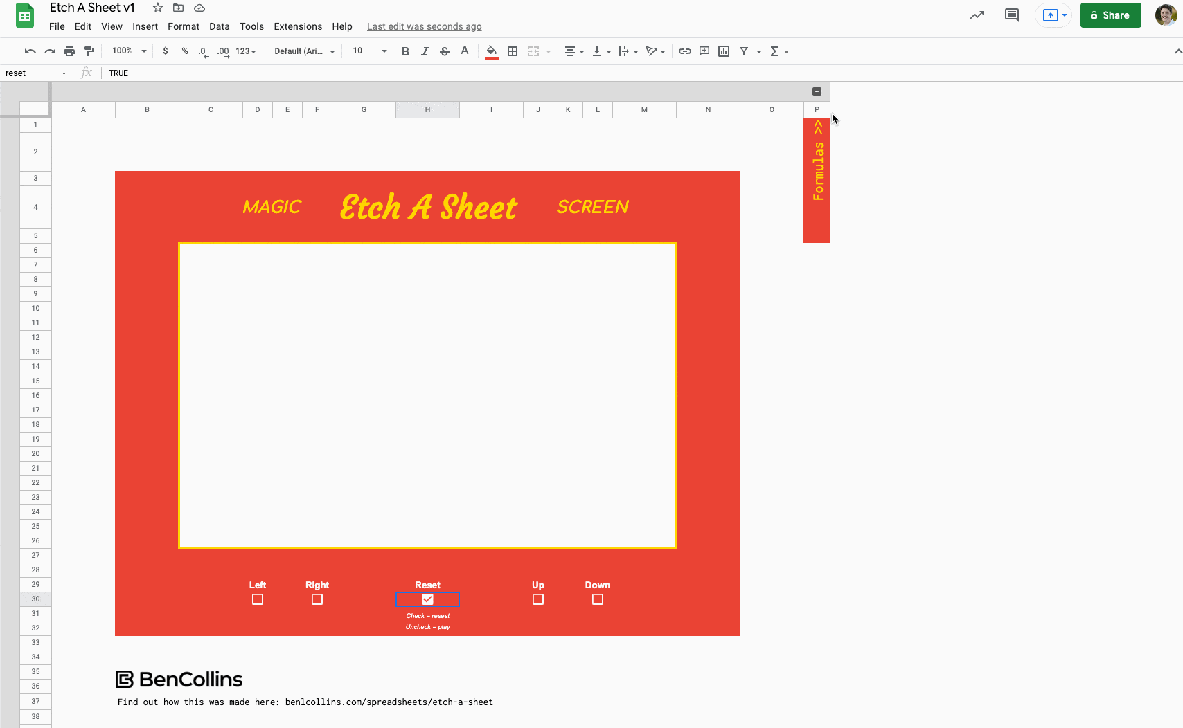
The buttons are regular checkboxes, which toggle a TRUE/FALSE value in the cell.
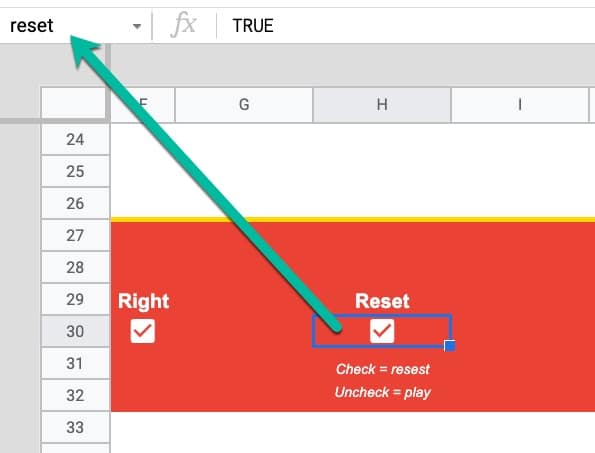
The checkbox in cell H30 is the reset checkbox and I’ve called it “reset” in the named ranges box.
Left Button Formulas
In cell V3:
=IF(F30<>V3,F30,V3)
In cell U3:
=F30<>V3
I also named U3 “right”.
Then in cell W3:
=IF(reset,0,IF(right,W3+1,W3))
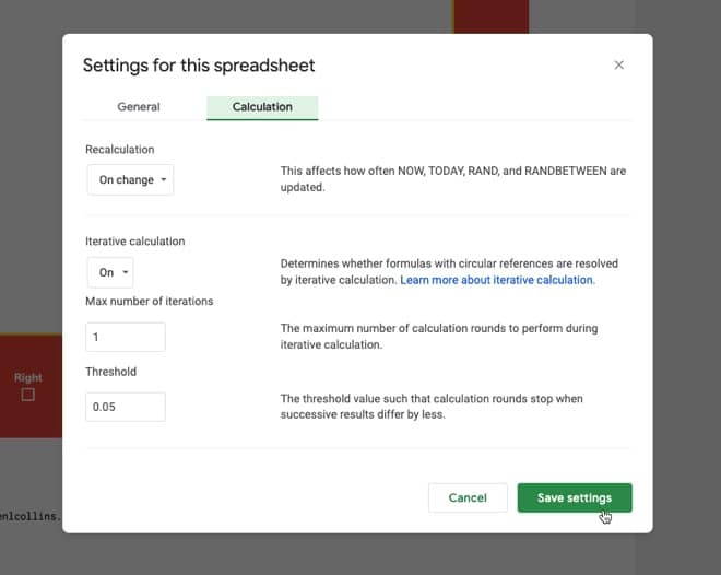
With iterative calculation switched on (see File > Settings > Calculation) and set to a maximum of 1 iteration, these formulas let the checkboxes function as buttons (see Tyler Robertson’s post for more details of how this works).
Starting Coordinates
I put the value 1 in cell U16 and named it “startX”.
Similarly, I put a 1 in cell U19 and named it “startY”.
Current X Formula
The main IFS function, which controls the horizontal X coordinate, is in cell V16:
=IFS(reset, startX, AND(right,currentX<50), currentX+1, AND(left,currentX>1), currentX-1, TRUE, currentX)
This formula cell is labeled as a named range “currentX”.
Firstly, it checks if the reset button is checked and if it is, resets the value of the cell to the starting X value.
If the reset button is unchecked, i.e. FALSE, then it checks if the right button is pressed and the current X is less than 50, using an AND function, and if it is, adds 1 to the current value.
Otherwise, if the left button is pressed and the current X is greater than 1, it subtracts 1 from the current value.
Finally, there is a TRUE condition to act as a catch-all when the previous conditions fail. It sets the value back to the start value.
X Path Formula
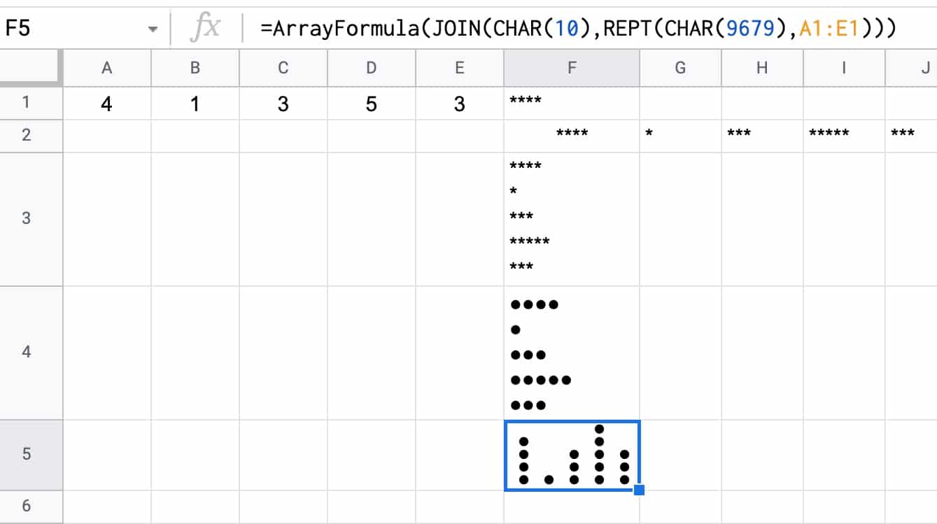
This self-referencing formula is put into the adjacent cell, W16, and called “xPath”.
It appends each new current value to itself to create a string of x values as the buttons are pressed, i.e. “1”, “1,2”, “1,2,3”, “1,2,3,4” etc.
=IF(reset,,xPath & "," & currentX)
For this to work, the spreadsheet needs to have iterative calculations enabled with a max of 1 iteration.
The settings are found under the File > Settings > Calculation:
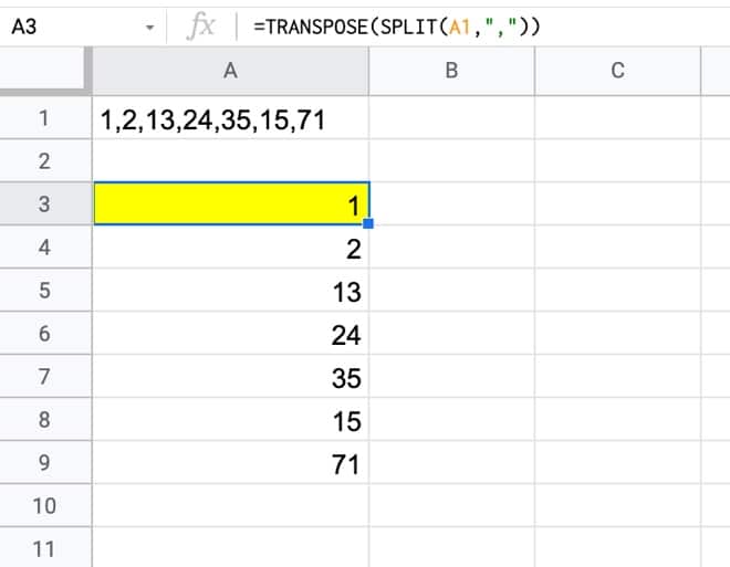
X Number Formula
This formula turns the xPath string of values into a column of numbers, which is fed into the sparkline function in the next step.
=IFERROR(TRANSPOSE(SPLIT(xPath,",")),"")
The SPLIT function breaks up the previous string of data, by the comma separator.
The TRANSPOSE function turns the array from a row vector to a column vector.
The IFERROR function wrapper hides the error message when the xPath variable is empty.
Y Formulas
The same formulas are replicated to create a column of Y coordinates.
Sparkline Formula
=IFERROR(SPARKLINE(Q3:R,{"linewidth",2 ; "xmin",1 ; "xmax",50 ; "ymin",1 ; "ymax",50}),"")
Here, the sparkline formula takes the X Number and Y Number coordinates (two columns of numbers) and simply plots them as a line.
In the sparkline options, I’ve set the linewidth to 2 so it stands out more. I also set min and max values for the canvas, so that the drawing always starts from the bottom left.
Using Groups To Show/Hide Content
This is another interesting technique, used here to show or hide content that doesn’t need to be on display all the time. I’ve used the same technique for the “Formulas” section, shown in the GIF above.
The grouped row button below the Etch A Sheet board shows and hides the instructions section when it is toggled:
Finishing Touches
There are a few other steps to complete the Etch A Sheet:
- Merge a big section of cells for the sparkline area
- Add a thick red background around the outside of the Etch A Sheet
- Add a heading, in a playful gold-colored font
- Remove gridlines (one of the best tips to make your Sheets look good!)
And there you have it!
Improvements
Alternative Controls
To stay true to the original game, I put the horizontal checkbox buttons on the left side and the vertical controls on the right side.
However, these are awkward to press because you have to jump back and forth between them with your cursor. Of course, it doesn’t matter with the physical Etch A Sketch because the dials are positioned for each hand and can be operated simultaneously.
Perhaps a better approach in the Sheet version is to put the checkbox buttons close together so that the cursor movement is minimized.
Starting From The Previous Position
Every Etch A Sheet game restarts from (1,1).
However, when you turn a real Etch A Sketch upside down, shake it, and then restart, the line is drawn from wherever it last finished. It does NOT revert back to the bottom left.
So I’ll leave this as a challenge for you! Can you modify the formulas to match this behavior?
Formula Bug
If you look really closely at the GIFs in this post, you’ll notice that the line is one step behind the button press. I.e. when I press a button, it has to draw the previous step still before registering the new button action. Obviously, this is not ideal.
Again, I leave this as a challenge for you to explore…
Unfortunately, I have to get back to my actual work now, so I’m going to leave this fix for another day. This project exceeded my expectations (It was a lot of fun! It was intellectually challenging! I learned some new techniques!) so I feel satisfied with this outcome. I don’t feel the need to make it perfect.
Etch A Sheet Template
Open the Etch A Sheet template here.
Make your own copy: File > Make a copy
(Note: If you are unable to open this file, it’s probably because it’s from an outside organization and my Google Workspace domain is not whitelisted at your organization. You may be able to ask your Google Workspace administrator about this. In the meantime, feel free to open it in an incognito window and you should be able to view it.)
If it does not appear to work, check you have the iterative calculations enabled.
Go to File > Settings > Calculation
Make sure Iterative Calculations is ON and set to 1 iteration. See the image under “X Path Formula” for more details.
If you do make a copy, I’d love to see what you draw with it!