This article looks at how to add a total row to tables generated using the Query function in Google Sheets. It’s an interesting use case for array formulas, using the {...} notation, rather than the ArrayFormula notation.
So what the heck does this all mean?
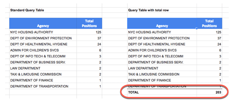
It means we’re going to see how to add a total row like this:
Table on the left without a total row; Table on the right showing a total row added
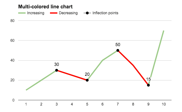
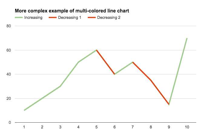
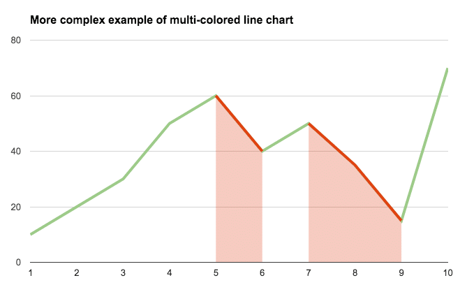
In this article, you’ll see how to create a multi-colored line chart in Google Sheets, for example when the line is increasing it’s colored green, when it’s decreasing it’s colored red, as shown in this image:
Colors are a powerful way of adding context to your charts, to bring attention to certain trends and add additional understanding.
The embedded charts tool in Google Sheets is pretty basic, so we can only achieve this with a formula workaround.
How do I create a multi-colored line chart in Google Sheets?
Basic Example
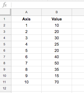
Let’s start with this basic dataset:
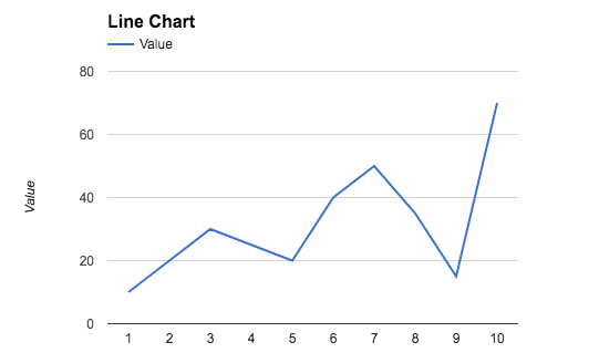
which, when charted, looks like this:
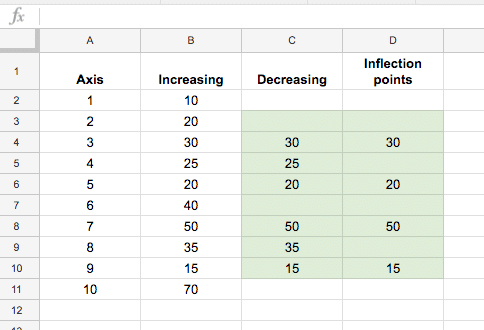
To create the colored version seen at the top of this post, we need to add helper columns to the dataset, one to create a dataset of decreasing values, and an optional column to mark the inflection points (where the line changes from going up to going down, or vice versa).
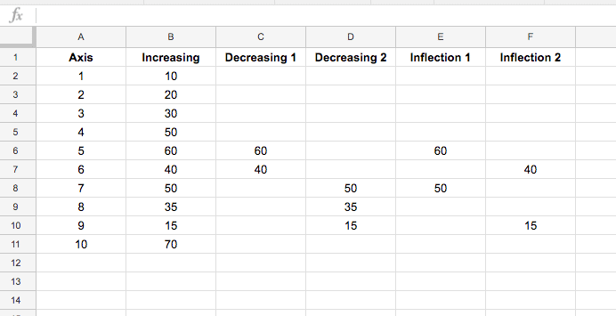
The finished dataset looks like this:
The green highlighted cells contain formulas to calculate the decreasing data and the inflection points (see below). The first and last lines in column C and D (cells C2, D2, C11, D11 in this case) are left blank.
The IF function in column C, starting in cell C3 down to C10 is:
=IF(OR(B3>B4,B3<B2),B3,"")
The formula in column D, for identifying inflection points, starting in cell D3 down to D10, is:
=IF(OR(B3=MAX(B2:B4),B3=MIN(B2:B4)),B3,"")
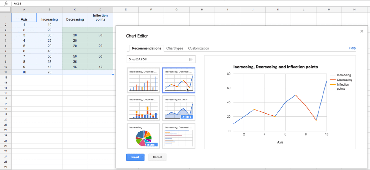
With this data table setup, highlight the whole table (use Ctrl + A, or Cmd + A on a Mac, to do this quickly) and Insert > Chart...:
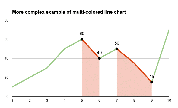
Then simply format to the style you want, such as coloring the Increasing Series in green and the Decreasing Series in red:
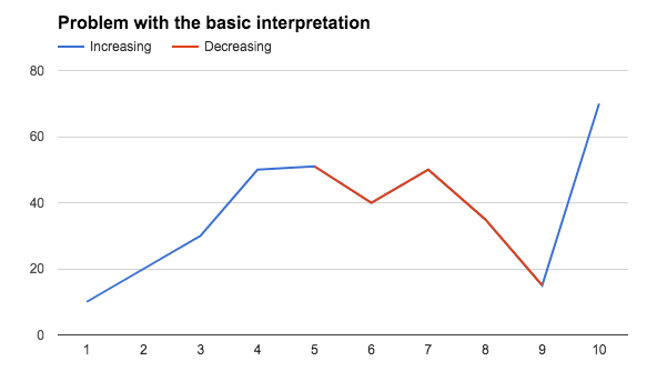
Problem with this basic interpretation of this chart
This method has a drawback though, if you have adjacent inflection points, i.e decreasing – increasing – decreasing, then it tricks the chart so it colors the whole section decreasing, as shown in this image:
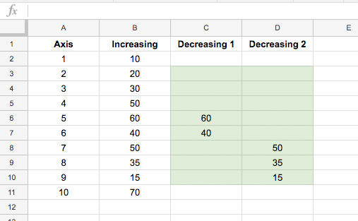
The fix
If you encounter this issue of adjacent inflection points, then you’ll need to create additional decreasing series to separate them, like this example dataset:
The final chart will then look like this:
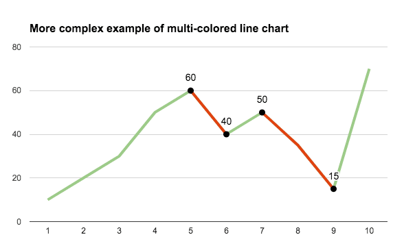
Add the inflection point values
Again we need to split the inflection point data into two columns so there are no adjacent inflection points in these series. The dataset now looks like:
and the final chart:
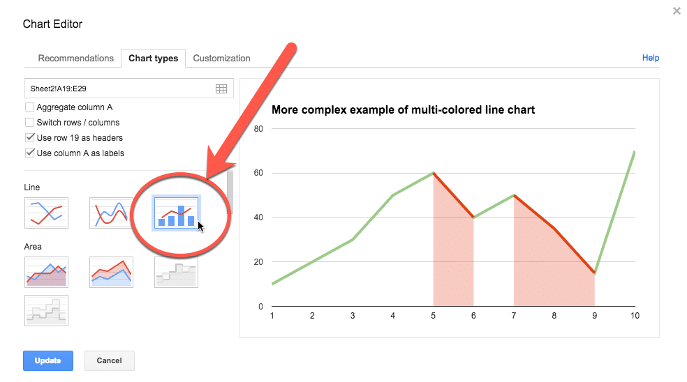
Even more customization options
Select the Combo chart instead of the straightforward line chart and change the increasing series to a line and the decreasing series to area charts:
Your final chart will look like this:
And here’s the version with the inflection points marked:
💡 Sponsored Link Grow your business with secure, collaborative tools. Try Google Workspace free for 14 days and enjoy all the latest and greatest Sheets features!
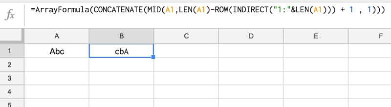
Basically we make an array of numbers corresponding to how many letters are in the original text string. Then we reverse that, so the array shows the largest number first. Then we extract each letter at that position (so the largest number will extract the last letter, the second largest will extract the second-to-last letter, etc., all the way to the smallest number extracting the first letter). Then we concatenate these individual letters.
Easy! Err…
The only way to really understand this formula is to break it down, starting from the inner functions and building back out.
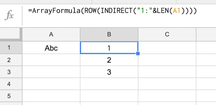
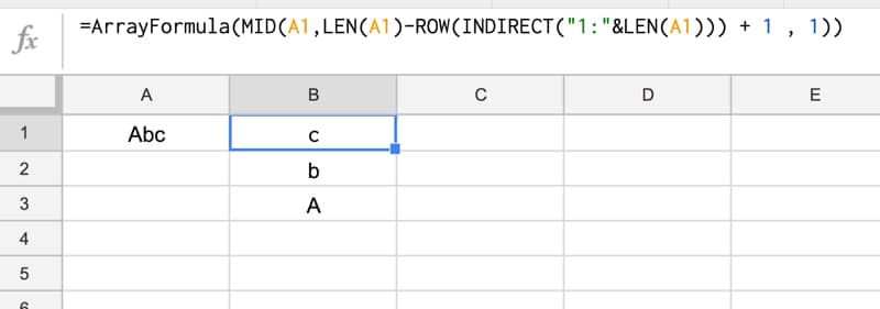
Assuming we have the text string “Abc” in cell A1, then let’s build the formula up in cell B1, step-by-step:
Step 1:
Use the LEN function to calculate the length of the text string and turn it into a range string with “1:”&LEN(A1)
Use the INDIRECT function to turn this string range reference into a valid range reference.
Finally wrap with ROW to convert into a row number list.
=ROW(INDIRECT("1:"&LEN(A1)))
which outputs a result of 1 in cell B1.
Step 2:
Turn the formula into an array formula, by hitting Ctrl + Shift + Enter, or Cmd + Shift + Enter (on a Mac), to the formula above. This will add the ArrayFormula wrapper around the formula:
=ArrayFormula(ROW(INDIRECT("1:"&LEN(A1))))
This outputs 1 in cell B1, 2 in cell B2 and 3 in cell B3:
Step 3:
Reverse the output, so 3 is in cell B1, 2 in B2 and 1 in B3, by subtracting from the length of the text in A1 and adding 1 to avoid 0:
1. User submits Google Forms survey 2. Response logged in Google Sheet 3. Google Apps Script parses responses and sends emails 4. Original user receives reply!
You’re happy!
You sent out a Google Forms survey to your customers and received hundreds of responses.
They’re sitting pretty in a Google Sheet but now you’re wondering how you can possibly reply to all those people to say thank you.
Manually composing a new email for each person, in turn, will take forever. It’s not an efficient use of your time.
You could use an ESP like Mailchimp to send a bulk “Thank You” message, but it won’t be personal. It’ll be a generic, bland email and nobody likes that. It won’t engage your customers and you’ll be missing an opportunity to start a genuine conversation and reply to any feedback from the survey.
Thankfully, there is another way.
Of course, there is, otherwise, why would I be writing this tutorial! 😉
By adding a reply column to your Google Sheet, next to the Google Forms survey responses, you can efficiently compose a personal response to every single survey respondent.
Then, using Google Apps Script (a Javascript-based language to extend Google Workspace), you can construct an email programmatically for each person, and send out the responses in bulk directly from your Google Sheet.
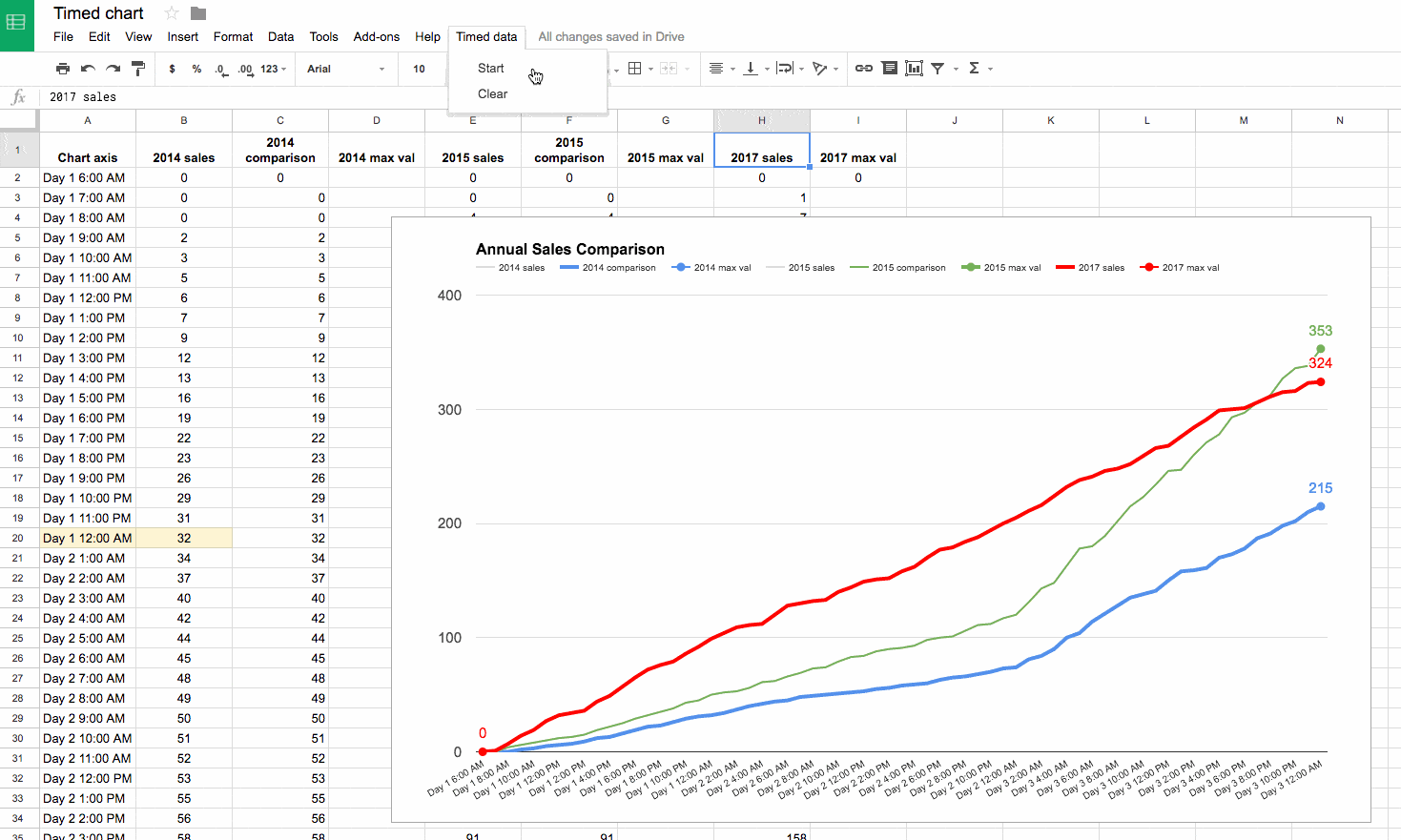
This post looks at how to make a line graph in Google Sheets, an advanced one with comparison lines and annotations, so the viewer can absorb the maximum amount of insight from a single chart.
For fun, I’ll also show you how to animate this line graph in Google Sheets.
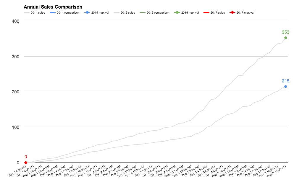
The key to this line graph in Google Sheets is setting up the data table correctly, as this allows you to show an original data series (the grey lines in the animated GIF image), progress series lines (the colored lines in the animated GIF) and current data values (the data label on the series lines in the GIF).
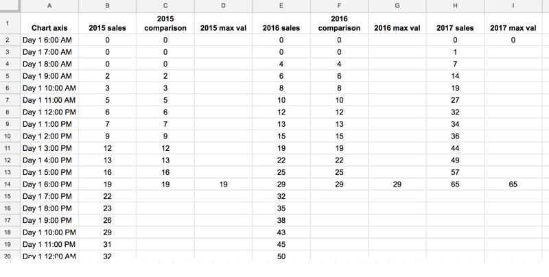
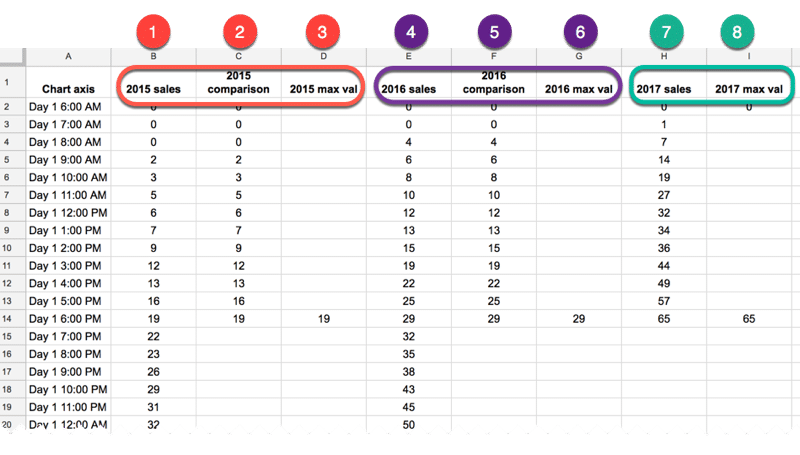
In this example, I have date and times as my row headings, as I’m measuring data across a 4-day period, and sales category figures as column headings, as follows:
Red columns
The red column, labeled with 1 above, contains historic data from the 2015 sale.
Red column 2 is a copy of the same data but only showing the progress up to a specific point in time.
In red column 3, the following formula will create a copy of the last value in column 2, which is used to add a value label on the chart:
=IF(AND((C2+C3)=C2,C2<>0),C2,"")
Purple columns:
Purple columns 4,5 and 6 are exactly the same but for 2016 data. The formula in this case, in column 6, is:
=IF(AND((F2+F3)=F2,F2<>0),F2,"")
Green columns:
Data in green columns 7 and 8, is our current year data (2017), so in this case there is no column of historic data. The formula in column 8 for this example is:
=IF(AND((H2+H3)=H2,H2<>0),H2,"")
Creating the line graph in Google Sheets
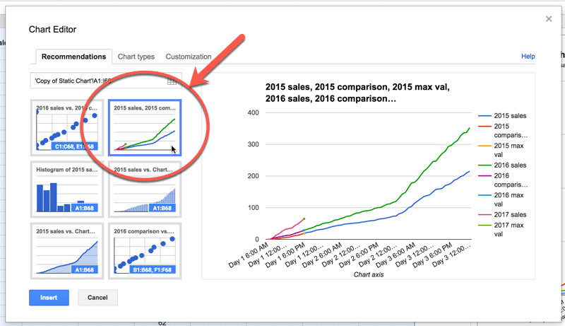
Highlight your whole data table (Ctrl + A if you’re on a PC, or Cmd + A if you’re on a Mac) and select Insert > Chart from the menu.
In the Recommendations tab, you’ll see the line graph we’re after in the top-right of the selection. It shows the different lines and data points, so all that’s left to do is some formatting.
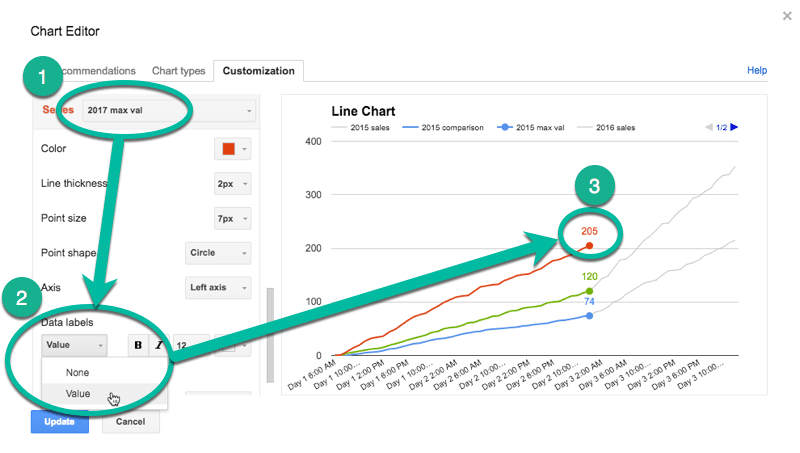
Format the series lines as follows:
For the historic data (columns 1 and 4 in the data table), make light grey and 1px thick
For the current data (columns 2, 5 and 7 in the data table), choose colors and make 2px thick
For the “max” values (columns 3, 6 and 8 in the data table), match the current data colors, make the data point 7px and add data label values (see steps 1, 2 and 3 in the image below)
This is the same technique I’ve written about in more detail in this post:
How about creating an animated version of this chart?
Oh, go on then.
When this script runs, it collects the historic data, then adds that data back to each new row after a 10 millisecond delay (achieved with the Utilities.sleep method and the SpreadsheetApp.flush method to apply all pending changes).
I don’t make any changes to the graph or create any fancy script to change it, I leave that up to the Google Chart Tool. It just does its best to keep up with the changing data, although as you can see from the GIF at the top of this post, it’s not silky smooth.
By the way, you can create and modify charts with Apps Script (see this waterfall chart example, or this funnel chart example) or with the Google Chart API (see this animated temperature chart). This may well be a better route to explore to get a smoother animation, but I haven’t tried yet…
Here’s the script:
function startTimedData() {
  var ss = SpreadsheetApp.getActive();
  var sheet = ss.getSheetByName('Animated Chart');
  var lastRow = sheet.getLastRow()-12;

  var data2015 = sheet.getRange(13,2,lastRow,1).getValues(); // historic data
  var data2016 = sheet.getRange(13,5,lastRow,1).getValues(); // historic data

  // new data that would be inputted into the sheet manually or from API
  var data2017 = [[1],[7],[14],[19],[27],[32],[34],[36],[44],[49],[57],[65],[72],[76],[79],[86],[92],[99],[104],[109],[111],[112],[120],[128],[130],
                  [132],[133],[140],[144],[149],[151],[152],[158],[162],[170],[177],[179],[184],[188],[194],[200],[205],[211],[216],[224],[232],[238],
                  [241],[246],[248],[252],[259],[266],[268],[276],[284],[291],[299],[300],[301],[306],[311],[315],[316],[323],[324]];

  for (var i = 0; i < data2015.length;i++) {
    outputData(data2015[i],data2016[i],data2017[i],i);
  }

}

function outputData(d1,d2,d3,i) {
  var ss = SpreadsheetApp.getActive();
  var sheet = ss.getSheetByName('Animated Chart');

  sheet.getRange(13+i,3).setValue(d1);
  sheet.getRange(13+i,6).setValue(d2);
  sheet.getRange(13+i,8).setValue(d3);
  Utilities.sleep(10);
  SpreadsheetApp.flush();
}

function clearData() {
  var ss = SpreadsheetApp.getActive();
  var sheet = ss.getSheetByName('Animated Chart');
  var lastRow = sheet.getLastRow()-12;

  sheet.getRange(13,3,lastRow,1).clear();
  sheet.getRange(13,6,lastRow,1).clear();
  sheet.getRange(13,8,lastRow,1).clear();

}
On lines 6 and 7, the script grabs the historic data for 2015 and 2016 respectively. For the contemporary 2017 data, I’ve created an array in my script to hold those values, since they don’t exist in my spreadsheet table.